The Sage's Seven scores 65/100 — better than 10% of Casual capsules (n=10,153).

Quick text summary

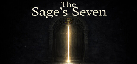
The Sage's Seven scored 65/100 on Steam Analyzer — Solid for a Casual capsule. Top priority fix: [genre_clarity] Incorporate a visual element that hints at card strategy or argumentation—such as visible cards, debate symbols, or a character in dialogue conflict—to clarify the actual gameplay.

Capsule scores by dimension

  • Genre Clarity: 5/10 — Ambiguous genre signals. The ornate archway and glowing light evoke fantasy or narrative adventure rather than strategy or logic gameplay. At tiny size, the architectural framing reads as atmospheric fantasy setting but gives no clear cue that this is a card-based debate duel or strategy game. The visual theme contradicts the core mechanic of argument refutation and draft-based card play.
  • Title Readability: 8/10 — Clear serif typography. The Sage's Seven uses a clean, elegant serif font with strong contrast against the dark background. Title remains readable at small size due to generous spacing and centered placement on a controlled dark zone. At tiny size, the text may blur slightly but the elegant letterforms hold enough distinction to remain recognizable.
  • Contrast & Color: 7/10 — Strong value separation. Warm golden light from the archway creates clear visual separation from the dark architectural frame and black background (#1b2838). The bright vertical glow line is the dominant focal point and maintains clarity at all sizes. Slight risk that midtone stone textures flatten in grayscale, but the light source remains distinct.
  • Uniqueness & Polish: 6/10 — Competent but generic fantasy. The ornate archway with golden illumination is well-rendered and atmospheric, but echoes common fantasy game aesthetic without communicating the unique logic-duel or card-strategy hook. No visual storytelling about argumentation, debate mechanics, or the game's distinct seven-turn structure. Feels premium in craft but generic in thematic differentiation from typical fantasy titles.
  • Brand Consistency: 5/10 — No memorable identity cues. The golden archway is the only recurring visual motif, but it lacks distinctive character or symbolism tied to debate, logic, or the number seven. Without reference to the store screenshots, this image does not establish a recognizable brand identity that would distinguish The Sage's Seven from other fantasy games. The palette and architecture style feel interchangeable with multiple other indie fantasy titles.
  • Composition: 8/10 — Strong centered focal point. The vertical golden light source creates a clear primary focal point in the center, with the archway framing it symmetrically. Title is positioned safely above the main visual without edge crowding or crop risk. Depth layering from dark foreground stone through illuminated archway to background darkness creates visual hierarchy that holds at small and tiny sizes.

What works

  • Readable title hierarchy. The serif typography maintains clarity across all viewing sizes with good spacing and centered placement on a controlled dark background.
  • Strong focal point clarity. The bright vertical glow provides an unambiguous primary focal point that guides the eye immediately and remains distinct at tiny size.
  • Safe composition margins. Title and central elements are positioned well within safe zones with minimal risk of Steam cropping or edge interference.

What hurts the capsule

  • Genre mismatch. Fantasy architectural imagery does not communicate the card-based strategy or logic-duel gameplay, creating confusion about what type of game this is.
  • Generic visual identity. The ornate archway aesthetic lacks distinctive character or thematic elements tied to debate, argumentation, or strategic gameplay.
  • No unique hook communicated. The capsule fails to visually convey what makes this game different—the seven-turn structure, draft mechanics, or core argument-refutation gameplay feel completely absent from the design.

Priority fixes

  1. [genre_clarity] Incorporate a visual element that hints at card strategy or argumentation—such as visible cards, debate symbols, or a character in dialogue conflict—to clarify the actual gameplay.
  2. [uniqueness_polish] Add a distinctive motif or symbol related to the 'seven' concept or logic/debate theme to establish memorable brand identity that differentiates from generic fantasy.
  3. [brand_consistency] Develop a signature visual element (character icon, symbolic object, or palette accent) that can anchor all marketing materials and become recognizable across store screenshots.

Store copy priority fixes

  1. [hook_strength] Simplify 'draft-based card strategy' in the short description to 'play logic cards' or 'build your argument deck' to make the mechanic immediately accessible without jargon.
  2. [feature_communication] Add a brief line explaining how the 7-turn structure creates tension (e.g., 'With only 7 turns, you must choose your rebuttals wisely—every card is your last chance') to deepen understanding of the core tension.
  3. [uniqueness] Include a single line comparing this game to other card games or explicitly stating what makes logic-based argument refutation different (e.g., 'Unlike deck-builders focused on power, every card is a reason you must defend').

Related guides

Steam app ID: 4563450 · Tags: Casual, Logic, Card Game, Detective, Turn-Based Strategy