Scoring genre clarity...

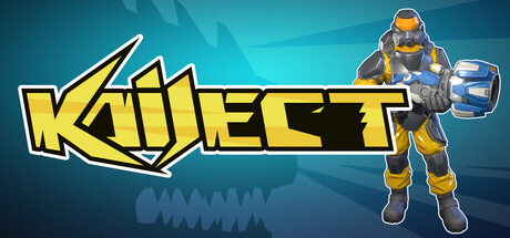
KAIJECT capsule

KAIJECT

Land on giant kaiju, drill through their bodies, and destroy the monsters from within. Gather resources, upgrade your weapons, and reach their main organs to save the city.

ActionExplorationSimulation
Gryphon`s NestComing soon

KAIJECT scores 70/100 — better than 28% of Action capsules (n=8,871).

Released Coming soon · By Gryphon`s Nest

Quick text summary

KAIJECT scored 70/100 on Steam Analyzer — Good for a Action capsule. Top priority fix: [genre_clarity] Introduce a clear kaiju silhouette or drilling rig visual element in the background or mid-ground to communicate the unique 'inside the monster' mechanic at tiny size.

Capsule scores by dimension

  • Genre Clarity: 7/10 — Action gameplay with unclear setting. The bold yellow geometric logo and angular design suggest action or combat, but the kaiju drilling mechanic is not visually apparent at any size. The teal gradient background with geometric patterns creates energy but doesn't communicate the unique 'drill inside monsters' hook. At tiny size, it reads as generic action-arcade rather than the specific simulation-action hybrid it is.
  • Title Readability: 8/10 — Strong legible logo with clean contrast. The KAIJECT title uses bold yellow lettering with a thick white outline that maintains clarity at all sizes, including tiny thumbnails. The geometric slash through the K adds visual interest without sacrificing readability. At full size it is crisp; at small and tiny sizes the outline prevents letterform collapse, though the geometric styling becomes slightly angular.
  • Contrast & Color: 8/10 — Bright yellow pops cleanly against teal. The bright saturated yellow (#F4D03F range) has strong value separation from the dark teal background (#0B5F7F range), creating clear silhouette and pop in quick scroll. The white outline amplifies contrast further. Grayscale test shows good light-dark separation; the yellow reads as distinctly lighter even when desaturated, ensuring readability against #1b2838 Steam background.
  • Uniqueness & Polish: 6/10 — Polished design, generic action feel. The execution is clean with professional letterforms, consistent stroke weight, and intentional geometric styling. However, the visual presentation reads as bold action-arcade branding rather than communicating the unique kaiju-drilling simulation core mechanic. Compared to top performers like Lethal Company or DREDGE, it lacks a memorable hook or distinctive visual storytelling beyond 'bold action game.'
  • Brand Consistency: 6/10 — Consistent style, minimal identity signal. The geometric angular aesthetic and yellow-white-teal palette are internally cohesive throughout the capsule. However, there is no iconic character, creature silhouette, or signature motif that would make KAIJECT immediately recognizable on repeat viewing. The styling is competent but generic enough that it could fit multiple action titles without feeling distinctly kaiju-focused.
  • Composition: 7/10 — Centered logo, busy background support. The title logo sits confidently centered in the frame with strong focal hierarchy at all sizes. The teal geometric rays and patterns create depth layering but become visual noise at tiny size without supporting the main message. Safe margins protect the title from edge cropping, and the composition remains legible at small and tiny sizes, though the supporting elements feel decorative rather than purposeful.

What works

  • Excellent title contrast and readability. Yellow letterforms with white outline maintain clarity from full size down to tiny thumbnails without letterform collapse or outline thickness loss.
  • Strong color pop against Steam dark background. The saturated yellow and teal combination creates immediate visual separation with excellent value contrast that reads clearly in quick scroll and grayscale.
  • Clean professional typography and stroke consistency. Geometric letter styling and outlines are intentional and well-executed with no rough edges or sloppy effects.

What hurts the capsule

  • Generic action branding obscures unique mechanic. The capsule communicates 'bold action game' rather than the specific kaiju-drilling-from-within hook, failing to convey the distinctive gameplay loop.
  • Decorative background competes at small sizes. Geometric ray patterns and angular elements create visual clutter that muddies focal hierarchy when the capsule shrinks, especially at tiny thumbnail size.
  • No recognizable character or iconic motif. The design lacks a memorable visual identity signal—no kaiju silhouette, drilling rig, or signature symbol—that would distinguish it from other action titles.

Priority fixes

  1. [genre_clarity] Introduce a clear kaiju silhouette or drilling rig visual element in the background or mid-ground to communicate the unique 'inside the monster' mechanic at tiny size.
  2. [uniqueness_polish] Add a distinctive brand motif such as a signature drilling tool, glowing core, or iconic enemy silhouette that creates a memorable visual identity for repeat recognition.
  3. [composition] Simplify or remove busy geometric background patterns at small sizes; replace with a cleaner supporting layer that does not compete with the logo focal point.

Related guides

Steam app ID: 4563860 · Tags: Action, Exploration, Simulation, First-Person, Voxel