Scoring genre clarity...
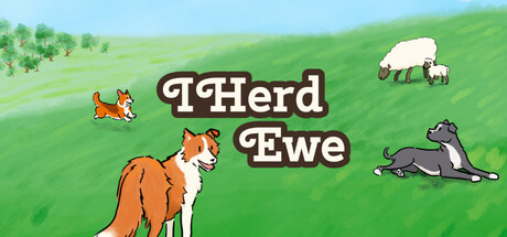
I Herd Ewe capsule

I Herd Ewe

It's time for the sheep to head home! Will you command your team of dogs to round them up in as few turns as possible? Or will the sheep outsmart you with their wooly ways? Make use of each dog's unique ability to get the sheep home as efficiently as possible in this cozy turn-based strategy game.

CasualDogsFamily Friendly
1 2 Many Humans2027

I Herd Ewe scores 75/100 — better than 65% of Casual capsules (n=10,382).

Released 2027 · By 1 2 Many Humans

Quick text summary

I Herd Ewe scored 75/100 on Steam Analyzer — Good for a Casual capsule. Top priority fix: [composition] Enlarge or reposition the secondary animals to occupy safer margins and remain readable at tiny thumbnail size, or consolidate focal elements into a tighter primary group.

Capsule scores by dimension

  • Genre Clarity: 8/10 — Clear casual strategy with charming animal theme. The pastoral landscape, herding dogs, and sheep immediately signal a cozy turn-based strategy game about animal management. At tiny size, the fox, sheep, and dog silhouettes remain recognizable and reinforce the herding gameplay loop. Genre identity is strong and unambiguous.
  • Title Readability: 7/10 — Readable title with playful font treatment. The title 'I Herd Ewe' is displayed in a bold, rounded serif font with thick outlines that provides good contrast against the green background. At small size it remains legible; however, at tiny size the outline thickness and letter spacing begin to compress slightly. The wordplay pun is charming but relies on reading the full text.
  • Contrast & Color: 8/10 — Strong value separation with vibrant palette. The bright green gradient background provides excellent contrast against the white title outline and warm-colored animals (orange fox, gray dogs). The saturated greens and oranges pop clearly against the dark Steam background at all sizes. Silhouettes remain clean and readable even when squinted.
  • Uniqueness & Polish: 7/10 — Charming art style with intentional craft. The hand-drawn aesthetic of the animals and landscape feels cohesive and deliberately stylized rather than generic. The pun-based title and whimsical animal poses communicate personality and warmth. Compared to top genre benchmarks like Tiny Glade or Moonstone Island, the craft is solid but the visual hook is modest—it reads as competent indie style without a standout signature element.
  • Brand Consistency: 7/10 — Consistent warm palette and animal-centric identity. The warm color palette (greens, oranges, pastels), rounded character design, and pastoral setting establish a recognizable brand voice for a cozy indie title. The fox, sheep, and dog appear intentionally designed to be memorable mascots. Without access to store screenshots, the internal cohesion signals a consistent identity, though the title treatment is the primary brand anchor.
  • Composition: 8/10 — Well-balanced layout with clear focal hierarchy. The fox in the lower left anchors the composition, the title sits centered and elevated with the sheep and dog balanced to the right, creating a natural reading flow from left to right. The landscape gradient provides depth. At small and tiny sizes the layout remains coherent with no critical elements in unsafe margins, though the small sheep at top right becomes less distinct at minimal sizes.

What works

  • Strong genre signaling through character pose and setting. The herding dog pose, pastoral landscape, and sheep immediately communicate turn-based strategy about animal management without ambiguity.
  • Excellent value contrast against dark background. Warm oranges and bright greens provide clear separation that pops at all viewport sizes including quick scroll conditions.
  • Cohesive warm color palette with personality. The rounded character design and pastoral aesthetic feel intentional and charming rather than templated or generic.

What hurts the capsule

  • Small secondary details lose legibility at tiny size. The sheep at top right and small dog at right edge become indistinct blobs when viewed at 120x45 pixels.
  • Title relies on wordplay that requires full readability. The pun 'I Herd Ewe' only communicates personality when all letters are clearly readable; at extreme compression it may read as generic text.
  • Limited visual hook beyond charming animals. The capsule feels competent and pleasant but lacks a distinctive visual signature or mechanic callout that differentiates it from other cozy indie games.

Priority fixes

  1. [composition] Enlarge or reposition the secondary animals to occupy safer margins and remain readable at tiny thumbnail size, or consolidate focal elements into a tighter primary group.
  2. [uniqueness_polish] Add a subtle UI element or visual cue (e.g., a small turn counter, movement arrow, or command icon) that hints at the strategy layer and creates visual distinction from pure animal aesthetic games.
  3. [title_readability] Test the title legibility at 120x45 viewport and consider slight letter spacing adjustment if compression degrades the pun clarity.

Store copy priority fixes

  1. [feature_communication] Add one or two concrete examples of dog abilities (e.g., 'The Border Collie can block paths, the Sheepdog can push multiple animals at once') to help players visualize gameplay.
  2. [uniqueness] Insert a sentence differentiating the game from standard turn-based tactics, such as 'Unlike traditional grid-based puzzlers, animals move with real personality and can surprise you' or highlight what makes this specifically a herding game rather than generic unit placement.
  3. [hook_strength] Consider opening the short description with a confident statement like 'Master the art of herding in this cozy turn-based strategy' rather than leading with a question, to create stronger immediate appeal.

Related guides

Steam app ID: 4564970 · Tags: Casual, Dogs, Family Friendly, Puzzle, Strategy