Scoring genre clarity...
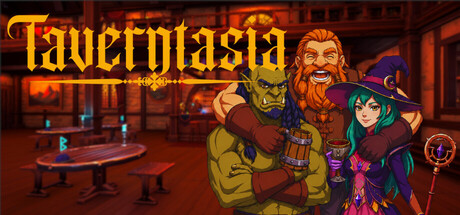
Taverntasia capsule

Taverntasia

Manage your very own tavern as a wizard! Host guests from diverse races. Brew special magical drinks with potions and herbs, and serve delicious meals. Keep your customers happy with quick and quality service. Build your reputation, earn money, and take your tavern to the top!

SimulationShop KeeperManagement
MvM InteractiveComing soon

Taverntasia scores 75/100 — better than 62% of Simulation capsules (n=5,401).

Released Coming soon · By MvM Interactive

Quick text summary

Taverntasia scored 75/100 on Steam Analyzer — Good for a Simulation capsule. Top priority fix: [composition] Inset the potion bottle or other right-edge elements further from the margin to eliminate crop risk across all Steam viewport sizes.

Capsule scores by dimension

  • Genre Clarity: 8/10 — Fantasy tavern management clear. The capsule immediately communicates a fantasy tavern simulation through multiple visual cues: a bearded dwarf character in brown/gold clothing, a witch in purple robes with a pointed hat, an interior tavern setting with tables and warm lighting, and magical potion bottles visible on the right. At tiny size, the fantasy tavern theme and management gameplay remain legible through character silhouettes and warm interior environment, though specific mechanics blur slightly.
  • Title Readability: 8/10 — Bold gold title reads well. The 'Taverntasia' title uses a large, bold gold/yellow serif font with a decorative fantasy styling that contrasts strongly against the dark red-orange background. At full and small sizes the title is clearly readable; at tiny size the letterforms compress slightly but remain identifiable due to strong color contrast and weight. The placement in the upper-left region avoids the character cluster, keeping the read clean.
  • Contrast & Color: 8/10 — Warm tones pop on dark. The capsule uses a rich warm palette of golds, oranges, and reds that create strong value separation against the Steam dark background (#1b2838). Character silhouettes and the tavern interior maintain clear edges through saturated warm lighting, and the grayscale test shows good mid-tone differentiation between foreground characters and background environment. The color scheme is cohesive and avoids muddy transitions.
  • Uniqueness & Polish: 7/10 — Stylized characters, generic tavern. The character art shows intentional cartoon style with expressive facial features and detailed costume design (dwarf's outfit, witch's robes), giving personality and polish. However, the background tavern interior feels somewhat generic—warm-lit wooden pub space without standout details that signal 'magical' or 'unique' management mechanics. The capsule feels well-crafted but relies heavily on character charm rather than communicating a distinctive core mechanic or hook.
  • Brand Consistency: 7/10 — Cartoon style consistent, palette strong. The illustrative cartoon art style is internally coherent across the dwarf, witch, and environment, with consistent linework and shading approach. The warm gold-orange-red palette reinforces a fantasy tavern identity that could be recognizable on repeat. The visual tone matches casual indie management game expectations, though without a signature motif or icon unique enough to feel iconic across multiple touchpoints.
  • Composition: 7/10 — Clear focal point, minor crowding. The two characters (dwarf and witch) form a clear primary focal group in the center-right, drawing immediate attention and establishing the fantasy tavern theme. The title sits safely in the upper-left, and the tavern interior provides context in the background without competing for focus. At small and tiny sizes the character silhouettes read as a unified group; however, the right edge shows a potion bottle that sits slightly close to the margin, risking minor crop issues on some displays.

What works

  • Strong color contrast vs dark bg. The warm gold and red palette pops decisively against the Steam dark background, ensuring visibility even at small scroll sizes.
  • Expressive character personality. The dwarf and witch show distinct, appealing character design with readable expressions and detailed costume work that conveys charm and professionalism.
  • Title placement and legibility. The large, bold 'Taverntasia' gold text is positioned cleanly in the upper zone away from character clutter, maintaining readability from full size down to tiny.
  • Cohesive warm color story. The unified orange-gold-red palette creates a memorable fantasy tavern mood that feels intentional and genre-appropriate.

What hurts the capsule

  • Generic tavern interior. The background environment is a standard warm-lit pub with tables; it lacks distinctive magical or management-specific visual details that signal the game's unique selling point.
  • Potion bottle edge hazard. The small potion bottle on the right edge sits close to the margin and may be clipped or awkwardly cropped on certain Steam display formats.
  • No iconic brand motif. While the palette and characters are cohesive, there is no distinctive symbol, logo, or signature element that would make the capsule immediately recognizable in a game library of similar fantasy titles.

Priority fixes

  1. [composition] Inset the potion bottle or other right-edge elements further from the margin to eliminate crop risk across all Steam viewport sizes.
  2. [uniqueness_polish] Add a magical visual element or UI hint (e.g., glowing potion effects, brewing cauldron, magical aura) to the background to signal the unique 'potion-brewing tavern' mechanic and differentiate from generic pub settings.
  3. [brand_consistency] Develop a distinctive icon or visual motif (e.g., a signature potion bottle shape, tavern crest, or magical emblem) that can appear in this capsule and other marketing materials to build instant recognition.

Store copy priority fixes

  1. [feature_communication] Add one sentence explaining what the 'Fame' system does—does it unlock new recipes, perks, or story content? Give players a concrete reason to care about this progression metric.
  2. [uniqueness] Add a specific detail that differentiates this tavern sim—e.g., 'Mix over 50 unique potion combinations,' or 'Each fantasy race has distinct preferences and complaints,' something that competitors don't emphasize.
  3. [feature_communication] Expand the brewing mechanic in the detailed description with one example recipe or gameplay loop (e.g., 'Gather moonflowers and dragon pepper, crush them in your mortar, distill under a full moon to craft a shimmering ale') to make crafting feel tangible.
  4. [audience_targeting] Add a sentence signaling the expected playstyle—e.g., 'Perfect for players seeking a relaxing, progression-based management game' or 'Ideal for fans of cozy sims with magical themes'—to help the right players self-identify.

Related guides

Steam app ID: 4565730 · Tags: Simulation, Shop Keeper, Management, Magic, Fantasy