Scoring genre clarity...

Rutted capsule

Rutted

A physics-based off-road riding game about balance, momentum, and not flipping over like an idiot.

$3.99
RacingSide ScrollerBikes
ApeXPloit StudiosApr 21, 2026

Rutted scores 75/100 — better than 60% of Racing capsules (n=762).

$3.99 · Released Apr 21, 2026 · By ApeXPloit Studios

Quick text summary

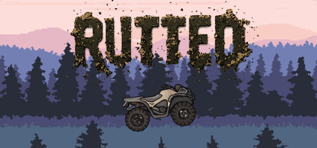
Rutted scored 75/100 on Steam Analyzer — Good for a Racing capsule. Top priority fix: [title_readability] Reduce particle decay density or offset title placement to a cleaner region to improve legibility below 200px width.

Capsule scores by dimension

  • Genre Clarity: 8/10 — Clear off-road racing identity. The ATV centered in the composition with pixelated forest silhouette immediately signals off-road vehicle gameplay. At TINY size, the ATV silhouette remains legible and the terrain context reinforces motorsport/racing genre expectations. The physics-based nature is harder to convey visually, but the vehicle pose and landscape clearly communicate 'off-road rider' without ambiguity.
  • Title Readability: 7/10 — Readable title with decay effect. The word 'RUTTED' uses a bold sans-serif with a distinctive pixelated decay/erosion effect that breaks apart into particles at the top. At FULL size it reads cleanly; at SMALL size (231×87) the title remains legible due to large letterforms and strong contrast. At TINY size (120×45) the decay effect becomes noise, but the core letters still resolve due to letter width and darkness, though readability drops slightly below ideal.
  • Contrast & Color: 8/10 — Strong silhouette against calm palette. The dark forest treeline and ATV create clear separation from the warm pink-to-blue gradient sky. The pixelated pine trees and vehicle read as dark solid shapes against lighter background layers, maintaining silhouette clarity even in grayscale. At TINY size the foreground ATV and treeline remain visibly distinct from the sky gradient, supporting quick recognition during scroll.
  • Uniqueness & Polish: 7/10 — Polished pixel art with cohesive style. The capsule demonstrates intentional craft through consistent pixel-art rendering across sky gradient, forest layers, and ATV detail. The decay particle effect on the title is a memorable visual hook that signals creative direction without feeling generic. However, the scene itself—forest landscape with vehicle silhouette—is a fairly standard racing game trope, limiting how distinctive the core composition feels against similar titles.
  • Brand Consistency: 7/10 — Consistent pixel aesthetic, limited icon. The pixel-art style is coherent throughout and likely matches the in-game visual identity. The decay/erosion particle motif on the title suggests a memorable brand language around physics-based destruction or breakdown. Without access to the 5 store screenshots for direct comparison, internal assessment shows solid stylistic unity, though there is no immediately iconic character or symbol that would make RUTTED instantly recognizable in isolation.
  • Composition: 8/10 — Balanced hierarchy with clear focal point. The ATV is centered and commands attention as the primary subject, with the forest layers creating depth and framing without competing for focus. The title sits above in a controlled region with sufficient breathing room. At SMALL and TINY sizes, the center vehicle remains the dominant visual anchor, and the layered forest maintains background clarity without clutter or dead space.

What works

  • Clear genre and subject. ATV silhouette against forest landscape immediately communicates off-road racing without ambiguity.
  • Strong foreground-background separation. Dark treeline and vehicle contrast sharply against the warm sky gradient, maintaining silhouette legibility at tiny size.
  • Polished pixel-art craft. Consistent rendering style and intentional decay effect on title elevate the feel above generic racing templates.
  • Centered focal point. ATV placement ensures strong primary subject that reads clearly even when scaled down to thumbnail size.

What hurts the capsule

  • Decay effect obscures title clarity at small size. The particle erosion on 'RUTTED' adds visual interest but introduces noise that reduces legibility below 150px width.
  • Generic scene composition. Forest silhouette with centered vehicle is a common racing game trope that does not stand out against benchmark titles like Forza or RIDE 5.
  • No iconic brand symbol or motif. The capsule lacks a recognizable character, logo, or signature visual element that would make RUTTED memorable on repeat viewings.

Priority fixes

  1. [title_readability] Reduce particle decay density or offset title placement to a cleaner region to improve legibility below 200px width.
  2. [uniqueness_polish] Introduce a visual hook or signature element—such as a flipped ATV, exaggerated physics feedback, or distinct UI accent—that signals the 'physics-based balance' core mechanic.
  3. [brand_consistency] Develop a more distinctive palette or motif that could carry across store screenshots and future marketing materials to build icon recognition.

Store copy priority fixes

  1. [feature_communication] Expand the detailed description to explain what 'tricks' are and how they interact with balance/physics (e.g., 'chain wheelies and bunny hops to maintain momentum'), and clarify what procedural generation means for replayability.
  2. [feature_communication] Add a sentence describing progression or meta-goals: do players unlock new bikes, compete for scores, or face escalating challenge tiers?
  3. [uniqueness] Add one sentence that articulates what makes this physics model or flip mechanic distinct (e.g., 'ultra-responsive controls demand split-second lean adjustments' or 'the only motocross game where the flip is the entire game').

Related guides

Steam app ID: 4570100 · Tags: Racing, Side Scroller, Bikes, Motocross, Motorbike