Scoring genre clarity...
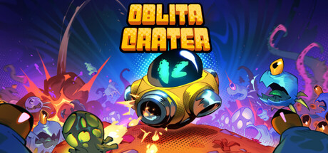
Dive into an action-packed shoot 'em up where every drop onto the planet is a high-stakes gamble. Fight through endless waves of increasingly deadly alien monsters while collecting powerful upgrades to aid you in battle. You can escape at any time, but beware — death resets your score to zero!
$4.99Mostly Positive(13)
Bullet HellShoot 'Em UpTwin Stick Shooter
Strangely NamedApr 24, 2026