Scoring genre clarity...
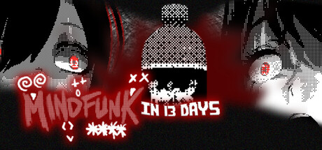
Help Nari and Sena make sense of a cringeworthy drink called MINDFUNK that predicts their death. Your choices in this psychological horror visual novel will determine how they deal with this MIND****.
$2.99Positive(13)
Visual NovelChoose Your Own AdventureMultiple Endings
VAINSANEApr 24, 2026