Scoring genre clarity...
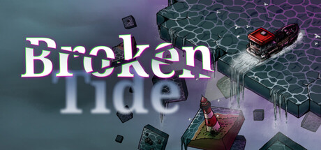
Broken Tide capsule

Broken Tide

Your best friend is dead, and something made you do it. Now you fish a broken sea, drafting your path piece by piece in waters that never form the same way twice. Haul in your catch. Upgrade your boat. Return before dark. The sea forgets nothing. Neither should you.

MysteryStrategyExploration
Off The Beaten TrackTo be announced

Broken Tide scores 67/100 — better than 20% of Mystery capsules (n=2,266).

Released To be announced · By Off The Beaten Track

Quick text summary

Broken Tide scored 67/100 on Steam Analyzer — Solid for a Mystery capsule. Top priority fix: [contrast_color] Increase brightness or saturation contrast of floating middle-tone assets (gray cubes) to ensure they separate from the water background in grayscale evaluation.

Capsule scores by dimension

  • Genre Clarity: 7/10 — Fishing and narrative dread clear. The capsule clearly communicates a fishing-focused game through the visible boat, water environment, and casting/harvesting visual. At TINY size, the boat silhouette and water setting are recognizable, though the narrative horror/mystery element (referenced in description) is less obvious from visuals alone. The isometric perspective and modular asset style hint at strategy/indie mechanics effectively.
  • Title Readability: 6/10 — Title legible but compressed awkwardly. The title 'Broken Tide' is readable at full size with clear white letterforms, but the vertical stacking and transparency overlay on the boat area creates some visual competition. At SMALL size (231×87), the text remains legible due to contrast, but at TINY size (120×45) the letters compress and the bottom word 'Tide' becomes cramped. The outline and anti-aliasing help, but tight spacing reduces emergency readability at extreme reduction.
  • Contrast & Color: 7/10 — Good separation with purple-teal harmony. The purple and teal gradient background provides strong value separation from the white title text, and the boat assets in warm reds and metallics stand out well against the cooler background palette. At TINY size, the silhouettes remain distinct due to the bold color choices. However, some mid-tone floating assets (gray cubes, reflective elements) blend slightly into the darker regions, and the overall composition leans on color harmony rather than pure contrast punch.
  • Uniqueness & Polish: 7/10 — Distinctive art style with cohesive mood. The isometric, low-poly aesthetic with modular floating assets creates a memorable and premium look that differentiates from generic fishing or adventure games. The purple-teal color grading and ethereal particle effects convey a dreamlike, unsettling tone that matches the narrative hook of mystery and dark storytelling. The craft is clean and intentional, though the scene composition feels somewhat standard for indie puzzle-adventure titles in this visual family.
  • Brand Consistency: 6/10 — Cohesive art direction, limited identity anchors. The capsule maintains strong internal consistency with a unified color palette, isometric rendering style, and atmospheric lighting throughout. However, there are no signature character, icon, or symbol that would make this instantly recognizable as 'Broken Tide' on a second viewing without text. The art direction is polished and deliberate, but the visual identity could benefit from a more iconic or distinctive motif that separates it from other indie adventure titles using similar isometric aesthetics.
  • Composition: 7/10 — Clear focal point, good depth layering. The boat in the center-right creates a strong primary focal point, with floating modular assets and water providing supporting foreground and background layers that guide the eye naturally. The title placement in the upper-left avoids blocking the main subject, and the overall balance feels intentional. At SMALL and TINY sizes, the boat and title remain the dominant reads, though some floating assets in the periphery could potentially be trimmed to reduce competition for attention in extreme reduction.

What works

  • Strong atmospheric color grading. The purple-to-teal gradient and ethereal lighting create immediate mood and emotional tone that signals indie narrative-driven game without text.
  • Boat silhouette clarity. The fishing boat is immediately recognizable and dominates the composition, clearly communicating the core mechanic even at TINY size.
  • Cohesive visual polish. Isometric rendering, particle effects, and asset design all feel intentional and premium rather than assembled from generic templates.
  • Title contrast readability. White letterforms on layered background maintain legibility across sizes and against the Steam dark background.

What hurts the capsule

  • Mid-tone asset blending. Gray and reflective floating cubes lose silhouette clarity against darker water regions, reducing visual punch in grayscale test.
  • Generic isometric aesthetic. While well-executed, the isometric puzzle-adventure style is shared across many top-performing indie titles, limiting distinctive brand recognition.
  • Compressed readability at TINY. The stacked title 'Broken / Tide' becomes cramped at 120×45 resolution, risking clarity during thumbnail scroll.
  • No signature visual anchor. The capsule lacks an iconic character, symbol, or motif that would make it instantly recognizable without text on repeat exposure.

Priority fixes

  1. [contrast_color] Increase brightness or saturation contrast of floating middle-tone assets (gray cubes) to ensure they separate from the water background in grayscale evaluation.
  2. [title_readability] Add subtle background panel or outline to the title area to improve TINY size legibility and ensure 'Tide' remains readable below 120px width.
  3. [uniqueness_polish] Introduce a signature visual motif or iconic element (e.g., a distinctive fishing lure, artifact, or character silhouette) that could serve as a brand anchor across marketing.
  4. [composition] Consider trimming or repositioning the smallest floating assets on the periphery to strengthen focus on the boat and reduce visual scatter at extreme reduction.

Store copy priority fixes

  1. [feature_communication] Clarify what 'drafting' means mechanically—add one sentence explaining whether players actively choose tiles, randomize routes, or build a path in real-time navigation.
  2. [genre_clarity] Add a sentence explicitly stating the story pacing—whether the mystery unfolds gradually across days or is a meta-layer above the daily fishing loop.
  3. [uniqueness] Strengthen the differentiation by stating explicitly what makes this fishing game distinct from other deck-builders or roguelikes (e.g., 'the only game where fishing and involuntary guilt merge,' or 'combines deck-building navigation with psychological narrative').
  4. [audience_targeting] Add a phrase signaling whether this targets casual players seeking story/exploration or hardcore players seeking strategic optimization (e.g., 'for players who value atmosphere and discovery over mechanical challenge' or vice versa).

Related guides

Steam app ID: 4576670 · Tags: Mystery, Strategy, Exploration, Story Rich, Atmospheric