Scoring genre clarity...
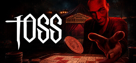
TOSS is a psychological tabletop horror game where every coin toss decides your fate. Kidnapped and forced to gamble for your life, you must earn enough to escape, knowing that luck can turn against you at any moment. One mistake, one bad toss, and everything you’ve fought for could be lost.
$4.991 user reviews
SimulationTabletopWalking Simulator
SolitaryStudiosMay 18, 2026