Scoring genre clarity...
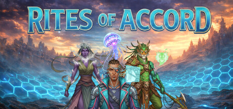
Rites of Accord capsule

Rites of Accord

Outsmart your rival and win a full wargame in 30 minutes. Command six factions that play nothing alike: turn your enemy's dead into ghosts that hunt them, spread living terrain across the map, or grow stronger with every wound you take. Free to play.

Free to Play
Turn-Based TacticsWargamePvP
CodeSeedNovember 2026

Rites of Accord scores 72/100 — better than 40% of Turn-Based Strategy capsules (n=1,283).

Free to Play · Released November 2026 · By CodeSeed

Quick text summary

Rites of Accord scored 72/100 on Steam Analyzer — Good for a Turn-Based Strategy capsule. Top priority fix: [uniqueness_polish] Integrate a signature faction emblem, rune, or distinctive logo treatment into the title or corner to create memorable brand identity and differentiate from genre peers.

Capsule scores by dimension

  • Genre Clarity: 7/10 — Strategy faction clash evident. The three distinct character archetypes (armored warrior, robed mage, beast-like creature) with magical effects clearly signal a strategy/tactics game with multiple factions. At tiny size, the silhouettes and magical auras (blue glow, green magic) remain readable enough to suggest tactical gameplay, though the hex-grid pattern at the bottom is too small to register as a UI hint.
  • Title Readability: 8/10 — Bold cyan title reads well. RITES OF ACCORD is rendered in large, bright cyan with a thick outline that creates strong contrast against the warm sunset background. The title maintains excellent readability down to small size due to generous letter spacing and the strategic placement above the character trio, avoiding competition with busy elements.
  • Contrast & Color: 8/10 — Strong warm-cool separation. The composition leverages warm orange/gold sunset against cool cyan title and blue magical effects, creating clear value separation. Character silhouettes pop distinctly from the background, and the glowing magical auras provide additional focal point lighting that reads clearly even when squinted or viewed at tiny size.
  • Uniqueness & Polish: 7/10 — High-quality render, familiar composition. The 3D character rendering is polished and well-lit, with cohesive color harmony and professional visual effects (magical glows, atmospheric lighting). However, the 'three heroes against epic backdrop' composition is a genre-standard trope seen in many strategy and RPG titles, limiting distinctiveness despite solid execution.
  • Brand Consistency: 6/10 — Consistent style, limited iconography. The visual language—warm fantasy aesthetic, asymmetric character designs, magical effect style—is internally coherent and likely carries through store screenshots. However, there are no distinctive brand markers like a unique logo treatment, signature symbol, or color palette that would make this capsule immediately recognizable as Rites of Accord versus other hex tactics games.
  • Composition: 7/10 — Clear hierarchy, safe margins. The three-character arrangement creates a natural focal point with clear depth layering: golden sky backdrop, misty midground, and grounded character foreground. Title sits safely in the upper-center with good breathing room, and key elements avoid dangerous edges, though the lower hex-grid pattern becomes invisible at tiny sizes and offers no compositional benefit.

What works

  • High contrast cyan title. Bright outline typography stands out decisively against warm backgrounds at all sizes, including tiny thumbnail view.
  • Character silhouette clarity. Three distinct faction representatives have readable poses and visual identity that communicate asymmetric gameplay even at small scale.
  • Professional rendering quality. Lighting, magical effects, and character detail feel premium and polished, elevating perceived game quality.

What hurts the capsule

  • Generic fantasy composition. The 'three heroes against sunset' layout is a familiar industry standard that does not differentiate from competing strategy games.
  • Hex-grid underutilized. The blue hexagon pattern at the bottom collapses into noise at small and tiny sizes, adding visual clutter without communicating core mechanic.
  • Limited brand identity markers. No distinctive logo, symbol, or signature visual element that would be recognizable across other marketing materials or repeat views.

Priority fixes

  1. [uniqueness_polish] Integrate a signature faction emblem, rune, or distinctive logo treatment into the title or corner to create memorable brand identity and differentiate from genre peers.
  2. [composition] Remove or simplify the bottom hex-grid pattern to eliminate visual noise at small sizes and allocate that space to stronger focal point emphasis.
  3. [genre_clarity] Consider adding a subtle UI element (tactical objective marker, ability icon, or faction banner) to make the hex-tactics mechanic immediately obvious without text.

Store copy priority fixes

  1. [feature_communication] Add a brief explanation of subfactions and how they interact with unit composition; include an example like 'Subfaction bonuses reward themed builds (e.g., all-aerial Solar Nomadry units)' to close the mechanical gap.
  2. [uniqueness] Strengthen the monetization transparency: add a sentence clarifying whether DLC factions have competitive parity with the free faction, e.g., 'All factions are balance-tuned for competitive play; additional factions expand playstyle variety, not power.'
  3. [feature_communication] Remove the duplicate 30-minute match reference in the 'Six Factions, Infinite Ways to Play' section to tighten pacing and avoid repetition.

Related guides

  • Steam page optimisationCapsule, copy, screenshots, tags — the full Steam page conversion stack.
  • Steam tags guideTag selection, ordering, and how it shapes Steam's recommendation rails.

Steam app ID: 4579700 · Tags: Turn-Based Strategy, Free to Play, Strategy, Turn-Based Tactics, Hex Grid