Scoring genre clarity...
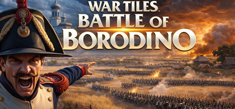
TURN BASED WAR STRATEGY GAME SET DURING THE NAPOLEONIC WARS. AT THE GATES OF MOSCOW, THE BLOODIEST BATTLE OF THE NAPOLEONIC WARS. Players must make there moves on a hex grid system, use infantry, cavalry, or artillery. Shoot or Charge Mechanics to win.
$2.99
SimulationStrategyTurn-Based Strategy
Kingdom Games, Joash ShadeApr 27, 2026