Scoring genre clarity...

CAMERAMAN NEVER DIES capsule

CAMERAMAN NEVER DIES

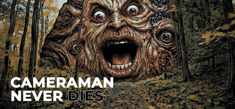
An interactive horror-comedy adventure where you play as a cameraman trapped in a surreal nightmare. React to quick-time events, make life-or-death choices, and survive AI-generated terror in this cinematic FMV experience.

Free to PlayMixed(28)
AdventureActionInteractive Fiction
StefanobeckMay 13, 2026

CAMERAMAN NEVER DIES scores 73/100 — better than 61% of Adventure capsules (n=7,922).

Mixed (28 reviews) · Free to Play · Released May 13, 2026 · By Stefanobeck

Quick text summary

CAMERAMAN NEVER DIES scored 73/100 on Steam Analyzer — Good for a Adventure capsule. Top priority fix: [uniqueness_polish] Add subtle cameraman or camera equipment visual element to communicate the protagonist role and differentiate from generic horror imagery

Capsule scores by dimension

  • Genre Clarity: 8/10 — Horror-comedy with clear supernatural threat. The grotesque tree-faced entity with exaggerated features and open mouth immediately signals horror-comedy tone rather than pure horror. The forest setting and creature design clearly convey a surreal, unsettling experience. At TINY size, the creature silhouette and expression remain distinctive enough to communicate the genre as supernatural horror-comedy without ambiguity.
  • Title Readability: 7/10 — Strong contrast, clean typographic hierarchy. The all-caps white sans-serif title 'CAMERAMAN NEVER DIES' sits on the lower left with excellent contrast against the dark forest background. The word 'NEVER' in a darker strikethrough treatment adds visual interest and reinforces the game's theme. At SMALL size the title remains fully readable; at TINY size the strikethrough detail slightly softens but the core message persists clearly.
  • Contrast & Color: 8/10 — High value separation, creature pops clearly. The warm tan and brown tones of the creature face create strong contrast against the dark forest background and dark sky. The creature's pale eye sclera and dark pupils create focal point depth that reads at all sizes. Grayscale evaluation shows excellent mid to light separation; the creature maintains clear silhouette definition even against the textured forest canopy.
  • Uniqueness & Polish: 7/10 — Distinctive creature design, thematic cohesion. The AI-generated aesthetic is intentionally unsettling with the carved wood texture and grotesque expression, reinforcing the game's unique FMV/interactive horror-comedy concept. The creature's over-the-top features and exaggerated emotion convey the cinematic absurdist tone promised in the description. The design avoids generic horror clichés and instead presents a memorable, slightly absurd antagonist that signals 'game about reaction and survival' rather than pure dread.
  • Brand Consistency: 6/10 — Limited visual vocabulary without flagship character. The creature serves as the primary visual anchor, but without reference to other store assets it is difficult to assess whether this entity becomes an iconic series symbol or remains a one-off scene. The forest-in-nightmare aesthetic and creature design show internal coherence. Without seeing additional marketing materials, consistency scores conservatively at functional baseline; the creature alone does not yet communicate a distinctive brand identity that would be immediately recognizable in isolation.
  • Composition: 8/10 — Strong focal point, balanced layout, safe framing. The creature face dominates the upper-center-right area with commanding presence while the title anchors the lower left, creating an asymmetrical but balanced composition. The forest detail frames the creature naturally without clutter or competing focal points. At SMALL and TINY sizes, the creature remains the unmistakable primary subject while the title stays readable in its corner position; no critical elements risk Steam's edge cropping or resize distortion.

What works

  • Creature silhouette unmistakable at small sizes. The grotesque face's distinctive proportions and expression read immediately even when compressed to thumbnail scale, creating strong genre and thematic communication without text dependency.
  • Title-background contrast highly effective. White sans-serif text on dark forest background provides maximum legibility and hierarchy, with the strikethrough 'NEVER' adding visual sophistication without sacrificing clarity.
  • Color palette reinforces surreal horror tone. Warm tan creature tones against cool dark forest create visual tension that communicates supernatural unease and nightmare quality aligned with FMV horror-comedy premise.
  • No wasted space or dead zones. Composition efficiently uses the full frame with creature and title positioned to guide eye flow naturally while maintaining balanced asymmetry across all viewing sizes.

What hurts the capsule

  • Limited brand identity recognition potential. Without additional contextual cues or character consistency signals, the creature reads as a specific scene rather than an iconic symbol that would be recognizable across future marketing materials or sequels.
  • No gameplay mechanic visual hints. The capsule emphasizes horror aesthetics but provides no visual cues about the interactive QTE/choice-based gameplay or cameraman protagonist role that differentiates it from standard horror games.
  • Creature design clarity depends on high resolution. While the creature reads at TINY size, fine details like the carved wood texture and subtle eye direction fade significantly, reducing some of the intentional unsettling polish that makes it memorable at full quality.

Priority fixes

  1. [uniqueness_polish] Add subtle cameraman or camera equipment visual element to communicate the protagonist role and differentiate from generic horror imagery
  2. [brand_consistency] Establish visual signature motif (icon, symbol, or palette accent) that could become recognizable across future game marketing and sequels
  3. [genre_clarity] Consider a small HUD or choice indicator element in the corner to signal the interactive/reactive gameplay mechanic central to the game concept

Store copy priority fixes

  1. [uniqueness] Expand the AI generation claim with one concrete example: "Every AI-generated scene creates unpredictable visuals—no two playthroughs look identical" or similar, showing why this matters to player experience beyond novelty.
  2. [feature_communication] Add estimated playtime or chapter count for Episode 1 (e.g., "Fully playable Episode 1 with 8 chapters, approximately 60+ minutes of content") to clarify free-to-play value proposition.
  3. [audience_targeting] Include a line like "Perfect for players who love cinematic choice-driven adventures more than twitch reflex challenges" to segment audience between story-focused and action-focused players.
  4. [tone_match] Soften the corporate formatting by replacing some divider lines and bullet points with prose sections to feel more indie and authored, especially in the opening hook.

Related guides

Steam app ID: 4581410 · Tags: Adventure, Action, Interactive Fiction, Action-Adventure, Visual Novel