Scoring genre clarity...
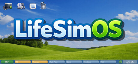
A story-rich coming-of-age experience told through a 2004 desktop, where friendships, music, and late-night conversations shape who you become. Explore chats, drama, mini-games, and the early internet in a branching story about growing up, making mistakes, and finding your place.
$9.992 user reviews
Visual NovelInteractive FictionStory Rich
Clayton DavisApr 17, 2026