Scoring genre clarity...

The Final Stay - Chapter 1 capsule

The Final Stay - Chapter 1

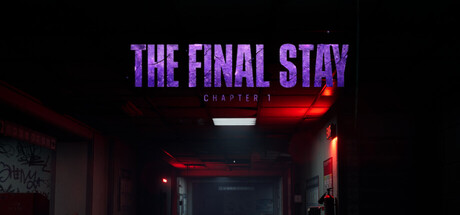
The Final Stay - Chapter 1 is a psychological horror experience that immerses players in a dark and unsettling world filled with mystery and fear. You arrive at an abandoned hotel, but something is wrong. The deeper you explore, the more the environment begins to change.

$4.992 user reviews
ActionAdventureAction-Adventure
CyberZone GamesMay 3, 2026

The Final Stay - Chapter 1 scores 72/100 — better than 46% of Action capsules (n=8,535).

2 user reviews · $4.99 · Released May 3, 2026 · By CyberZone Games

Quick text summary

The Final Stay - Chapter 1 scored 72/100 on Steam Analyzer — Good for a Action capsule. Top priority fix: [title_readability] Remove or significantly enlarge 'CHAPTER 1' subtitle—at tiny size it creates clutter without legibility; if chapter number matters, integrate it into main title or omit from capsule

Capsule scores by dimension

  • Genre Clarity: 8/10 — Horror atmosphere clearly communicated. The abandoned hotel interior with red neon lighting, dark hallways, and unsettling ambiance immediately signals psychological horror. At tiny size, the red glow and institutional setting still read as creepy and atmospheric, though specific genre details like 'adventure' may not be obvious. The moody color palette and claustrophobic framing are strong horror genre cues that survive at small viewing scales.
  • Title Readability: 7/10 — Bold title readable, subtitle weak tiny. THE FINAL STAY in large purple text with sharp outlines reads clearly at all sizes and has strong contrast against the dark background. However, the small 'CHAPTER 1' subtitle becomes nearly illegible at tiny size (~45px height) due to reduced character size and weight. At small capsule size, the title works well, but the hierarchical breakdown loses clarity in thumbnail viewing.
  • Contrast & Color: 8/10 — Strong red-purple value separation. Purple title text pops clearly against the black background with good saturation and value separation. Red neon accents in the hotel interior create warm-cool contrast that reads even at tiny size. The dark background provides excellent silhouette clarity for the title, and the red light sources create distinct edges that survive grayscale conversion and quick-scroll conditions.
  • Uniqueness & Polish: 7/10 — Atmospheric but familiar horror framing. The abandoned hotel setting with neon lighting is distinctive and well-executed with coherent mood and lighting treatment. However, the visual approach follows expected psychological horror conventions (similar framing seen in Resident Evil 4, Lies of P) without a unique mechanical or narrative hook visible in the capsule. The craft is solid and professional, but the concept lacks a memorable distinctive element that sets it apart from peer titles.
  • Brand Consistency: 6/10 — Atmospheric tone consistent, no icon. The purple-red neon aesthetic and abandoned hotel setting are consistent with psychological horror identity and likely align with the 30 available screenshots showing similar environments. However, there are no distinctive brand symbols, character icons, or signature motifs visible that would allow immediate recognition in a future capsule or sequel. The mood is cohesive but internally generic within horror game conventions.
  • Composition: 7/10 — Balanced layout with safe margins. The title sits in the upper-middle region with good breathing room, and the hotel hallway establishes clear depth with foreground red light, midground structure, and dark background. The composition avoids center voids and dead space, creating natural hierarchy from title to environment. At small/tiny sizes, the focal point remains the title text with supporting environment context, though the hallway depth detail becomes abstract at thumbnail scale.

What works

  • Purple title contrast vs dark background. Large, bold sans-serif lettering with purple hue creates strong value and color separation that reads clearly across all viewing sizes including tiny thumbnails.
  • Atmospheric horror mood establishment. Red neon glow, abandoned interior, and dark hallway create an immediately recognizable psychological horror atmosphere that communicates genre intent at quick-scroll speed.
  • Layered composition with depth. Clear foreground (neon), midground (hallway structure), and background (dark void) create visual hierarchy that feels intentional and polished at full size.

What hurts the capsule

  • CHAPTER 1 subtitle illegible at tiny. Small gray text loses readability completely at thumbnail size, creating a secondary text layer that adds visual noise without communicating information at the critical 45px viewing height.
  • Generic hotel horror setting. Abandoned institutional building is a familiar visual trope in horror games without visible unique environmental or mechanical signature that distinguishes this title from competitors like Resident Evil or Lies of P.
  • No distinctive brand icon or character. The capsule lacks a memorable visual anchor like a signature character, symbol, or motif that would allow immediate recognition in future marketing or sequels.

Priority fixes

  1. [title_readability] Remove or significantly enlarge 'CHAPTER 1' subtitle—at tiny size it creates clutter without legibility; if chapter number matters, integrate it into main title or omit from capsule
  2. [uniqueness_polish] Add a distinctive visual hook unique to this specific hotel or narrative—consider a signature architectural detail, object, or environmental anomaly visible at small size that differentiates from generic horror hotel tropes
  3. [brand_consistency] Introduce a recurring visual motif or symbol (icon, object, or character silhouette) that could become recognizable across multiple capsules and marketing materials

Store copy priority fixes

  1. [hook_strength] Replace the opening with a specific, concrete hook: instead of "psychological horror experience," lead with a unique environmental or mechanical detail (e.g., "You wake in an abandoned hotel where the rooms refuse to stay the same—each hallway leads somewhere impossible").
  2. [uniqueness] Add 1-2 sentences that explicitly differentiate this game: what mechanic, setting detail, or narrative approach is distinct? For example, explain how choices reshape the hotel environment or what makes the entities/mine shafts unique to this game.
  3. [audience_targeting] Remove or clarify the "Casual" tag and "Family Sharing" claim; either reframe the game's difficulty/maturity level clearly or remove signals that conflict with survival horror positioning.
  4. [feature_communication] Expand one bullet point in FEATURES with a concrete example: instead of "Combat encounters with hostile entities," write "Combat encounters: face hostile entities in mine shafts using limited resources; choose between fight or stealth-based survival."

Related guides

Steam app ID: 4587380 · Tags: Action, Adventure, Action-Adventure, Interactive Fiction, Puzzle