Scoring genre clarity...

My Rocky capsule

My Rocky

A relaxing pet sim of your pet Rock who lives on your screen while you do anything. Play with him, train him, unlock cosmetics to dress him up, or just watch him jump around as you work on that assignment, or even play a different game.

$2.99
IdlerPhysicsCasual
Rotwallington GamesApr 27, 2026

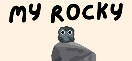
My Rocky scores 70/100 — better than 21% of Idler capsules (n=1,270).

$2.99 · Released Apr 27, 2026 · By Rotwallington Games

Quick text summary

My Rocky scored 70/100 on Steam Analyzer — Good for a Idler capsule. Top priority fix: [uniqueness_polish] Add 1–2 cosmetic examples or visual hints of outfit customization near the character to communicate the dress-up gameplay loop and differentiate from a generic pet concept.

Capsule scores by dimension

  • Genre Clarity: 7/10 — Pet sim identity clear at all sizes. The centered character is unambiguously a cute rock creature with expressive eyes, instantly signaling a casual pet/collectible game. At tiny size, the simple silhouette and character focus remain readable and communicate 'interactive pet' effectively. The minimal, friendly aesthetic matches pet sim expectations without ambiguity.
  • Title Readability: 8/10 — Bold handwritten title reads well throughout. The black handwritten "MY ROCKY" text sits on a clean beige background in the upper portion, providing strong contrast and clear letterforms. At small and tiny sizes, the casual hand-drawn style remains legible without collapsing, and the simple two-word title avoids clutter. The placement away from the character ensures no overlap or obscuring.
  • Contrast & Color: 7/10 — Warm palette pops against dark Steam background. The beige/cream background provides strong value separation from Steam's dark gray (#1b2838), and the dark gray rock character silhouette stands out clearly against the light background. At tiny size, the light-to-dark layering maintains visual separation, though the mid-tone gray rock relies somewhat on outline definition for clarity in grayscale.
  • Uniqueness & Polish: 6/10 — Charming but minimal presentation. The art is clean and intentional with a cohesive flat design style, and the concept of a pet rock is memorable and distinct. However, the capsule itself is very minimal—just a title and single character on a solid background—lacking visual storytelling depth or a hook that communicates the interactive/cosmetic gameplay promise mentioned in the description.
  • Brand Consistency: 6/10 — Simple character establishes identity. The rock character with its distinct dot eyes and simple form is recognizable and would likely carry across other promotional materials. However, without seeing the store screenshots, this analysis is limited; the capsule shows no secondary motifs, cosmetic hints, or distinctive visual language that reinforces the pet sim or collectible gameplay loop mentioned in the game description.
  • Composition: 8/10 — Clear hierarchy with safe focal point. The title anchors the top in a strong position, the character centers below with breathing room, and the entire composition is balanced and uncluttered. The character sits safely away from edges and remains the clear primary focus at all sizes; the composition is resilient to Steam's cropping and reads instantly at tiny size.

What works

  • Strong silhouette and focal point. The centered character with distinct eyes reads clearly even at tiny size and immediately communicates 'cute interactive pet' without confusion.
  • Excellent title contrast and placement. Bold handwritten text on a clean background maintains full legibility at all zoom levels and sits in a safe, non-competing upper zone.
  • Clean, cohesive aesthetic. The flat design style and minimal beige palette feel intentional and professional, avoiding a cluttered or generic template appearance.

What hurts the capsule

  • Minimal visual storytelling. The capsule shows only a static character and title, missing visual cues about gameplay features like cosmetics, interaction, or the 'pet on your screen' unique hook.
  • No supporting visual elements. Lacking secondary motifs, UI hints, or cosmetic examples that would reinforce brand identity and gameplay depth compared to top-performing casual game capsules.
  • Limited depth and layering. The composition is very flat—just background and character—without foreground or background elements that would add visual interest and premium feel.

Priority fixes

  1. [uniqueness_polish] Add 1–2 cosmetic examples or visual hints of outfit customization near the character to communicate the dress-up gameplay loop and differentiate from a generic pet concept.
  2. [composition] Introduce a simple foreground or background layer—such as a subtle play environment, UI frame, or secondary decorative element—to add depth and visual richness while maintaining focal clarity.
  3. [brand_consistency] Include a distinctive motif or color accent (beyond beige and gray) that ties to the brand identity and would be recognizable across promotional materials and store pages.

Store copy priority fixes

  1. [feature_communication] Expand the detailed description to include specific feature details: examples of cosmetics (hat, glasses, backpack), explanation of what training unlocks or improves, and how progression works over time.
  2. [hook_strength] Add a sentence that emphasizes the emotional or humorous appeal of caring for a rock pet—why is this charming or funny?—to strengthen the opening hook.
  3. [uniqueness] Include a statement that clarifies what makes this rock pet distinct: Does it have personality quirks? Unique animations? A story reason for being a rock? Concrete differentiation from generic pet sims.

Related guides

Steam app ID: 4592630 · Tags: Idler, Physics, Casual, Point & Click, Character Customization