Scoring genre clarity...

Sir, We Have an Orc Problem capsule

Sir, We Have an Orc Problem

Sir, We Have an Orc Problem is an incremental style tower-defense game where you face an overwhelming amount of orcs. Place and upgrade turrets and let bombs rain on the horde.

Tower DefenseIncrementalWar
Mumpitz GamesJul 28, 2026

Sir, We Have an Orc Problem scores 72/100 — better than 50% of Tower Defense capsules (n=709).

Released Jul 28, 2026 · By Mumpitz Games

Quick text summary

Sir, We Have an Orc Problem scored 72/100 on Steam Analyzer — Good for a Tower Defense capsule. Top priority fix: [composition] Rebalance title placement by centering or right-weighting the text block to eliminate left-side crowding and improve visual symmetry.

Capsule scores by dimension

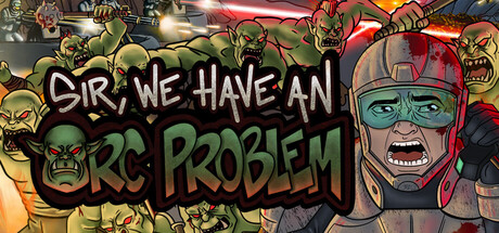
  • Genre Clarity: 8/10 — Tower defense with orc horde combat. The capsule immediately signals tower defense and orc combat through the large menacing orc faces with aggressive expressions and the prominent text emphasizing an 'orc problem.' At TINY size, the repeated orc heads and chaotic arrangement still read as combat-focused strategy, though the specific 'incremental' tower-defense subgenre is not explicitly clear from visuals alone. The art style and enemy focus strongly communicate what you're defending against.
  • Title Readability: 7/10 — Bold text readable at small sizes. The title 'SIR, WE HAVE AN ORC PROBLEM' uses bold, outlined white lettering with black stroke that maintains legibility at SMALL and TINY sizes. The staggered layout works functionally but feels slightly cramped on the left side. At TINY size the words still parse as readable English, though some kerning tightness reduces elegance.
  • Contrast & Color: 8/10 — Strong green and red separation. The yellow-green orc skin tones pop distinctly against the dark warm background, creating clear value separation and silhouette definition. The red helmet and accents on the right orc add secondary contrast. In grayscale, the light yellow-greens and dark backgrounds maintain strong tonal separation that survives quick scrolling and TINY size viewing.
  • Uniqueness & Polish: 7/10 — Distinctive comedic tone and art. The orc faces carry exaggerated, almost comedic expressions that differentiate this from serious tower-defense games, and the bright caricature art style feels deliberate and polished rather than generic. The tagline framing 'an orc problem' as a bureaucratic matter hints at the game's tone, though the visual execution relies heavily on familiar orc tropes without a deeply unique hook beyond humor. It reads as well-crafted but not revolutionary.
  • Brand Consistency: 6/10 — Coherent orc theme, limited identity. The capsule maintains internal cohesion around the orc enemy faction with consistent cartoon art style and color palette, but lacks a signature iconic element or distinctive brand marker that would make it instantly recognizable in future marketing. The exaggerated orc design is competent but does not yet feel like a proprietary visual language or unforgettable mascot.
  • Composition: 7/10 — Balanced focal hierarchy with minor spacing issues. The composition uses a layered approach with orc heads creating depth and the title positioned strategically across the upper-left quadrant. The multiple orc faces guide the eye effectively, and nothing feels completely dead-centered or cluttered. At TINY size the arrangement remains readable, though the title's left-heavy placement crowds text and leaves the right side slightly empty, reducing visual balance slightly.

What works

  • Immediate genre and tone communication. Exaggerated orc faces and bold 'problem' framing instantly convey tower defense, combat focus, and comedic tone that sets genre expectations.
  • Readable title at all scales. White-outlined bold lettering holds legibility from full header down to TINY thumbnail size without collapsing into illegibility.
  • Strong value contrast and silhouettes. Yellow-green orcs and red accents separate cleanly from the dark background, maintaining visual clarity and pop in grayscale and during quick scroll.

What hurts the capsule

  • Cramped left-side title placement. The staggered title text compresses toward the left edge, creating unbalanced composition with wasted space on the right and reduced elegance.
  • Generic orc tropes without unique visual hook. While well-executed, the orc design and expressions rely on familiar fantasy archetypes without a memorable signature identity or proprietary character that would make future recognition easy.
  • Incremental mechanics not visually implied. The capsule communicates tower defense combat but does not hint at the incremental gameplay loop or progression systems that distinguish the core mechanic.

Priority fixes

  1. [composition] Rebalance title placement by centering or right-weighting the text block to eliminate left-side crowding and improve visual symmetry.
  2. [uniqueness_polish] Introduce a unique visual signature element (iconic tower, bomb counter, or recurring UI motif) that could anchor brand identity across future marketing materials.
  3. [genre_clarity] Add a subtle visual cue hinting at the incremental tower-defense loop, such as a small turret icon or upgrade visualization in the background or margins.

Store copy priority fixes

  1. [uniqueness] Add a sentence explaining what makes the incremental tower defense loop distinct—e.g., 'Permanent turret unlocks carry across runs, so each attempt gets exponentially stronger' or compare directly to similar games.
  2. [audience_targeting] Specify the expected player profile: add language about session length ('30-minute runs,' 'play at your own pace') and difficulty curve ('easygoing progression,' 'optional challenge modes') to signal who will enjoy it most.
  3. [feature_communication] Clarify the relationship between runs and meta-progression: explain whether players lose progress on death, whether all upgrades persist, and what determines a successful vs. failed run.

Related guides

Steam app ID: 4594150 · Tags: Tower Defense, Incremental, Roguelite, War, Military