Scoring genre clarity...

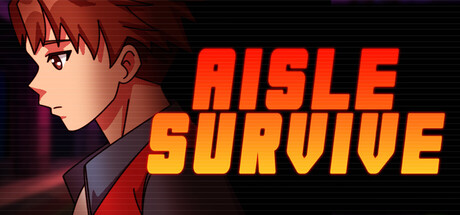
Aisle Survive capsule

Aisle Survive

Survive a week at the last human-run store in Mech City. Melee, multi-task and manage your stress to meet your boss' crushing standards - and stop the revolution.

StrategyRoguelikeShop Keeper
Studio SkerrattJul 28, 2026

Aisle Survive scores 62/100 — better than 3% of Strategy capsules (n=5,305).

Released Jul 28, 2026 · By Studio Skerratt

Quick text summary

Aisle Survive scored 62/100 on Steam Analyzer — Solid for a Strategy capsule. Top priority fix: [genre_clarity] Integrate visible store elements—shelves, products, or a busy retail environment—into the background or midground to immediately signal management/strategy gameplay and differentiate from narrative games.

Capsule scores by dimension

  • Genre Clarity: 5/10 — Ambiguous genre signals. The anime character and retail store setting create mixed messaging. While the word 'SURVIVE' and stressed character expression hint at strategy or management gameplay, the visual reads more like a narrative adventure or visual novel at tiny size. The core mechanic (store management during a revolution) is completely obscured by the character-focused illustration, failing to communicate the strategy genre expected in this category.
  • Title Readability: 8/10 — Strong title legibility. AISLE SURVIVE uses bold, high-contrast orange-yellow sans-serif lettering that remains readable at small and tiny sizes. The all-caps treatment and layered shadow effect ensure clarity against the dark background. The title placement in the right-center region avoids the character and maintains clean spacing, though at tiny size the individual letters compress slightly.
  • Contrast & Color: 7/10 — Good value separation overall. The bright orange-red title pops cleanly against the dark background, and the character's warm skin tones contrast well with the cool purples and blacks of the backdrop. However, the character's red-brown hair and clothing blend somewhat with the warm-toned background gradient, reducing silhouette clarity. In grayscale, the character loses some edge definition in the mid-tone range.
  • Uniqueness & Polish: 5/10 — Generic anime art direction. The illustration is technically clean with smooth shading and professional rendering, but the style is a common anime/manga aesthetic that appears in dozens of indie games. The stressed expression and corporate jacket suggest the theme, but without the store setting visible, it reads as generic character art rather than a distinctive visual hook. The capsule communicates 'anime game' rather than 'retail survival strategy.'
  • Brand Consistency: 6/10 — Minimal identity cues present. The red-orange color palette is consistent with the title treatment, creating internal cohesion. However, the image lacks memorable iconography, symbols, or visual motifs that would create brand recognition across multiple touches. The anime protagonist is a common template rather than a distinctive character signature that would stick in memory or differentiate from competitor capsules.
  • Composition: 6/10 — Balanced but unfocused hierarchy. The character occupies the left-center with clear focal weight, and the title sits cleanly in the right half, creating reasonable balance without dead space. However, the character and title compete for attention rather than creating a unified focal point that explains the game's core appeal. At tiny size, the composition reads as 'character + text' without communicating what makes this game strategically unique; the store management and stress mechanics are completely invisible in the visual hierarchy.

What works

  • Title contrast and legibility. Orange-yellow lettering with shadow effect maintains excellent readability from full size down to tiny thumbnail despite high-saturation background colors.
  • Professional illustration quality. The character art is cleanly rendered with smooth gradients, proper shading, and attention to lighting that elevates the overall presentation above placeholder quality.
  • Color palette consistency. Warm reds, oranges, and purples create a coherent internal color scheme that ties character and title together visually.

What hurts the capsule

  • Genre messaging failure. The capsule reads as a character-driven narrative game, not a strategy management title, completely hiding the store-survival and multi-task mechanics that differentiate Aisle Survive.
  • Generic anime aesthetic. The illustration style and character design are template-like and common across indie games, offering no distinctive visual hook or memorable brand identity.
  • Missing core setting. The retail store environment that defines the unique premise is entirely absent; only the stressed protagonist is visible, leaving the core mechanic completely unexplained.
  • Weak silhouette at small sizes. The character's warm-toned hair and jacket blend into the gradient background, reducing figure-ground separation when viewed as a small capsule in quick scroll.

Priority fixes

  1. [genre_clarity] Integrate visible store elements—shelves, products, or a busy retail environment—into the background or midground to immediately signal management/strategy gameplay and differentiate from narrative games.
  2. [uniqueness_polish] Introduce a distinctive visual motif like a unique store aesthetic, recognizable product imagery, or iconic UI element that creates memorable brand identity and sets Aisle Survive apart from generic anime titles.
  3. [composition] Recompose to feature the character interacting with store environment (stocking shelves, managing stress meter, or confronting a mechanical threat) so the core mechanic is visible at all sizes.
  4. [contrast_color] Adjust character clothing or background tones to increase figure-ground separation and ensure the protagonist silhouette reads cleanly at small and tiny sizes.

Store copy priority fixes

  1. [feature_communication] Expand the stress/bladder management section to explain mechanical consequence: 'Manage your stress and bladder—let them peak and you'll fail orders or suffer penalties' so players understand how survival mechanics interlock with task completion.
  2. [hook_strength] Reorder the detailed description to lead with gameplay rather than story setup—move 'Aisle Survive is a retail rogue-like...' to the first paragraph and condense Glen's motivation to one sentence to grab gameplay-first players.
  3. [audience_targeting] Add one explicit sentence clarifying who this is for, such as 'Perfect for roguelike fans who love high-stress time-management games' or 'For players who enjoy strategic juggling under pressure,' so the right audience self-selects.
  4. [uniqueness] Replace 'like no other' with a specific claim: 'the only roguelike where multi-tasking retail work IS the core mechanic, not a theme' or mention what distinguishes the upgrade loop/tower-defense integration from standard roguelikes.

Related guides

  • Steam page optimisationCapsule, copy, screenshots, tags — the full Steam page conversion stack.
  • Steam tags guideTag selection, ordering, and how it shapes Steam's recommendation rails.

Steam app ID: 4596550 · Tags: Strategy, Roguelike, Shop Keeper, Pixel Graphics, Cyberpunk