Silvers Snake scores 83/100 — better than 95% of Casual capsules (n=10,153).

Quick text summary

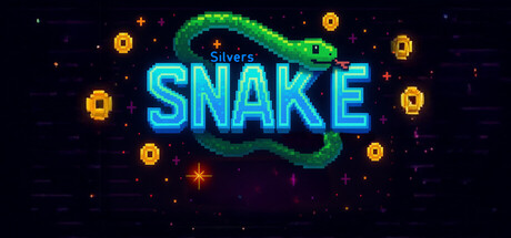
Silvers Snake scored 83/100 on Steam Analyzer — Good for a Casual capsule. Top priority fix: [title_readability] Remove or redesign the 'Silvers' tagline to remain legible at SMALL size, or rely on SNAKE title alone as primary identifier.

Capsule scores by dimension

  • Genre Clarity: 8/10 — Classic arcade gameplay clearly signaled. The iconic snake silhouette in green with cyan neon glow immediately reads as Snake genre at any size. The roguelike twist is not visually obvious from the capsule alone, but the core casual arcade identity is unmistakable. At TINY size, the serpentine shape and glowing title remain recognizable as a Snake variant.
  • Title Readability: 9/10 — Bold neon type highly legible throughout. The cyan neon SNAKE text with sharp letterforms and high contrast against the dark background reads clearly at FULL, SMALL, and TINY sizes. The smaller 'Silvers' tagline above is readable at full size but becomes unclear at TINY, though the dominant SNAKE title carries the communication alone. Strategic placement in the center with clean negative space around the text ensures no collapse.
  • Contrast & Color: 9/10 — Exceptional value separation and vibrancy. Cyan neon title pops dramatically against the dark #1b2838 background with strong luminous contrast. The green snake body creates secondary color interest while maintaining clear silhouette separation. Warm orange coin/gem accents add layered visual depth without muddying the focal point, and grayscale squint test shows excellent light-dark separation.
  • Uniqueness & Polish: 8/10 — Premium retro-arcade aesthetic well executed. The neon glow treatment and pixel-art snake with modern lighting effects signal a polished indie revival rather than a generic Snake clone. The roguelike framing is communicated through the word choice in description rather than visuals, but the craft level and visual style feel intentional and premium. Stands apart from generic casual game capsules through confident use of neon styling and clean particle effects.
  • Brand Consistency: 7/10 — Coherent retro-neon identity established. The cyan-green neon palette, arcade-inspired typography, and glowing particle effects create a recognizable visual signature for the Silvers Snake brand. The snake motif is central and memorable, though without access to the 5 store screenshots, internal consistency across assets cannot be fully verified. The neon aesthetic is cohesive and would likely carry through related marketing materials.
  • Composition: 9/10 — Excellent focal hierarchy and balance. The title and snake occupy prime center real estate with perfect weight balance and clear visual hierarchy. Surrounding gold coin accents provide supporting detail without cluttering or competing for attention. Safe margins are respected, supporting elements frame the focal point effectively, and the composition remains readable and balanced across SMALL and TINY sizes with no edge-hugging or crop risk.

What works

  • Vibrant neon contrast. Cyan glow and green snake create exceptional value separation against the dark Steam background, ensuring high visibility during quick scroll.
  • Strong genre recognition. The iconic snake silhouette with neon treatment immediately communicates casual arcade gameplay at all viewing sizes.
  • Clean centered composition. Title and snake are well-balanced in prime real estate with no wasted space, supporting gold accents frame without cluttering.
  • Legible title at scale. Cyan neon letterforms maintain clarity from full header through TINY thumbnail sizes with no collapse or fine-detail loss.

What hurts the capsule

  • Tagline loses readability small. The 'Silvers' text above SNAKE becomes unreadable at SMALL and TINY sizes, forcing viewers to rely on the main title alone.
  • Roguelike hook not visual. The capsule does not communicate the roguelike twist or 'skill matters' positioning through visual cues, relying entirely on text description.
  • Generic particle field. The scattered gold coins and stars feel like standard indie game accents rather than unique visual storytelling or mechanic hints.

Priority fixes

  1. [title_readability] Remove or redesign the 'Silvers' tagline to remain legible at SMALL size, or rely on SNAKE title alone as primary identifier.
  2. [genre_clarity] Add subtle roguelike visual cue such as a progression indicator, loot icon, or run counter to hint at the game's core twist.
  3. [uniqueness_polish] Replace generic gold coin accents with game-specific icons or visual elements that hint at roguelike mechanics or progression.

Store copy priority fixes

  1. [uniqueness] Add a sentence explaining what makes the roguelike mechanics or biome system unique to Snake (e.g., 'randomized hazards force adaptive strategy' or 'co-op biome runs reward teamwork').
  2. [audience_targeting] Explicitly mention co-op gameplay and its appeal in the detailed description, since it's a listed category but absent from the copy.
  3. [hook_strength] Replace 'where only Skill matters' with a concrete gameplay consequence (e.g., 'where one wrong move ends your run' or 'where mastering the grid is survival').
  4. [tone_match] Adopt a more conversational, less corporate tone in section headers and descriptions to match the indie, minimalist identity.

Related guides

Steam app ID: 4599440 · Tags: Casual, Roguelike, 2D, Retro, Singleplayer