Scoring genre clarity...
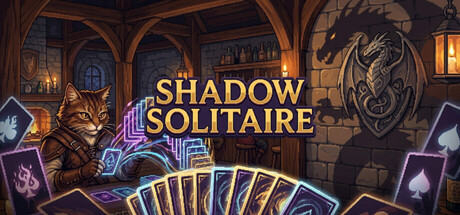
Shadow Solitaire is a roguelite, turn-based score-chasing card strategy game where you chain plays across multiple lanes, build powerful skill synergies, and manage risk through shop upgrades, casino bets, bank loans, and market trading.
$8.992 user reviews
CasualStrategyCard Game
AshphlyMay 12, 2026