Scoring genre clarity...
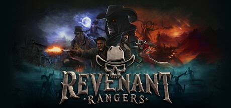
Revenant Rangers capsule

Revenant Rangers

Ride out as a Revenant Ranger—an undead lawman bound by Hell’s contract—to hunt the escaped souls of the damned. Gun down demons, witches, and sinners across the Hell Plains in a brutal, fast-paced third-person co-op shooter where death is only the beginning.

ActionOnline Co-OpPvE
Digital Void StudioTo be announced

Revenant Rangers scores 77/100 — better than 78% of Action capsules (n=8,856).

Released To be announced · By Digital Void Studio

Quick text summary

Revenant Rangers scored 77/100 on Steam Analyzer — Good for a Action capsule. Top priority fix: [uniqueness_polish] Add a distinctive visual hook—such as a unique weapon design, signature glowing effect, or iconic accessory—to the central gunman that differentiates from standard action-game archetypes.

Capsule scores by dimension

  • Genre Clarity: 8/10 — Western gunslinger demon hunter clear. The capsule immediately communicates action-shooter gameplay through the prominent cowboy hat, dual-wielding gunman silhouette in center, and fiery demonic background. At tiny size, the western outlaw aesthetic combined with supernatural orange/blue color scheme and zombie-like character renders the action-horror-western fusion readable. The zombie face and hellish flames reinforce the undead bounty hunter premise effectively.
  • Title Readability: 8/10 — Strong metallic serif logo placement. The 'REVENANT RANGERS' title uses a bold, metallic serif typeface centered in the lower half with a dark outline that maintains legibility across all sizes. At small and tiny sizes, the letter forms remain distinct and the two-word structure reads cleanly without collapse. The outline treatment and centered placement on a slightly darkened background region ensure it doesn't drown in the busy upper imagery.
  • Contrast & Color: 8/10 — Strong warm-cool color separation. The capsule uses excellent value and hue contrast with blue-white mystical light on the left transitioning through dark midtones to orange-red demonic fire on the right, creating clear silhouette separation against the dark Steam background. The central gunman figure has strong rim lighting that pops at any size, and the grayscale squint test shows distinct value layers: bright highlights, dark mid-character, and warm background glow. This layering maintains readability even at tiny thumbnail size.
  • Uniqueness & Polish: 7/10 — Polished western-horror fusion premise. The capsule presents a distinctive hook—undead western gunslinger hunting demons—that feels more original than generic action fare, supported by professional VFX compositing with particle effects and atmospheric lighting. The metallic title treatment and careful color grading elevate it beyond template work. However, the composition borrows familiar action-game silhouette tropes (hero center, supporting cast sides, fiery background), preventing it from reaching 8-9 territory where truly iconic visual storytelling would be evident.
  • Brand Consistency: 7/10 — Coherent undead-western visual identity. The capsule establishes a recognizable internal visual language: weathered western attire, supernatural blue-to-orange lighting, demon/zombie character rendering, and a metallic serif font that could become iconic through repeated exposure. The color palette and protagonist archetype create a memorable identity distinct from other shooters. However, without access to in-game screens at the moment of review, full brand consistency cannot be verified, though the capsule suggests a cohesive art direction that should extend into gameplay UI and promotional materials.
  • Composition: 8/10 — Clear hierarchy with centered gunman focal point. The central gunman in a wide stance is the unmistakable primary focal point, framed by supporting character silhouettes on the left and demonic threat on the right, creating balanced visual weight distribution. The title anchors the lower third without interfering with character clarity. At small and tiny sizes, the composition remains scannable—the eye immediately finds the protagonist—and critical elements stay within safe margins away from typical Steam crop zones.

What works

  • Atmospheric lighting and color separation. The blue-to-orange gradient with strong rim lighting on the central character creates excellent contrast against the Steam dark background and remains readable at all sizes.
  • Western-horror genre fusion clarity. The cowboy hat, gunslinger pose, and demonic background immediately communicate the unique action-horror premise without ambiguity.
  • Title treatment and placement. The metallic serif 'REVENANT RANGERS' logo uses strategic outline and centered lower placement to maintain legibility across FULL, SMALL, and TINY viewing sizes.
  • Balanced compositional hierarchy. The centered protagonist with supporting cast flanking creates clear focal point dominance and visual stability without scattered attention.

What hurts the capsule

  • Visual familiarity with action-game conventions. The composition relies on well-established silhouette-against-dramatic-background tropes common to tier-1 AAA shooters, limiting distinctiveness.
  • Limited readable environmental storytelling. The hell-plains setting is communicated through generic demonic flames and dark atmosphere rather than specific location or mechanic visual cues that might hint at co-op gameplay.
  • Character legibility at tiny size. While the gunman reads as the focal point at tiny size, fine details like individual character faces and costume specifics blur into silhouette, reducing brand personality recognition potential.

Priority fixes

  1. [uniqueness_polish] Add a distinctive visual hook—such as a unique weapon design, signature glowing effect, or iconic accessory—to the central gunman that differentiates from standard action-game archetypes.
  2. [genre_clarity] Include subtle HUD elements or environmental props (burning wanted posters, demonic contracts, supernatural weapons) in the midground to reinforce the 'lawman-bound-by-Hell' narrative specificity.
  3. [brand_consistency] Ensure the metallic serif font and blue-orange color palette are consistently applied across all in-game UI, loading screens, and promotional assets to build brand recognition.

Store copy priority fixes

  1. [feature_communication] In the 'GUNS & CARDS' section, replace vague phrasing with concrete mechanics: specify how many cards are in a hand, whether they're drawn per mission or per run, and give one example of a specific card power and how it affects gameplay.
  2. [feature_communication] Add a short section explaining the progression loop: are missions roguelike runs? Do decks persist between runs or reset? How do players unlock new cards or upgrade their Ranger?
  3. [audience_targeting] Add one sentence to the detailed description clarifying difficulty or accessibility (e.g., 'scale difficulty solo to Nightmare,' 'adjustable settings for all skill levels') to expand audience confidence.
  4. [genre_clarity] Explicitly mention 'roguelike' or 'roguelite' in the short description or early in detailed copy, since it is a key tag but only implied through mission-based language.

Related guides

Steam app ID: 4605930 · Tags: Action, Online Co-Op, PvE, Deckbuilding, Roguelike