Scoring genre clarity...
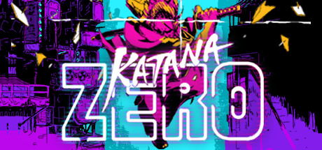
Katana ZERO capsule

Katana ZERO

Katana ZERO is a stylish neo-noir, action-platformer featuring breakneck action and instant-death combat. Slash, dash, and manipulate time to unravel your past in a beautifully brutal acrobatic display.

CDN$ 19.49Overwhelmingly Positive(309)
Pixel GraphicsActionStory Rich
Askiisoft18 Apr, 2019

Katana ZERO scores 87/100 — better than 99% of Pixel Graphics capsules (n=5,353).

Overwhelmingly Positive (309 reviews) · CDN$ 19.49 · Released 18 Apr, 2019 · By Askiisoft

Quick text summary

Katana ZERO scored 87/100 on Steam Analyzer — Excellent for a Pixel Graphics capsule. Top priority fix: [composition] Reduce background detail density in top corners by simplifying geometric elements or increasing background blur to strengthen focal point hierarchy at TINY size

Capsule scores by dimension

  • Genre Clarity: 9/10 — Vibrant action clarity. The neon-soaked cyberpunk aesthetic, dynamic character pose mid-action with katana, and explosive visual effects immediately signal fast-paced action gameplay. At TINY size, the bright magenta and cyan color scheme, acrobatic silhouette, and weapon visibility remain unmistakable as stylized action-platformer. The visual language strongly communicates the neo-noir, slash-focused core mechanic.
  • Title Readability: 8/10 — Strong outline, minor scale issues. The white outlined 'KATANA ZERO' logo sits prominently in the lower half with excellent contrast against the dark purple-to-cyan gradient background. At SMALL size it reads clearly; at TINY size the letterforms remain legible though slightly tighter. The strategic placement on a relatively controlled background region helps, though the outlined stroke style holds up well across all scales.
  • Contrast & Color: 9/10 — Excellent neon pop and separation. The vibrant magenta and cyan palette creates exceptional value separation against the dark Steam background (#1b2838). The bright yellow accents, white title outline, and glowing character silhouette all maintain crisp edges and readability even in grayscale test due to strong luminosity contrast. At TINY size, the color blocks and character shape remain clearly distinguishable and eye-catching.
  • Uniqueness & Polish: 9/10 — Distinctive neon neo-noir style. The capsule showcases a cohesive, premium cyberpunk art direction with intentional glitch effects, layered geometry, and a signature neon color palette that feels distinctive and polished rather than generic. The character's dynamic pose, particle effects, and architectural backdrop communicate both the stylistic hook and the high-octane action premise effectively. This stands apart from typical action game capsules through consistent artistic vision and craft.
  • Brand Consistency: 9/10 — Iconic neon identity. The capsule establishes a memorable visual identity through its signature neon magenta-cyan-yellow palette, geometric cyberpunk architecture, and energetic character rendering that would be instantly recognizable across marketing materials. The consistent neo-noir aesthetic, glitch-inspired effects, and color language create strong internal cohesion and a distinctive brand marker. This visual approach is unmistakably 'Katana ZERO' and not interchangeable with other titles.
  • Composition: 8/10 — Clear focal point, busy background. The character mid-action dominates the center-upper area as the primary focal point, with the title anchored below in the lower third, creating natural hierarchy. The layered background (dark buildings, cyan midground, bright effects) provides depth, though the dense detail in upper corners adds visual complexity that competes slightly at TINY size. Safe margins are respected and the composition remains readable across all scales, though the busy upper region could feel slightly scattered at thumbnail size.

What works

  • Exceptional neon contrast. Magenta, cyan, and yellow colors pop dramatically against dark background with clean silhouettes readable at all sizes.
  • Clear action-game genre signal. Dynamic character pose, weapon, and explosive effects communicate fast-paced platformer gameplay immediately at TINY scale.
  • Distinctive visual identity. Consistent neon cyberpunk aesthetic with glitch effects creates a memorable, premium brand signature that feels intentional and cohesive.
  • Strong title placement and contrast. White outlined logo sits on controlled gradient background with excellent readability across FULL, SMALL, and TINY viewing scales.

What hurts the capsule

  • Busy upper background detail. Dense geometric architecture and effects in top corners add visual clutter that slightly competes for attention at TINY thumbnail size.
  • Particle field complexity. Multiple overlapping motion lines and fragments create visual noise that loses some clarity when squinting or viewing at very small scales.

Priority fixes

  1. [composition] Reduce background detail density in top corners by simplifying geometric elements or increasing background blur to strengthen focal point hierarchy at TINY size
  2. [contrast_color] Consider adding a subtle vignette or darkening the upper edges to further isolate the character silhouette and reduce peripheral visual competition

Store copy priority fixes

  1. [feature_communication] Expand the time manipulation mechanic with one concrete example: e.g., 'Rewind your last attempt to analyze enemy patterns before executing a perfect run' or 'Slow time mid-air to chain deflections and dodges.'
  2. [feature_communication] Replace 'Defeat foes creatively, using spontaneous approaches' with specific examples: e.g., 'Bait enemies into traps, deflect bullets back at their source, or chain wall-slides into instant takedowns.'
  3. [audience_targeting] Add a line clarifying difficulty and player type, e.g., 'Designed for players seeking fast-paced action with tight controls and puzzle-like level design'—to set expectations around skill floor.

Related guides

Steam app ID: 460950 · Tags: Pixel Graphics, Action, Great Soundtrack, Story Rich, Platformer