Scrapbot Outpost scores 77/100 — better than 79% of Strategy capsules (n=5,103).

Quick text summary

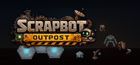
Scrapbot Outpost scored 77/100 on Steam Analyzer — Good for a Strategy capsule. Top priority fix: [uniqueness_polish] Introduce a distinctive tower archetype or core mechanic visual (e.g., a signature linked-core symbol or unique robot mascot) that becomes synonymous with Scrapbot's brand identity

Capsule scores by dimension

  • Genre Clarity: 8/10 — Tower defense strategy clearly signaled. The pixelated robot towers, defensive hexagon UI elements at bottom, and scrapyard industrial aesthetic immediately communicate a strategy tower defense game. At TINY size, the tower silhouettes and hexagon grid remain readable enough to suggest tactical placement mechanics, though fine details of tower types blur.
  • Title Readability: 8/10 — Strong logo with good contrast hierarchy. SCRAPBOT OUTPOST uses bold sans-serif lettering with cream/beige fill and orange hazard-striped accent bar that pops against the dark background. At SMALL size the text remains crisp and legible; at TINY the wordmark stays recognizable though secondary detail in the striped bar softens slightly.
  • Contrast & Color: 8/10 — Warm tones separate well from dark sky. Cream and orange palette of the logo and towers creates strong value separation from the near-black background. The glow on hexagon UI elements adds depth and helps key interactive elements read clearly even at reduced sizes, though some mid-tone rust textures on towers risk slight muddiness at TINY scale.
  • Uniqueness & Polish: 7/10 — Distinctive scrapyard aesthetic with solid craft. The hand-built robot and industrial decay theme feel cohesive and specific to this title—not a generic tower defense. Pixel art style and weathered metal textures show intentional art direction, but the overall composition relies on familiar tower defense visual language without a single standout hook that screams memorable identity.
  • Brand Consistency: 7/10 — Consistent industrial scrap theme throughout. The rust, hazard stripes, scavenged robot parts, and gritty texture palette maintain internal coherence across all visible elements. A recognizable color signature (orange and cream on brown metal) helps brand recall, though the visual identity leans heavily on genre conventions rather than a unique motif or iconic symbol.
  • Composition: 8/10 — Clear hierarchy with balanced element placement. Logo anchors the upper-left to center, with tower units and UI elements arrayed horizontally below in a logical scanning path. The right-side robot and floating tower units provide visual weight distribution; at SMALL and TINY sizes, the layout remains uncluttered with a clear focal point on the logo, and safe margins protect key elements from edge cropping.

What works

  • Strategic tower clarity at small sizes. Tower silhouettes and hexagon grid elements remain visually distinct even when scaled down, reinforcing genre identity quickly during scroll.
  • Cohesive industrial art direction. Weathered metal, rust tones, hazard stripes, and scrap robot parts work together to build a memorable scrapyard world without feeling generic.
  • Strong logo-to-background separation. Cream and orange lettering with outline and striped bar maintain legibility and pop against the dark night sky across all viewing sizes.

What hurts the capsule

  • Reliance on familiar tower defense tropes. The visual approach uses expected genre conventions without a standout unique hook that distinguishes it from peer titles like Frostpunk or Manor Lords.
  • Secondary UI elements risk blur at tiny scale. Smaller tower units on the right and floating hexagon details lose crispness at TINY size, reducing readability of defensive mechanic messaging.
  • Limited iconic character or symbol. No single memorable mascot, unique tower type, or signature visual motif emerges that could serve as instant brand recognition in future marketing.

Priority fixes

  1. [uniqueness_polish] Introduce a distinctive tower archetype or core mechanic visual (e.g., a signature linked-core symbol or unique robot mascot) that becomes synonymous with Scrapbot's brand identity
  2. [genre_clarity] Emphasize the 'linked network' tower mechanic with subtle connection lines or node highlights on the UI elements to differentiate from standard tower defense
  3. [composition] Increase the prominence and sharpness of the central robot unit so it reads as the hero element at TINY size rather than blending into background clutter

Store copy priority fixes

  1. [hook_strength] Rewrite the short description to lead with the strategic differentiator: 'Link towers together to defend your core—tower placement and adjacency matter more than firepower alone' or similar, moving the unique mechanic to the first sentence.
  2. [audience_targeting] Add a sentence after the opening paragraph explicitly addressing player type, such as 'Built for players who value spatial puzzle-solving and optimization over click-speed' or 'Designed for strategy fans who relish building the perfect defense layout.'
  3. [uniqueness] Add a comparative statement clarifying what separates this from standard tower defense, e.g., 'Unlike typical tower defense, every placement decision is spatial—towers gain strength by proximity and power links, not by raw damage output.'

Related guides

  • Steam page optimisationCapsule, copy, screenshots, tags — the full Steam page conversion stack.
  • Steam tags guideTag selection, ordering, and how it shapes Steam's recommendation rails.

Steam app ID: 4611310 · Tags: Strategy, Tower Defense, Singleplayer, Pixel Graphics, Sci-fi