Quick text summary
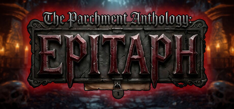
EPITAPH: The Parchment Anthology scored 68/100 on Steam Analyzer — Solid for a Mystery Dungeon capsule. Top priority fix: [genre_clarity] Add a subtle visual cue suggesting narrative choice or text (e.g., a parchment scroll, open book, or narrative UI element) to hint at the text-based adventure mechanic and differentiate from action-oriented horror.
Capsule scores by dimension
- Genre Clarity: 7/10 — Dark horror adventure clearly signaled. The ornate gothic typography, deep red and black color scheme, coffin imagery, and ominous atmospheric background immediately communicate horror and dark fantasy. At tiny size, the red metallic letters and decorative border still read as menacing, though the specific 'text-based' or 'choice-driven' mechanic is not visually apparent. The genre intent is clear but the core gameplay loop (interactive fiction/choices) is not obvious from visuals alone.
- Title Readability: 6/10 — Ornate title legible at full size only. The main title 'EPITAPH' in large metallic red letters reads well at full header size with clear letterforms and strong contrast against the dark background. However, the ornamental serif font and decorative frame create visual noise that becomes harder to parse at small size—the letters remain distinguishable but with reduced impact. The smaller 'The Parchment Anthology' subtitle is readable at full size but nearly illegible at tiny size, which is a minor liability.
- Contrast & Color: 8/10 — Strong red and dark value separation. The vibrant red metallic text pops decisively against the dark atmospheric background and Steam's #1b2838 color, creating excellent silhouette separation even at small thumbnail size. The warm orange glow from the lanterns and architectural details adds depth without muddying the core message. In grayscale, the value range remains strong, with the red converting to a distinct mid-tone that reads cleanly against blacks and deep grays.
- Uniqueness & Polish: 7/10 — Polished gothic aesthetic, somewhat templated. The design demonstrates strong craft with coherent dark fantasy art direction, high-quality 3D rendering of the architectural environment, and intentional decorative typography that feels premium. However, the ornate gothic horror style is a familiar visual language in indie horror marketing—the composition feels like a well-executed variation on established dark fantasy tropes rather than a distinctive visual hook. The coffin and candlelit setting support the game's core premise effectively but don't communicate what makes this text-based experience unique.
- Brand Consistency: 6/10 — Consistent gothic branding, limited identity cues. The capsule maintains coherent internal style with matching gothic serif typography, consistent warm-and-dark color palette, and unified 3D rendering approach that would align with similar promotional materials. However, there are no immediately iconic character, symbol, or motif elements that would make this capsule uniquely recognizable as EPITAPH specifically rather than a generic dark fantasy title. The ornate frame border is a memorable design element but not a brand-defining signature.
- Composition: 7/10 — Balanced layering with strong focal point. The composition uses clear depth with background architectural environment (lanterns, stone), midground decorative frame, and foreground title text creating good visual hierarchy. The title sits centered with ample breathing room and is not threatened by edge cropping on Steam's aspect ratio. At tiny size, the layering still reads logically, though the decorative elements and background atmosphere compete slightly for attention rather than strictly supporting the title.
What works
- Excellent color-to-background contrast. The vibrant metallic red EPITAPH text achieves strong separation against dark backgrounds and remains legible at small thumbnail sizes.
- Coherent dark fantasy art direction. The 3D environment with candlelit lanterns, gothic architecture, and ornate framing creates a unified, premium visual presentation that supports the horror theme.
- Safe composition with centered focal point. The title placement avoids edge-cropping hazards and maintains clear hierarchy even when scaled down for small Steam library views.
What hurts the capsule
- Ornate font reduces readability at scale. The decorative serif typography and elaborate letterforms lose crispness and visual impact as the capsule shrinks, making the fine details harder to parse quickly.
- Generic gothic horror visual language. The design uses familiar dark fantasy tropes (coffins, candlelit crypts, ornate frames) that are common across horror marketing and don't visually differentiate EPITAPH from competitors.
- Core mechanic not visually communicated. The capsule does not hint at the game's text-based, choice-driven nature—it reads as a traditional 3D horror adventure rather than interactive fiction.
Priority fixes
- [genre_clarity] Add a subtle visual cue suggesting narrative choice or text (e.g., a parchment scroll, open book, or narrative UI element) to hint at the text-based adventure mechanic and differentiate from action-oriented horror.
- [title_readability] Simplify the decorative serif letterforms or add a subtle outline/glow to the main EPITAPH text to improve legibility and impact at small and tiny sizes without losing the gothic aesthetic.
- [uniqueness_polish] Introduce a distinctive brand symbol or iconic visual motif (e.g., a signature coffin design, recurring symbol, or unique color accent) that could become the memorable EPITAPH identity across future marketing materials.
Store copy priority fixes
- [uniqueness] Add a concrete differentiator in the short description: e.g., 'Text-based horror where your inventory and past choices invisibly shape which horrors you encounter,' or 'The only game where your final escape is determined by rituals you performed chapters earlier.'
- [feature_communication] Replace 'Multiple endings' with an example: 'Three fundamentally different endings determined by which rituals you complete and which entities you confront,' to show scope and consequence.
- [hook_strength] Strengthen the closing lines with a personal emotional note: e.g., 'There is a way out. Whether you find it—and what you become in the process—is up to you.' to deepen the psychological hook.
- [audience_targeting] Add a sentence clarifying the expected playtime and intended audience: e.g., 'Ideal for narrative-driven players who enjoy slow-burn horror and puzzle-solving in confined spaces,' to filter for the right player.
Related guides
Steam app ID: 4613610 · Tags: Mystery Dungeon, Adventure, Exploration, Puzzle Platformer, Text-Based