Scoring genre clarity...

Cat Watch capsule

Cat Watch

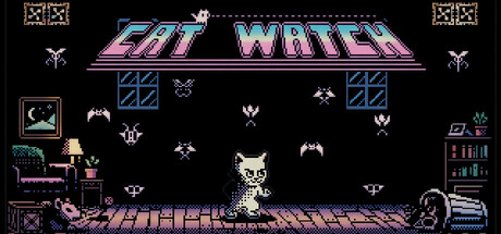
A 2D arcade shooter minigame with roguelike progression where you control a cat defending an apartment against enemies that seek cover and strike at the right moment. Jump, attack, and eliminate waves of mosquitoes, rats, and bats as you advance toward the source of the infestation.

$1.996 user reviews
Action RoguelikeBullet HellTop-Down Shooter
Decimate Software, Minicactus GamesMay 1, 2026

Cat Watch scores 75/100 — better than 68% of Action Roguelike capsules (n=1,675).

6 user reviews · $1.99 · Released May 1, 2026 · By Decimate Software

Quick text summary

Cat Watch scored 75/100 on Steam Analyzer — Good for a Action Roguelike capsule. Top priority fix: [title_readability] Thicken the blue outline on 'CAT WATCH' or switch to a single solid outline color to maintain crispness at TINY scale without anti-alias blur.

Capsule scores by dimension

  • Genre Clarity: 8/10 — Retro arcade shooter instantly clear. The pixelated cat protagonist in the center, descending enemy sprites (mosquitoes, bats, rats), and classic arcade layout immediately signal a retro 2D shooter. The apartment interior setting with furniture silhouettes and the defensive stance of the cat against waves of threats read as action gameplay at full size. At TINY size, the cat silhouette and enemy swarms remain readable enough to confirm the genre, though some enemy types become abstract.
  • Title Readability: 7/10 — Readable title with minor issues. The 'CAT WATCH' title uses a pink/magenta gradient with blue shadow outline that stands out against the black background at full and SMALL sizes. The letterforms are bold and arcade-styled, maintaining legibility at medium scales. At TINY size (~120x45), the title compresses but remains distinguishable, though the outline becomes slightly muddy and individual letter definition softens slightly.
  • Contrast & Color: 8/10 — Strong neon contrast, excellent pop. The bright pink/magenta title with blue neon outline pops strongly against the dark background, and the pixelated cyan-blue window frames and UI elements create clear silhouettes. The cat and enemies use light cream/white pixels that separate cleanly from the black background. In grayscale, the value separation remains strong, with no muddy mid-tone blending; the silhouettes read clearly even at reduced size.
  • Uniqueness & Polish: 7/10 — Polished retro aesthetic, familiar formula. The capsule demonstrates competent pixel art craft with intentional color grading (neon pink and cyan), consistent arcade styling, and clear visual storytelling—a cat defending home against pests is a distinct hook. However, the retro arcade shooter style is a well-worn genre template, and while execution is clean, it lacks a breakthrough visual innovation that would elevate it above similar indie shooters. The apartment defense premise and cat protagonist add personality but don't visually stand out enough to feel premium versus other casual indie titles.
  • Brand Consistency: 7/10 — Consistent retro arcade identity. The capsule maintains a coherent pixel art aesthetic throughout, with matching resolution, color palette (neon pink, cyan, cream on black), and arcade UI styling. The cat character is visually distinctive and could serve as a recognizable brand icon. The internal cohesion is strong—all elements feel like they belong to the same game world—but without seeing other store screenshots, it's unclear if this capsule uniquely reinforces brand signals (iconic character moments, signature mechanics, or motifs) that would make 'Cat Watch' immediately recognizable in isolation.
  • Composition: 8/10 — Balanced layout, clear focal hierarchy. The cat is positioned in the center-lower portion of the frame as the primary focal point, with enemy waves distributed above in a reading-friendly pattern that guides attention. The apartment environment (furniture, shelving on left/right) frames the action without overwhelming the center. At TINY size, the cat silhouette remains the clear hero, and the enemy swarm reads as a cohesive threat above, maintaining hierarchy through size and position rather than competing elements.

What works

  • Retro aesthetic executed cleanly. Consistent pixel art style, intentional neon color grading, and arcade-appropriate UI elements create a cohesive and polished look that appeals to the target audience.
  • Strong silhouette clarity at all sizes. The cat protagonist, enemy swarms, and environment remain readable at TINY size due to careful value contrast and uncluttered positioning.
  • Title pops with neon contrast. The pink/magenta gradient with blue outline separates excellently from the dark background and maintains legibility across viewing scales.
  • Distinctive gameplay hook communicated. The cat-as-defender premise against household pests is immediately clear and adds memorable personality compared to generic shooter themes.

What hurts the capsule

  • Generic retro formula lacks premium distinction. While well-executed, the arcade shooter style is familiar and common in indie gaming, and the visual presentation doesn't break new ground enough to signal exceptional quality.
  • Title outline softens at TINY size. The blue shadow outline on 'CAT WATCH' becomes muddy when compressed to thumbnail scale, reducing crisp edge definition.
  • Minimal visual storytelling beyond setting. The capsule shows the apartment and cat, but lacks a striking moment or mechanic visualization that would hint at unique gameplay depth or core selling points.

Priority fixes

  1. [title_readability] Thicken the blue outline on 'CAT WATCH' or switch to a single solid outline color to maintain crispness at TINY scale without anti-alias blur.
  2. [uniqueness_polish] Add a subtle visual element that hints at the roguelike progression system or highlight a unique enemy behavior (e.g., a rat taking cover or a mosquito formation pattern) to differentiate from standard arcade shooters.
  3. [contrast_color] Increase local contrast around the cat character by adding a subtle glow or darker shadow beneath to further separate it from the flooring at compressed sizes.

Store copy priority fixes

  1. [uniqueness] Add a concrete example of how the roguelike upgrade system works or what types of upgrades differentiate runs (e.g., 'unlock new weapons, passive abilities, or defensive tools that fundamentally change how you approach each floor').
  2. [hook_strength] Rewrite the opening to lead with the cat's personality or role rather than generic 'control a cat' phrasing; something like 'You're a cat on patrol. The building is under siege. Defend it.' would be more evocative.
  3. [audience_targeting] Add one sentence that directly speaks to the intended audience, such as 'Perfect for arcade fans seeking quick roguelike runs' or 'Ideal for players who love fast-paced combat and strategic upgrades.'
  4. [tone_match] Replace repeated instances of 'positioning, timing, and quick reflexes' with varied, more specific language that captures the cat's personality or the arcade chaos (e.g., 'sprint between cover, time your jumps, and pounce when enemies least expect it').

Related guides

Steam app ID: 4614580 · Tags: Action Roguelike, Bullet Hell, Top-Down Shooter, Action, Shooter