Scoring genre clarity...
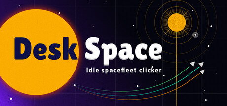
Desk Space: Idle Spacefleet clicker capsule

Desk Space: Idle Spacefleet clicker

Grow your fleet of spaceships in this incremental space game. Mine asteroids and trade with stations, unlock upgrades to make more money, deploy pirates, and unlock [REDACTED]. Pin to your desktop and watch your empire grow while you do "more important" things.

$5.09Mixed(93)
CasualIncrementalIdler
Shotgun AnacondaJun 30, 2026

Desk Space: Idle Spacefleet clicker scores 73/100 — better than 53% of Casual capsules (n=10,372).

Mixed (93 reviews) · $5.09 · Released Jun 30, 2026 · By Shotgun Anaconda

Quick text summary

Desk Space: Idle Spacefleet clicker scored 73/100 on Steam Analyzer — Good for a Casual capsule. Top priority fix: [title_readability] Increase tagline size or move to full-height readable region, or remove and rely on title-only composition for TINY size robustness

Capsule scores by dimension

  • Genre Clarity: 8/10 — Space strategy gameplay immediately clear. The large yellow sun with orbital rings, starfield background, and trajectory lines with directional markers all communicate a space/astronomy theme at full size. At TINY size, the orbital mechanics and celestial bodies still read clearly enough to suggest a space simulation. The subtitle 'Idle spacefleet clicker' provides explicit genre confirmation, though at TINY the subtitle becomes unreadable, leaving only visual cues—which are sufficient but not exceptional for pure idle-game recognition.
  • Title Readability: 7/10 — Title readable but tagline collapses tiny. The 'DeskSpace' title uses bold, high-contrast blue and white letterforms positioned across the left-center area with good value separation from the dark background. At SMALL size it reads cleanly, but at TINY size the text remains identifiable due to solid letterforms and spacing. The tagline 'Idle spacefleet clicker' below drops to illegible levels at TINY size, creating a two-tier hierarchy where only the game name survives at thumbnail scale.
  • Contrast & Color: 8/10 — Strong value separation, vibrant palette. The bright yellow sun (#FFA500 range) creates excellent contrast against the dark purple-blue space background (#1B2838 equivalent). The white title text pops cleanly, and the teal/cyan trajectory lines add secondary visual interest with good saturation control. In grayscale, the bright sun maintains strong luminosity separation and the orbital rings remain visible; the design does not collapse under squinting or low-attention scroll conditions.
  • Uniqueness & Polish: 7/10 — Polished space aesthetic, minor generic risk. The design demonstrates intentional craft with coherent orbital mechanics visualization, layered rings, and a clean starfield that avoids clutter. The trajectory arrows and planetary visualization suggest active gameplay systems rather than a static scene. However, the orbiting celestial body motif is familiar in space-game marketing; the design is premium-feeling but not distinctly memorable—similar orbital concepts appear across multiple space simulators.
  • Brand Consistency: 6/10 — Cohesive internal style, limited identity signal. The capsule maintains internal coherence with a consistent dark space theme, unified color palette (yellow, white, teal accents), and clean geometric styling. However, without reference to other brand touchpoints, the design lacks a memorable signature motif or distinctive identity cue that would signal 'Desk Space' uniquely; it could visually apply to many space-themed idle games.
  • Composition: 8/10 — Balanced hierarchy, strong focal point. The large yellow sun anchors the left-center composition as a clear primary focal point, with the title integrated alongside and orbital elements guiding the eye outward without competing. The layout uses the full width effectively, with the right side providing breathing room for the orbital visualization. At SMALL and TINY sizes, the focal point remains unmistakable; the design avoids edge clipping and maintains good margins around key elements.

What works

  • Excellent contrast against dark background. The bright yellow sun and white title text create strong value separation that persists even at TINY size, ensuring quick visual recognition on Steam's dark browse interface.
  • Clear genre communication through visuals. Orbital rings, trajectories, and celestial bodies immediately signal a space-themed game, reinforced by starfield and planetary iconography that survives at small scale.
  • Balanced composition with intentional hierarchy. The sun serves as an unambiguous focal point while the title and orbital elements support without clutter, creating visual flow that guides the eye naturally.
  • Professional craft and consistent styling. Clean geometric design, controlled color palette, and polished orbital visualization avoid a cheap-asset feel and present a premium casual-game aesthetic.

What hurts the capsule

  • Tagline becomes illegible at TINY size. The 'Idle spacefleet clicker' subtitle drops below readable threshold at thumbnail scale, forcing viewers to rely solely on visuals to infer the idle-clicker subgenre.
  • Limited distinctive brand identity. While the design is cohesive and well-executed, the orbital-planet-sun motif is generic across space games, offering no memorable signature element unique to Desk Space.
  • Subtle risk of generic space-game visual. The aesthetic closely follows familiar space-simulator conventions; without unique visual hooks, the capsule may blend into a crowded category of similar-looking space titles.

Priority fixes

  1. [title_readability] Increase tagline size or move to full-height readable region, or remove and rely on title-only composition for TINY size robustness
  2. [uniqueness_polish] Introduce a distinctive visual motif—such as a desktop-specific element, unique ship silhouette, or branded UI detail—to differentiate from generic space games
  3. [genre_clarity] Consider adding a subtle desk-related visual element (e.g., monitor bezel, desktop corner) to reinforce the 'Desk' Space concept and clarify the idle-desktop niche

Store copy priority fixes

  1. [feature_communication] Replace [REDACTED] with the actual mechanic being unlocked, or restructure the short description to avoid the placeholder entirely—incomplete copy damages credibility.
  2. [uniqueness] Add a sentence explaining why this idle game's space setting or mechanics matter—e.g., 'Discover how asteroid mining synergizes with pirate fleets to exponentially multiply profits' to show systems depth.
  3. [feature_communication] Add a structured feature bullet list to the detailed description (Ship Types, Upgrade Trees, Trading System, Stock Market, Exploration Tiers) to make the full scope of gameplay immediately scannable.
  4. [audience_targeting] Clarify progression pacing or session length expectations (e.g., 'Earn your first million credits in minutes, then chase prestige resets for exponential growth') to set expectations for the idle-game audience.

Related guides

Steam app ID: 4616840 · Tags: Casual, Incremental, Idler, Resource Management, Management