Scoring genre clarity...

Abominable Asteroids capsule

Abominable Asteroids

Lost in deep space and surrounded by deadly asteroids, your survival will depend on your shooting and piloting skills in this retro-inspired action game!

Free to Play2 user reviews
2DActionController
Fractal Fungus GamesMay 9, 2026

Abominable Asteroids scores 70/100 — better than 29% of 2D capsules (n=8,980).

2 user reviews · Free to Play · Released May 9, 2026 · By Fractal Fungus Games

Quick text summary

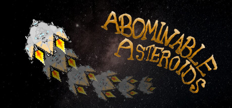
Abominable Asteroids scored 70/100 on Steam Analyzer — Good for a 2D capsule. Top priority fix: [uniqueness_polish] Introduce a distinctive visual hook such as an iconic enemy ship, a unique asteroid shape variant, or a signature color accent that reflects the 'Abominable' theme beyond generic retro style.

Capsule scores by dimension

  • Genre Clarity: 8/10 — Space shooter clarity strong. The asteroids, space setting, and angular geometric hazards immediately signal a retro arcade space shooter at all sizes. The yellow diamond-pattern on the rocky fragments reinforces a classic arcade aesthetic. At tiny size, the silhouette of fragmented asteroids and the starfield background remain instantly recognizable as a space action game.
  • Title Readability: 7/10 — Golden text clear, spaced well. The title 'ABOMINABLE ASTEROIDS' uses a bold golden-orange serif font positioned in the right half of the composition with good contrast against the dark starfield. At small and tiny sizes, the text remains readable due to its size and color separation. The letterforms hold up reasonably well at small scale, though fine serifs may soften slightly at the tiniest thumbnail size.
  • Contrast & Color: 8/10 — Strong dark-light separation. The warm golden-orange title and yellow asteroid patterns provide excellent value contrast against the deep black starfield (#1b2838 equivalent). The white-gray asteroid fragments also read cleanly. In grayscale, the composition maintains clear separation between subject and background, with no muddy midtones obscuring the silhouettes.
  • Uniqueness & Polish: 6/10 — Retro aesthetic competent but generic. The retro arcade style is well-executed with consistent pixelated asteroid rendering and classic color choices, but the visual hook is a straightforward asteroids-style interpretation without a distinctive twist or memorable selling point. The capsule communicates the gameplay concept clearly but lacks the premium craft or unique art direction that would elevate it above a competent baseline.
  • Brand Consistency: 6/10 — Generic space shooter identity. The visual identity relies on standard retro arcade tropes—asteroids, starfield, angular geometry—without establishing a distinctive character, mascot, or signature visual motif that would be recognizable across multiple store materials. The golden serif typography is consistent, but alone does not create a memorable brand signature that differentiates from other space shooters.
  • Composition: 7/10 — Clear focal point, balanced layout. The asteroid cluster anchors the left side while the title occupies the right, creating a diagonal visual balance with clear hierarchy. The starfield background provides depth and keeps the composition from feeling flat. At small and tiny sizes, the left-aligned asteroids and right-aligned text maintain legibility without edge crowding, though the upper right corner title placement is slightly vulnerable to Steam's standard header crop.

What works

  • Instant genre recognition. Asteroids, starfield, and space setting communicate arcade space shooter immediately, even at tiny thumbnail size.
  • Golden title pop. The warm orange-gold serif text creates excellent contrast and visual appeal against the dark starfield background.
  • Balanced composition. The diagonal arrangement of asteroids left and title right creates visual flow without clutter or dead space.

What hurts the capsule

  • Generic retro aesthetic. The capsule relies on standard asteroids-game visuals without a distinctive art direction or unique visual hook that sets it apart.
  • Weak brand identity. No memorable character, mascot, or signature visual motif exists to create lasting brand recognition or differentiation.
  • Title placement edge risk. The upper-right positioning of the main text is vulnerable to Steam's standard header crop, potentially cutting off parts of the title on some resolutions.

Priority fixes

  1. [uniqueness_polish] Introduce a distinctive visual hook such as an iconic enemy ship, a unique asteroid shape variant, or a signature color accent that reflects the 'Abominable' theme beyond generic retro style.
  2. [brand_consistency] Establish a recognizable mascot or symbolic element (e.g., a creature, ship silhouette, or artifact) visible in the capsule that can anchor brand recognition across store pages.
  3. [composition] Reposition the title lower or add a subtle background panel behind the text to ensure safe clearance from Steam header crop zones on all resolutions.

Store copy priority fixes

  1. [uniqueness] Add a sentence explaining what is unique about Abominable Asteroids compared to classic Asteroids or other asteroid-dodging games—e.g., 'a twist on the classic formula' or a specific mechanic difference.
  2. [feature_communication] Expand resource management description with an example: 'Each fuel and ammo pickup is precious—running out mid-wave forces you to dodge or flee, changing your strategy.'
  3. [audience_targeting] Clarify the difficulty spectrum by naming a target audience: 'Casual players can relax with plenty of supply drops; veterans can crank the asteroids to brutal levels for pure skill-based challenge.'

Related guides

Steam app ID: 4619620 · Tags: 2D, Action, Controller, Pixel Graphics, Singleplayer