Scoring genre clarity...

Invasion of the Lizard People capsule

Invasion of the Lizard People

1–4 player co-op survival where you fight through waves of enemies, rack up kills, and collect powerful pickups to stay alive as long as possible. Fast-paced, chaotic runs push your limits every time.

$4.99
ActionTop-Down ShooterShooter
Wian JacobsMay 15, 2026

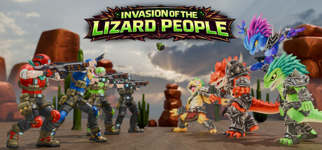
Invasion of the Lizard People scores 77/100 — better than 79% of Action capsules (n=8,535).

$4.99 · Released May 15, 2026 · By Wian Jacobs

Quick text summary

Invasion of the Lizard People scored 77/100 on Steam Analyzer — Good for a Action capsule. Top priority fix: [composition] Increase character hierarchy by enlarging one distinctive lead character or enemy in the foreground to create a clear focal point that stands out at TINY size.

Capsule scores by dimension

  • Genre Clarity: 8/10 — Clear action arcade with colorful chaos. The capsule immediately communicates a wave-based action game through vibrant, cartoonish robot-like characters in combat poses scattered across a desert wasteland. At TINY size, the bright neon color palette and chaotic character arrangement still read as frantic action gameplay, though the lizard theme becomes secondary to the general arcade shooter aesthetic.
  • Title Readability: 9/10 — Bold, high-contrast title excellent at all sizes. The yellow-green 'INVASION OF THE LIZARD PEOPLE' text with thick black outline sits cleanly at the top against the sky background, maintaining perfect legibility from full size down to TINY thumbnails. The high saturation and weight of the letterforms ensure the title remains sharp and distinct even under quick-scroll conditions.
  • Contrast & Color: 8/10 — Strong neon palette pops against dark Steam. Vibrant lime green, hot pink, cyan, and orange characters create excellent value separation against both the light sky background and the dark Steam #1b2838 interface color. The neon saturation and bright character silhouettes maintain clear definition at SMALL and TINY sizes, though the middle-distance desert floor slightly compresses contrast in grayscale.
  • Uniqueness & Polish: 7/10 — Stylish indie aesthetic with clear personality. The colorful, modular character design and playful title communicate a fun, deliberately campy tone that stands apart from darker action game competitors like Helldivers 2 or Lies of P. The neon color choices and cartoonish robot-alien mashup feel intentional and cohesive, though the composition feels slightly loose compared to premium AAA benchmarks.
  • Brand Consistency: 7/10 — Consistent art direction recognizable from capsule. The bright neon palette, chunky character proportions, and desert sci-fi setting create a distinctive visual identity that should be recognizable across store screenshots and in-game assets. The lime-green-and-neon-pink color scheme serves as a strong brand anchor, though the cartoonish style lacks an iconic character or mascot for deeper recall.
  • Composition: 7/10 — Balanced layout with clear focal chaos. The title anchors the top with confident placement, while characters are distributed across the mid and lower thirds creating visual rhythm and energy that suggests frenetic gameplay. At SMALL size the composition reads well with good depth layering (sky, robot characters, ground), though at TINY the individual character details blur together slightly, reducing impact.

What works

  • Excellent title contrast and legibility. The thick-outlined yellow-green title maintains perfect readability at all sizes, from full header to tiny thumbnail, ensuring the game name is immediately clear during fast scrolling.
  • Vibrant neon palette stands out. The bright lime, cyan, magenta, and orange color choices create strong visual separation against the Steam dark background and maintain distinctiveness even in grayscale.
  • Clear action game messaging. Combat poses, weapon details, and character variety immediately communicate wave-based action gameplay without ambiguity about genre.

What hurts the capsule

  • Composition loses focus at tiny size. Individual character details and their silhouettes blur together at TINY size, reducing the impact of the otherwise strong visual design and making it harder to parse individual elements quickly.
  • Generic desert wasteland setting. The brown rocky background and sky lack distinctive environmental storytelling compared to benchmarks like DREDGE or Sea of Stars, feeling more like a default arena than a memorable world.
  • No clear primary focal point. Characters are distributed evenly across the lower section rather than hierarchically arranged around one hero or standout element, creating balanced but undirected visual attention.

Priority fixes

  1. [composition] Increase character hierarchy by enlarging one distinctive lead character or enemy in the foreground to create a clear focal point that stands out at TINY size.
  2. [genre_clarity] Consider adding subtle UI elements (ammo counter, wave indicator, health bar) to reinforce the wave-survival loop mechanic more explicitly.
  3. [uniqueness_polish] Differentiate the background environment with unique lizard-themed architectural elements or flora to strengthen the 'Lizard People' IP and move beyond generic desert tropes.

Store copy priority fixes

  1. [uniqueness] Add 2–3 sentences in the About the Game section that explain what makes this game's wave survival, pickups, or co-op mechanics distinctly different (e.g., synergy systems, unique enemy types, or a specific twist on the wave formula).
  2. [feature_communication] Move or reduce the roadmap to a separate collapsed section and expand the About the Game section with 2–3 concrete examples of pickups, enemy types, or strategic decisions players will make in a typical run.
  3. [hook_strength] Consider adding a single-sentence comparison or differentiator in the short description (e.g., 'where synergy builds matter' or 'with unpredictable arena hazards') to stand out from generic wave shooters.

Related guides

Steam app ID: 4621860 · Tags: Action, Top-Down Shooter, Shooter, Online Co-Op, Co-op