Scoring genre clarity...

Bonfire Buddies capsule

Bonfire Buddies

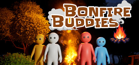
If the fire goes out, you don’t survive the night. Team up, gather resources, and survive the darkness. Bonfire Buddies is an online co-op survival game where you and your friends must keep the fire alive through the night.

$0.991 user reviews
CasualExplorationCartoony
Christopher Alan BonhamMay 1, 2026

Bonfire Buddies scores 72/100 — better than 43% of Casual capsules (n=10,153).

1 user reviews · $0.99 · Released May 1, 2026 · By Christopher Alan Bonham

Quick text summary

Bonfire Buddies scored 72/100 on Steam Analyzer — Good for a Casual capsule. Top priority fix: [uniqueness_polish] Differentiate character designs with iconic shapes, clothing, or accessories that hint at distinct roles or personalities and make silhouettes more memorable.

Capsule scores by dimension

  • Genre Clarity: 7/10 — Survival co-op is clear. The central bonfire, diverse character archetypes in different colors, and nighttime/darkness setting immediately communicate a cooperative survival theme. At tiny size, the colorful stylized figures around the fire and the flame remain readable, though the specific 'keep fire alive' mechanic is not visually explicit without text.
  • Title Readability: 8/10 — Bold, clean title placement. The title 'BONFIRE BUDDIES' uses a thick, outlined serif font in warm brown and cream against a white cloud banner, ensuring strong contrast and legibility at all sizes. At tiny size the title remains parseable though slightly condensed; the cloud background is a smart choice to isolate text from noisy scene elements.
  • Contrast & Color: 8/10 — Strong warm-cool value separation. Bright yellow, white, pink, and blue characters pop distinctly against the dark blue-black night sky and orange-brown flame glow. The color palette avoids muddy mid-tones; silhouettes remain clear even at tiny size, and the warm fire contrasts sharply with cool character bodies and cool sky background.
  • Uniqueness & Polish: 7/10 — Charming style, slight generic feel. The stylized, simple figure designs and cheerful color blocking give the capsule personality and warmth. However, the 'colorful characters around a fire' setup is a familiar indie game trope (similar to Bonfire spirits or group survival setups), and the scene lacks a distinctive mechanical or narrative hook that would elevate it above competent execution.
  • Brand Consistency: 6/10 — Consistent art, minimal identity. The simple, geometric character designs, warm color palette, and playful tone are internally cohesive and likely consistent across the store page. However, there are no iconic character designs, mascots, or signature visual motifs that would make this capsule immediately recognizable or memorable as a distinct brand.
  • Composition: 7/10 — Clear focal point, balanced layout. The bonfire sits as the natural center focal point with the five characters radiating around it, creating stable composition and depth layering (foreground figures, background fire and tree). At small and tiny sizes the arrangement remains readable, though the scattered placement of characters across the width could feel slightly busy at extreme zoom.

What works

  • Bold, outlined title on cloud banner. The thick serif 'BONFIRE BUDDIES' text with white cloud backing ensures legibility at tiny size and stands out clearly against the dark scene.
  • Distinct character color palette. Yellow, white, pink, and blue figures create strong individual silhouettes and quick visual differentiation that reads well even at low resolution.
  • Central fire as natural focal point. The bonfire naturally anchors the composition and reinforces the core survival mechanic without needing explicit UI or text.

What hurts the capsule

  • Generic survival group setup. The 'colorful characters around a campfire' concept is a familiar indie game visual trope that doesn't visually distinguish this game's unique selling point.
  • No iconic character or mascot. The simple, geometric figures lack personality traits, recognizable silhouettes, or standout designs that would make the game memorable on repeat browsing.
  • Mechanical hook not visually communicated. The critical 'keep the fire alive' resource mechanic is not visually expressed; the scene looks more like cheerful gathering than desperate survival.

Priority fixes

  1. [uniqueness_polish] Differentiate character designs with iconic shapes, clothing, or accessories that hint at distinct roles or personalities and make silhouettes more memorable.
  2. [genre_clarity] Add subtle visual indicators of urgency or resource strain (e.g., darkening sky, flickering fire, collected resources) to strengthen the survival pressure theme.
  3. [brand_consistency] Introduce a recognizable color motif, symbol, or character expression (e.g., a mascot buddy) that could serve as a visual brand anchor across marketing materials.

Store copy priority fixes

  1. [hook_strength] Replace the redundant opening paragraph of the detailed description with a new hook that expands the premise—e.g., 'Darkness brings danger: creeping shadows, hunger, and dwindling resources. Can your team survive until dawn?' This adds atmospheric depth and emotional stakes.
  2. [uniqueness] Add a concrete differentiator in the second or third paragraph, such as: 'Unlike other survival games, Bonfire Buddies focuses entirely on co-op collaboration—there is no PvP, no competition between players, only shared survival.' or highlight a specific mechanic unique to the game.
  3. [tone_match] Rewrite the Early Access section and closing line to match the 'Funny' and 'Cartoony' tags with lighter, more personality-driven language instead of corporate phrasing.
  4. [feature_communication] Expand the bulleted feature list to include one concrete detail about enemy types, resource diversity, or progression unlock (e.g., 'Escalating enemy waves — creatures grow bolder and more dangerous as the night deepens') to hint at strategic depth.

Related guides

Steam app ID: 4623280 · Tags: Casual, Exploration, Cartoony, Action-Adventure, 3D