Emoji Catcher scores 70/100 — better than 29% of Casual capsules (n=10,153).

Quick text summary

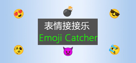
Emoji Catcher scored 70/100 on Steam Analyzer — Good for a Casual capsule. Top priority fix: [uniqueness_polish] Introduce a signature visual element or character mascot (beyond the generic pink cat) that creates a memorable brand hook and differentiates from other emoji casual games.

Capsule scores by dimension

  • Genre Clarity: 8/10 — Clear casual arcade gameplay implied. The scattered emoji icons falling across a light blue background immediately signal a casual, arcade-style collection game. At TINY size, the emoji variety and simple geometric layout clearly communicate 'catch falling objects' mechanics. The pink cat emoji adds personality and reinforces the casual, lighthearted tone.
  • Title Readability: 7/10 — Title readable but tagline fades small. The English 'Emoji Catcher' in bright green reads clearly at all sizes and has good contrast against the dark gray banner. However, the Chinese characters above are smaller and less accessible to Western audiences; at TINY size the green text remains legible but the banner proportions create a cramped feel. The title placement on the gray rectangle is strategic and survives small scaling reasonably well.
  • Contrast & Color: 8/10 — Strong pop against dark Steam background. The light blue background and bright emoji colors create excellent separation from Steam's dark interface #1b2838. The green 'Emoji Catcher' text has strong luminosity contrast against the gray banner. At TINY size, the emoji silhouettes remain distinct, and the overall warm-cool color interplay (yellow/orange emojis vs blue background) ensures quick visual recognition during scroll.
  • Uniqueness & Polish: 6/10 — Competent but generic casual aesthetic. The design is clean and functional with well-rendered emoji assets arranged symmetrically. However, the presentation feels straightforward—floating emoji icons on a solid background is a common casual game visual trope without a distinctive hook or memorable art direction. The execution is competent but lacks the premium craft or unique storytelling angle seen in top-tier casual titles like DAVE THE DIVER or Hades II.
  • Brand Consistency: 6/10 — Emoji theme cohesive, identity minimal. The capsule maintains consistent emoji theming with varied expressions and types arranged symmetrically around a central pink cat. However, there are no strong iconic visual cues, signature palette elements, or memorable brand identity markers that would distinguish Emoji Catcher from other casual emoji games. The design communicates the game concept clearly but offers limited brand recognition potential.
  • Composition: 7/10 — Balanced symmetry, clear center focus. The composition uses radial symmetry with the gray title banner anchoring the center and emoji icons distributed evenly around the edges, creating a stable, organized layout. The focal point is clear at all sizes. At TINY size, the arrangement remains readable and balanced. Safe margins are respected, though the emoji clustering near edges could risk slight crop overlap on some displays.

What works

  • Color pop against dark background. Bright emoji colors and light blue background create excellent contrast and silhouette separation from Steam's #1b2838 interface, ensuring strong visibility during quick scrolling.
  • Clear title contrast and placement. Green 'Emoji Catcher' text has high luminosity contrast against the dark gray banner and remains legible at small sizes without visual clutter.
  • Immediate genre communication. Falling emoji arrangement and simple layout instantly communicate casual arcade gameplay, making the core mechanic obvious at TINY size.

What hurts the capsule

  • Generic casual game aesthetic. The floating emoji on solid background approach lacks distinctive visual identity or premium craft compared to top casual genre performers.
  • Limited brand identity markers. No iconic character, signature motif, or memorable visual hook that would make Emoji Catcher visually recognizable in future marketing or game listings.
  • Bilingual title hierarchy unclear. Chinese characters occupy prominent space but are less readable for Western audiences; unclear which language should be primary on the capsule.

Priority fixes

  1. [uniqueness_polish] Introduce a signature visual element or character mascot (beyond the generic pink cat) that creates a memorable brand hook and differentiates from other emoji casual games.
  2. [brand_consistency] Establish a consistent color palette and rendering style across all marketing materials that creates instant visual recognition of the Emoji Catcher brand.
  3. [title_readability] Clarify language hierarchy by either prioritizing English 'Emoji Catcher' or designing the bilingual layout to give equal visual weight and legibility at SMALL size.

Store copy priority fixes

  1. [hook_strength] Replace the opening line with a verb-forward hook that conveys the core appeal, such as 'Tap, dodge, and catch hundreds of adorable emoji to build your high score in this zen platformer' or similar.
  2. [feature_communication] Add 2–3 sentences describing the core gameplay loop: how the player moves/controls, what types of emojis appear, and what consequences or rewards define each mode.
  3. [uniqueness] Include one clear reason this game stands apart—whether it is the emoji aesthetic, level design philosophy, the blend of relaxation and challenge, or a specific mechanic not common in the genre.
  4. [genre_clarity] Explicitly mention platformer actions (jump, move, avoid) rather than assuming 'catch' alone conveys interaction; clarify whether this is a physics platformer, reflex-based, or rhythm-aligned game.

Related guides

Steam app ID: 4625480 · Tags: Casual, Relaxing, Cute, Singleplayer, 2D Platformer