Scoring genre clarity...

Corp.S.E.: Escape capsule

Corp.S.E.: Escape

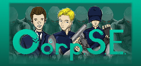
Witness your friend’s death and inherit a final mission. Trapped inside a deadly corporation, fight, hack, and solve your way through a heavily guarded facility to escape and uncover the truth. A fast-paced 2D action platformer filled with combat and puzzles.

$3.99
ActionAdventureAction-Adventure
Gulf Park GamesMay 15, 2026

Corp.S.E.: Escape scores 62/100 — better than 3% of Action capsules (n=8,535).

$3.99 · Released May 15, 2026 · By Gulf Park Games

Quick text summary

Corp.S.E.: Escape scored 62/100 on Steam Analyzer — Solid for a Action capsule. Top priority fix: [title_readability] Relocate title to bottom-right or bottom-center with a clean solid background panel, removing character overlap and increasing letterform size relative to total capsule width.

Capsule scores by dimension

  • Genre Clarity: 7/10 — Action platformer with espionage cues. Three characters posed with combat/stealth equipment (gun, tactical gear, hacking vibes) against an industrial teal background clearly suggest action gameplay. At SMALL size the posed characters and weaponry still communicate action-adventure effectively, though the 2D platformer aspect is not immediately obvious from visuals alone. The corporate/facility setting supports the escape narrative but doesn't strongly differentiate from generic action games.
  • Title Readability: 5/10 — Title legible at full but fragile at tiny. The large teal 'CORP.S.E' letterforms have decent contrast against the dark background at full size but suffer from serif complexity and letter spacing that becomes hard to parse at TINY size. The period-separated acronym breaks visual flow and adds cognitive load. At TINY (~120px), individual letters blur and the full title becomes ambiguous—readability relies heavily on viewers already knowing the game name.
  • Contrast & Color: 7/10 — Strong teal pops well against dark base. The bright cyan-teal title and character accents create excellent value separation against the dark teal-green background and darker character silhouettes. In grayscale stress test, the title and character faces maintain clear separation. However, the background character silhouettes and mid-tone industrial details blend together somewhat, reducing overall silhouette clarity at TINY size.
  • Uniqueness & Polish: 6/10 — Competent but generic indie action look. The character art style is clean and pixel-art influenced, with intentional pose storytelling (three protagonist archetypes: hacker, leader, enforcer) that hints at co-op or mission team dynamics. The teal industrial aesthetic feels polished but follows a familiar indie-game color palette. At SMALL size the distinctive character trio partially compensates, but the overall composition reads as a standard action-game character lineup without a unique visual hook that separates it from comparable titles.
  • Brand Consistency: 6/10 — Consistent art style, minimal identity signal. The three-character pose and teal-and-dark palette appear consistent with the game's store screenshots, and the pixel-art rendering is uniform throughout. However, there are no iconic motifs, symbols, or signature visual elements that would allow recognition beyond the character trio itself. The 'CORP.S.E' title and the corporate facility aesthetic are generic enough that the capsule does not establish a memorable brand identity separate from the character designs.
  • Composition: 6/10 — Centered trio, unbalanced title placement. The three characters occupy the center of the frame with clear focal hierarchy—the middle blond-haired character draws primary attention, flanked by supporting cast. The large title overlays the characters and splits attention rather than anchoring to a clear background region. At TINY size, the title and character elements compete for focus, and the composition does not leverage safe margins effectively. The background has adequate depth but offers no strong directional guides.

What works

  • Character silhouettes read clearly. The three-person pose is distinct and conveys team/co-op gameplay, with equipment and posture clearly differentiating roles.
  • Color contrast supports visibility. Bright teal title and character highlights maintain strong separation from the dark background even at reduced sizes.
  • Thematic coherence. Corporate facility setting, tactical gear, and character poses align well with the escape-mission narrative.

What hurts the capsule

  • Title obscured by character overlay. The 'CORP.S.E' text layers directly over character bodies, reducing clarity and creating visual competition at all sizes.
  • Serif complexity at small sizes. Decorative letterforms and period-separated acronym format lose legibility at TINY scale, hindering quick recognition.
  • Generic visual identity. The composition follows standard indie action-game conventions with no distinctive visual hook or memorable symbol that sets it apart.
  • Background character silhouettes muddy. Supporting cast and industrial details blend into mid-tones, weakening overall silhouette separation and depth perception.

Priority fixes

  1. [title_readability] Relocate title to bottom-right or bottom-center with a clean solid background panel, removing character overlap and increasing letterform size relative to total capsule width.
  2. [uniqueness_polish] Introduce a distinctive visual motif—such as a corporate logo, escape beacon, or glitch-effect accent—that becomes the brand anchor and is recognizable at TINY size.
  3. [composition] Adjust focal hierarchy by anchoring title in a safe margin (bottom or top edge) and repositioning characters to strengthen directional flow and reduce visual clutter.
  4. [contrast_color] Darken background industrial silhouettes or add subtle glow/outline to main character faces to increase separation and silhouette clarity at TINY size.

Store copy priority fixes

  1. [uniqueness] Add one specific, concrete differentiator in the short description—e.g., 'combines parkour-heavy platforming with real-time hacking systems' or 'features multiple parallel escape routes that reward exploration'—to distinguish this game from generic corporate-escape shooters.
  2. [audience_targeting] Clarify the skill floor and intended audience by adding a sentence about difficulty modes or accessibility features, e.g., 'accessible to newcomers with adjustable challenge, or punishingly fast for speedrunners.'
  3. [hook_strength] Strengthen the short description further by adding one visual or mechanical hook after the narrative premise, e.g., 'witness your friend's death and inherit their final mission—escape using parkour, hacking, and stealth in a sprawling facility.'
  4. [feature_communication] Consider adding 1-2 sample mechanics or example environments to the feature list to make the gameplay feel more tangible and memorable.

Related guides

Steam app ID: 4630110 · Tags: Action, Adventure, Action-Adventure, Puzzle, Shooter