Scoring genre clarity...

Shape Together capsule

Shape Together

Shape Together is a factory-building game: lay mines, belts, and machines, automate shapes, and use them to defeat monsters and bosses. Hold back waves, grow stronger over time—solo or with friends on Steam.

$4.99Positive(10)
StrategyIndieEarly Access
BluMay 19, 2026

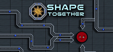
Shape Together scores 73/100 — better than 57% of Strategy capsules (n=5,103).

Positive (10 reviews) · $4.99 · Released May 19, 2026 · By Blu

Quick text summary

Shape Together scored 73/100 on Steam Analyzer — Good for a Strategy capsule. Top priority fix: [uniqueness_polish] Introduce a distinctive enemy or monster silhouette in the composition to visually communicate the combat/defense layer and differentiate from pure factory-sim competitors.

Capsule scores by dimension

  • Genre Clarity: 7/10 — Factory automation clearly signaled. The conveyor belt system with blue dotted path lines, mine/factory grid background, and red spherical object strongly communicate an automation or factory-building game. At TINY size, the belt routing and grid pattern are recognizable factory mechanics, though the monster-combat layer is not evident from visuals alone. The core factory loop reads clearly even at small scale.
  • Title Readability: 8/10 — Bold, readable title placement. SHAPE TOGETHER uses clean, modern sans-serif lettering with high contrast white text centered against a dark grid background, positioned in the upper right area away from visual clutter. At SMALL and TINY sizes, the text remains legible without distortion or collapse. The star icon left of the title adds a distinctive brand marker that anchors recognition.
  • Contrast & Color: 8/10 — Strong value separation and clarity. White title text and bright yellow star logo stand out crisply against the dark charcoal grid (#1b2838-adjacent). The red spherical object in the center-right creates a warm focal accent that pops against cool blue belt lines and neutral background. Grayscale squint test confirms the white, yellow, and red elements maintain distinct tonal separation, ensuring excellent readability in quick scroll scenarios.
  • Uniqueness & Polish: 7/10 — Distinctive factory-building aesthetic. The isometric grid layout with clean mechanical line work and the star emblem convey a polished, purposeful industrial theme rather than generic sci-fi. The red ball object hints at the shape-based mechanic mentioned in the description, adding a unique gameplay hook. Production quality is evident in the consistent vector style and intentional visual hierarchy, though the design falls short of being visually striking compared to top-tier indie titles like Balatro or DAVE THE DIVER.
  • Brand Consistency: 7/10 — Coherent industrial brand identity. The star logo, blue-accented conveyor lines, and grid-based composition create a consistent and recognizable visual identity tied to factory/automation themes. The color palette of cool grays, electric blue, and accent warm tones feels unified across the capsule. Internal cohesion is strong, though without access to all 8 screenshots, consistent application across marketing materials cannot be fully verified; the capsule itself maintains solid branded presence.
  • Composition: 7/10 — Clear hierarchy with balanced layout. The star-title lockup anchors the top-left/center area, while the red sphere provides a secondary focal point at center-right, creating visual balance and clear layering. The conveyor belt routing guides the eye across the composition naturally. At SMALL size, the design remains cohesive without clutter, though at TINY size the belt detail softens slightly; safe margins are well-respected and no critical elements sit dangerously close to edges.

What works

  • Strong color contrast and focal clarity. White title text, yellow star, and red sphere pop distinctly against the dark grid background, ensuring immediate recognition even in quick scroll browsing.
  • Effective visual communication of genre. Conveyor belt system, grid layout, and industrial aesthetic immediately convey factory automation without ambiguity or misleading visual signals.
  • Balanced composition and safe design. Elements are well-distributed across the frame with intentional hierarchy; title and logo remain legible at all sizes without edge-proximity risk.

What hurts the capsule

  • Limited visual distinctiveness in crowded genre. While competent, the factory-building aesthetic is familiar territory; the design does not stand out as memorably as top-tier genre competitors like Techtonica or House Flipper 2.
  • Monster/combat mechanic not visually apparent. The red sphere could represent any object; there is no clear visual indication of the game's monster-slaying or combat layer, leaving half the gameplay story untold.
  • Grid pattern detail diminishes at TINY size. The fine dotted conveyor lines and grid subdivisions lose clarity at thumbnail scale, reducing the design's polish impact in browse-scroll contexts.

Priority fixes

  1. [uniqueness_polish] Introduce a distinctive enemy or monster silhouette in the composition to visually communicate the combat/defense layer and differentiate from pure factory-sim competitors.
  2. [contrast_color] Enhance the blue conveyor line saturation or add a subtle glow effect to maintain visibility of the automation theme at TINY sizes without increasing clutter.
  3. [composition] Consider repositioning the red sphere or adding a subtle shape-based visual motif (e.g., different colored shapes) to reinforce the 'Shape Together' core mechanic in the capsule itself.

Store copy priority fixes

  1. [hook_strength] Replace 'defeat monsters and bosses' in the short description with 'break the enemy heart' or similar language that conveys the high-stakes factory-combat stakes more evocatively.
  2. [uniqueness] Add one sentence in the detailed description that explicitly differentiates this game—e.g., 'Unlike traditional factories, your production directly fuels combat' or highlight a specific mechanic (copy/paste, prestige loop) that sets it apart.
  3. [feature_communication] Expand the prestige explanation to clarify the progression loop: 'Prestige resets your factory but unlocks permanent upgrades that make future runs faster and deeper—ensuring no playthrough feels wasted.'
  4. [tone_match] Audit and harmonize tone throughout: either maintain the casual, conversational style consistently or shift to a more balanced formal-casual voice to avoid tonal whiplash.

Related guides

  • Steam page optimisationCapsule, copy, screenshots, tags — the full Steam page conversion stack.
  • Steam tags guideTag selection, ordering, and how it shapes Steam's recommendation rails.

Steam app ID: 4634300 · Tags: Strategy, Indie, Early Access, Simulation, Sandbox