Scoring genre clarity...

Cards n Zombies capsule

Cards n Zombies

Choose your champions and descend into card-based dungeons of the undead. Search for upgrade cards and treasures, survive, and make difficult choices, all within an exotic card game atmosphere.

StrategyRogueliteCasual
S.C. 16 BIT NIGHTS S.R.L., cavalie_roTo be announced

Cards n Zombies scores 75/100 — better than 69% of Strategy capsules (n=5,329).

Released To be announced · By S.C. 16 BIT NIGHTS S.R.L.

Quick text summary

Cards n Zombies scored 75/100 on Steam Analyzer — Good for a Strategy capsule. Top priority fix: [uniqueness_polish] Add a unique visual hook—such as an iconic card motif, treasure element, or signature champion feature—to differentiate from other casual strategy titles

Capsule scores by dimension

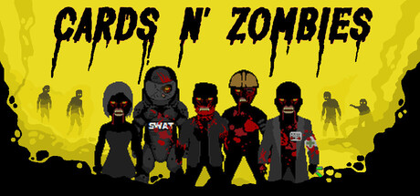
  • Genre Clarity: 8/10 — Strong zombie card game signals. The bright yellow background with silhouetted zombie figures immediately communicates a casual, undead-themed strategy title. At tiny size, the distinctive zombie poses and SWAT-style character lineup clearly suggest a tactical card-based experience rather than action or RPG. The color palette and character arrangement successfully avoid ambiguity about the core zombie theme.
  • Title Readability: 7/10 — Bold, readable at all sizes. The 'CARDS N' ZOMBIES' title uses a thick, distressed black font that maintains legibility even at tiny size due to strong letter spacing and weight. At full size, the dripping effect adds thematic character without sacrificing clarity. However, at extremely tiny sizes (below 120px), the letterforms compress slightly, though the overall title mass remains recognizable.
  • Contrast & Color: 9/10 — Excellent pop against dark Steam background. The bright yellow background creates dramatic value separation from the dark Steam interface (#1b2838), making the capsule immediately stand out in scrolls. Black character silhouettes against yellow provide clean separation and maintain readable silhouettes even at tiny size. The grayscale test confirms strong contrast throughout—no muddy midtones, just pure light-dark distinction.
  • Uniqueness & Polish: 7/10 — Polished but follows genre expectations. The capsule demonstrates solid craft with intentional character lineup composition and consistent distressed typography that reinforces the undead theme. The zombie characters show clear individual personality and pose variety, suggesting team-based mechanics. However, the overall approach remains somewhat familiar within the casual strategy genre—bright background + character row is a proven formula, limiting distinctiveness.
  • Brand Consistency: 6/10 — Coherent internal identity, generic genre cues. The distressed black font, yellow background, and zombie character aesthetic create a consistent visual language internally. The lineup of distinct character silhouettes suggests recognizable champions/classes that could build brand identity across marketing materials. However, without seeing additional store assets, the yellow + zombie formula feels aligned with genre conventions rather than distinctly memorable.
  • Composition: 8/10 — Clear focal hierarchy with strong framing. Five prominent character silhouettes form the natural focal point in the center-lower third, with title anchoring top and background zombies creating depth layers. At tiny size, the character lineup remains the dominant focal point without clutter or competing elements. The composition uses safe margins effectively, avoiding edge-hugging risks and maintaining visual balance across all viewing sizes.

What works

  • High-contrast yellow background. The bright yellow creates exceptional separation from Steam's dark interface and ensures the capsule stands out in scrolls and thumbnails.
  • Clear title typography. The bold, distressed black font remains readable at all sizes with no decorative collapse at tiny scale.
  • Purposeful character lineup. The five distinct zombie/champion silhouettes in varied poses clearly signal team-based strategic gameplay and visual personality.
  • Depth layering with background figures. Background zombie horde creates atmospheric context and compositional depth without competing with the foreground champions.

What hurts the capsule

  • Generic formula adherence. The bright background + character row layout is a proven but common approach in casual strategy games, reducing memorability.
  • Limited brand differentiation. While internally cohesive, the yellow + zombie aesthetic lacks a distinctive visual hook or iconic element that sets it apart from similar titles.
  • Minimal thematic variation. The capsule leans heavily on the zombie concept without communicating the card mechanics or dungeon exploration aspects of gameplay.

Priority fixes

  1. [uniqueness_polish] Add a unique visual hook—such as an iconic card motif, treasure element, or signature champion feature—to differentiate from other casual strategy titles
  2. [genre_clarity] Subtly incorporate card game imagery (e.g., card silhouettes, deck stacks) into the background or foreground to reinforce the card mechanic over pure zombie theme
  3. [brand_consistency] Ensure the five character designs are visually distinct and iconic enough to serve as recognizable brand ambassadors across store screenshots and marketing

Related guides

  • Steam page optimisationCapsule, copy, screenshots, tags — the full Steam page conversion stack.
  • Steam tags guideTag selection, ordering, and how it shapes Steam's recommendation rails.

Steam app ID: 4636540 · Tags: Strategy, Roguelite, Casual, Card Game, Dungeon Crawler