klik. scores 68/100 — better than 18% of Strategy capsules (n=5,103).

Quick text summary

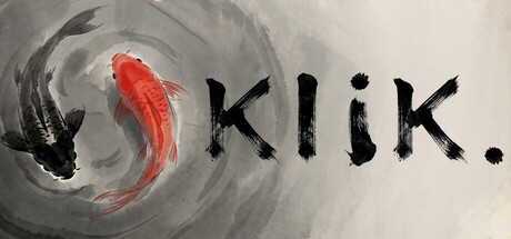
klik. scored 68/100 on Steam Analyzer — Solid for a Strategy capsule. Top priority fix: [title_readability] Simplify or enlarge the 'klik.' wordmark and consider a bolder or cleaner serif/sans-serif variant to improve legibility at SMALL and TINY sizes without sacrificing personality.

Capsule scores by dimension

  • Genre Clarity: 7/10 — Puzzle mechanic clear, minimal theme. The yin-yang circle with contrasting fish silhouettes immediately communicates a toggle or balance mechanic central to puzzle games. At TINY size, the circular negative space and fish shapes remain legible and suggest symmetry or state-switching gameplay. Genre reads as puzzle-casual rather than strategy, which aligns with the light-toggling core mechanic.
  • Title Readability: 6/10 — Title readable at full size only. The word 'klik.' uses a distressed, organic serif font positioned to the right of the yin-yang symbol. At full header size it reads clearly with good letter spacing. At SMALL size (~231x87) the letters begin to lose definition and the period becomes hard to distinguish; at TINY size (~120x45) letterforms collapse into a blur and the title becomes functionally illegible, though the shape and period punctuation remain recognizable as a signature.
  • Contrast & Color: 8/10 — Strong value separation, silhouette clarity. The red and black fish create sharp contrast against the light gray-white circular background and gradient swirl. The dark fish silhouettes cut clearly against the warm red, and both read well against #1b2838 dark Steam background due to the light mid-tone field. Grayscale squint test shows strong value separation; the circular composition and fish outlines remain distinct even when detail blurs.
  • Uniqueness & Polish: 7/10 — Minimalist craft, recognizable aesthetic. The yin-yang design with fish is a cohesive visual metaphor for toggle mechanics and balance, communicating the core loop without clutter. The distressed serif font on 'klik.' feels intentional and quirky, adding personality beyond generic puzzle templating. The hand-drawn quality and limited palette suggest craft, though the concept (yin-yang + fish) is not wholly unique in puzzle game branding.
  • Brand Consistency: 6/10 — Minimal but coherent identity. The monochromatic yin-yang with red accent, combined with the distressed serif 'klik.' wordmark, establishes a consistent minimal aesthetic. The design is internally cohesive—all elements share the same hand-drawn, understated tone. Without access to all 6 screenshots, the circular symbol and serif logo appear memorable enough to anchor brand recognition across marketing materials, though the overall identity is spare and could be more distinctive.
  • Composition: 7/10 — Clear focal point, safe layout. The yin-yang circle sits centered-left, creating a strong primary focal point; the title 'klik.' anchors the right side, forming a balanced horizontal hierarchy. The swirl background adds depth without competing for attention. At SMALL and TINY sizes the circle remains the clear focal point, and the title, though small, is positioned safely away from edges and does not obscure the symbol.

What works

  • Strong visual metaphor. Yin-yang with red and black fish immediately communicates toggle/balance mechanic, aligning perfectly with light-toggling gameplay.
  • Excellent contrast and silhouette. Dark fish and red forms cut cleanly against light background and read well against Steam's dark theme, with strong grayscale separation.
  • Minimalist coherence. Distressed serif font and sparse palette create a cohesive, intentional aesthetic that avoids generic template look.

What hurts the capsule

  • Title illegible at TINY size. The 'klik.' letterforms collapse into an unreadable blur below ~150px width, relying solely on shape recognition and period punctuation to communicate the title.
  • Limited brand distinctiveness. Yin-yang + fish is recognizable but not wholly unique; the design could feel derivative without stronger signature elements or color palette uniqueness.
  • Sparse secondary visual hooks. Beyond the central symbol and title, there are no additional brand markers, icons, or texture cues that would reinforce identity across touchpoints.

Priority fixes

  1. [title_readability] Simplify or enlarge the 'klik.' wordmark and consider a bolder or cleaner serif/sans-serif variant to improve legibility at SMALL and TINY sizes without sacrificing personality.
  2. [brand_consistency] Introduce a secondary visual signature—such as a consistent icon set, accent color bar, or textured element—visible at SMALL size to anchor brand recognition across Steam store pages and screenshots.
  3. [uniqueness_polish] Refine the fish and yin-yang refinement with a more distinctive rendering or compositional twist (e.g., geometric abstraction, color accent) to stand out against other minimalist puzzle capsules.

Store copy priority fixes

  1. [uniqueness] Replace 'Simple to learn, satisfying to master' with a sentence that articulates what makes klik.'s puzzle design or progression unique—e.g., 'Every puzzle sits at the mathematical limit of the 5x5 grid, demanding pure logic, no luck, no brute force.'
  2. [hook_strength] Strengthen the short description's emotional hook by adding one word or phrase that conveys the tonal promise—e.g., 'klik. is a meditative puzzle game about turning off every light' (explicitly linking to the relaxing tag).
  3. [feature_communication] Clarify the motivation for 3-star challenges with a single sentence: e.g., 'Earn up to 3 stars by matching the optimal move count—a test of efficiency for players who want to master every puzzle' (connecting achievement tracking to audience motivation).

Related guides

  • Steam page optimisationCapsule, copy, screenshots, tags — the full Steam page conversion stack.
  • Steam tags guideTag selection, ordering, and how it shapes Steam's recommendation rails.

Steam app ID: 4639120 · Tags: Strategy, Puzzle, Casual, Tutorial, Arcade