the art of Tortoise Walking scores 83/100 — better than 95% of Casual capsules (n=10,153).

Quick text summary

the art of Tortoise Walking scored 83/100 on Steam Analyzer — Good for a Casual capsule. Top priority fix: [genre_clarity] Add subtle controller or limb-control visual hint such as joint markers or a faint grid on the tortoise to communicate the unique four-limb control mechanic

Capsule scores by dimension

  • Genre Clarity: 8/10 — Clear casual simulation with unique hook. The tortoise silhouette immediately communicates a creature-focused simulation game with a meditative tone. At tiny size, the tortoise remains recognizable and the zen island setting is evident from the soft green landscape and peaceful composition. The genre reads as casual/walking simulator due to the slow, grounded subject matter and serene color palette.
  • Title Readability: 9/10 — Excellent clarity across all sizes. The title 'the art of Tortoise Walking' is rendered in clean white sans-serif on a bright blue background with strong contrast and ample negative space. At small and tiny sizes, the layout remains legible with no crowding, and the two-line hierarchy guides the eye naturally from tagline to main title. The font weight and size hold up perfectly at thumbnail scale without collapse.
  • Contrast & Color: 9/10 — Outstanding separation and visual pop. The bright turquoise blue background creates excellent value separation against the dark tortoise and green landmass, while the cream-colored curved element adds warmth and visual interest. At tiny size, the tortoise and small brown dot silhouette remain distinctly readable against the background, and the grayscale test shows strong contrast between all major elements. The color palette pops immediately against the Steam dark theme background.
  • Uniqueness & Polish: 8/10 — Distinctive indie aesthetic and craft. The minimalist art style with soft color gradients and organic shapes feels intentional and premium, avoiding generic asset library appearance. The concept of a walking simulator centered on a tortoise's perspective is a genuine unique selling point communicated through visual choice, not just generic scenery. The curve composition and warm-cool color balance show thoughtful design direction that aligns with the game's meditative nature.
  • Brand Consistency: 7/10 — Cohesive identity with clear art direction. The soft, muted palette and organic curved composition create a recognizable brand voice consistent with a zen walking simulator. The tortoise as central motif is a strong identity anchor that would be recognizable across store assets. The warm cream curve and cool blue background establish a consistent color vocabulary, though without access to other store screenshots, the broader brand touchpoints cannot be fully verified.
  • Composition: 9/10 — Masterful balance and safe hierarchy. The tortoise is positioned as a clear primary focal point on the left-middle area of the composition, with the title safely positioned in the upper right on uncluttered blue background. The curved cream element creates elegant depth layering and guides the eye, while the small brown dot on the right adds secondary interest without competing for attention. All critical elements remain well within safe margins and the composition is crop-resilient across small and tiny viewports.

What works

  • Title readability excellence. Clean white typography on solid blue background maintains perfect legibility from full size down to tiny thumbnail without any collapse or blur.
  • Distinctive visual identity. The tortoise-centric composition and soft minimalist aesthetic immediately communicate the game's unique walking simulator premise and meditative tone.
  • Strong contrast and color pop. Turquoise-to-green value separation and cream accent create excellent visual hierarchy that pops against the Steam dark background and remains readable at all sizes.
  • Composed focal hierarchy. The tortoise commands clear primary focus while supporting elements like the brown dot and curve guide without competing, maintaining clean composition across scales.

What hurts the capsule

  • Limited genre iconography. While the tortoise communicates walking simulator, there are no UI hints, controller iconography, or world-building details that could reinforce the unique limb control mechanic.
  • Minimal environmental storytelling. The island setting is pleasant but somewhat generic; the desolate island premise could be emphasized more distinctly with rock formations, sparse vegetation, or other environment-specific visual markers.

Priority fixes

  1. [genre_clarity] Add subtle controller or limb-control visual hint such as joint markers or a faint grid on the tortoise to communicate the unique four-limb control mechanic
  2. [uniqueness_polish] Incorporate one additional environmental detail like rocky outcrops or a distant horizon line to strengthen the desolate island setting and avoid feeling too abstract
  3. [brand_consistency] Cross-reference this capsule against the 5 available store screenshots to ensure color palette, tortoise rendering style, and typographic choices are consistent across all brand touchpoints

Store copy priority fixes

  1. [hook_strength] Replace "
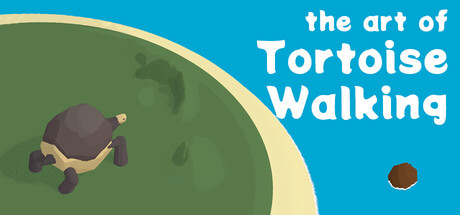
A walking simulator with a deep sense of zen" with a more active opening like: "Control a tortoise's four legs independently and discover meditative motion on a desolate island."
  2. [feature_communication] Add a 1-2 sentence section describing the sensory/environmental experience—what does the island feel like to move through? What sounds and sights accompany the journey?
  3. [uniqueness] Explicitly state what makes individual limb control meaningful—e.g., "Every step requires deliberate coordination, transforming walking from an automatic action into a mindful practice."

Related guides

Steam app ID: 4639300 · Tags: Casual, Walking Simulator, Atmospheric, Relaxing, Physics