Scoring genre clarity...
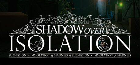
Shadow Over Isolation capsule

Shadow Over Isolation

“If you’re reading this, chances are it’s too late” Shadow Over Isolation is a First-Person Adventure Horror game INSPIRED by the storytelling style of H.P. Lovecraft and Visual Acuity & Artist Style of Stanley Kubrick. All without the stereotypical Haunted House gameplay saturating the adventure gaming market.

AdventureIndieViolent
Naughty ShinobiComing soon

Shadow Over Isolation scores 77/100 — better than 83% of Adventure capsules (n=8,243).

Released Coming soon · By Naughty Shinobi

Quick text summary

Shadow Over Isolation scored 77/100 on Steam Analyzer — Good for a Adventure capsule. Top priority fix: [genre_clarity] Add a subtle visual element that hints at first-person perspective or core gameplay mechanic (e.g., a silhouetted hand holding an object, or an investigative focal point) to signal game type at TINY size

Capsule scores by dimension

  • Genre Clarity: 7/10 — Horror atmosphere clear, gameplay ambiguous. The ornate dark aesthetic, eerie lighting with glowing fixtures, and dense atmospheric staging immediately signal horror or dark adventure. However, at TINY size the specific genre hook—first-person perspective, puzzle solving, or narrative-driven experience—is not visually communicated, leaving gameplay type unclear. The Lovecraftian visual language succeeds in mood but not mechanical identity.
  • Title Readability: 8/10 — Title legible at all sizes, ornate design holds. The serif-heavy 'SHADOW OVER ISOLATION' maintains readability even at TINY size due to generous letter spacing, high contrast white text on dark background, and clear hierarchy between main title and decorative ornament above. The subtitle line with repeated keywords is unreadable at TINY but does not obstruct the primary title. At FULL size the ornamental frame adds premium polish without compromising letterforms.
  • Contrast & Color: 8/10 — Strong value separation, moody lighting effective. Bright white title text pops distinctly against the dark teal-green atmosphere, and the warm amber/gold accent lights (top right, lower areas) create focal points that guide the eye. The grayscale test confirms clear silhouette separation between foreground elements and the shadowed background architecture. Saturation is controlled; warm lights feel intentional, not garish, and the overall dark palette reinforces horror tone while maintaining readability.
  • Uniqueness & Polish: 8/10 — Distinctive art direction, Lovecraftian authenticity. The capsule commits strongly to a cohesive aesthetic inspired by Lovecraft and Kubrick's visual language—ornate typography, chiaroscuro lighting, industrial-gothic architecture with decay—rather than defaulting to generic haunted house tropes. The ornamental frame and deliberate color palette feel premium and intentional. At SMALL size this distinctive approach stands out clearly against the more conventional horror or adventure capsules in the benchmark list.
  • Brand Consistency: 8/10 — Coherent identity, recognizable visual signature. The ornate serif typography, monochromatic frame design, and distinctly moody color palette establish a memorable brand identity that feels distinct from competitors. The industrial-gothic aesthetic with layered lighting is consistent with the described Kubrick influence and Lovecraftian tone. Assuming consistency across the 11 store screenshots, this capsule communicates a clear and recognizable visual identity that could be spotted later.
  • Composition: 7/10 — Balanced hierarchy, some edge tension. The ornamental frame and title occupy the upper-middle zone with clear hierarchy, and the atmospheric background provides depth. However, at SMALL and TINY sizes, the composition feels somewhat centered and static—the eye does not travel through distinct foreground-midground-foreground layers. The lower architectural elements fade into shadow, creating slight visual tension rather than confident depth layering. Safe margins appear adequate for Steam cropping, but the composition lacks dynamic spatial movement.

What works

  • Premium ornate typography. The serif-heavy title frame and decorative flourishes convey a sophisticated, intentional design that signals quality and authorial vision.
  • Strong atmospheric mood. The dark teal-green palette, warm accent lighting, and industrial-gothic staging create immediate emotional resonance aligned with Lovecraftian horror.
  • Excellent contrast readability. White text against dark background maintains clarity and pop even at TINY thumbnail size without any loss of legibility.
  • Distinctive brand voice. The capsule commits to a specific aesthetic identity that differentiates it from generic horror competitors in the space.

What hurts the capsule

  • Gameplay type not visually communicated. The capsule reads as 'dark atmosphere' but does not signal first-person perspective, puzzle-solving, narrative focus, or other core mechanics to genre-scanning players.
  • Composition lacks dynamic depth. The layout is balanced but somewhat static and centered; foreground and background elements do not create a strong sense of spatial layering or movement.
  • Subtitle text unreadable at small size. The repeating keyword line below the main title becomes illegible noise at SMALL and TINY sizes, wasting space on supporting information that does not register.

Priority fixes

  1. [genre_clarity] Add a subtle visual element that hints at first-person perspective or core gameplay mechanic (e.g., a silhouetted hand holding an object, or an investigative focal point) to signal game type at TINY size
  2. [composition] Introduce a clear foreground architectural or character element that draws the eye off-center and creates depth layering across the full height of the capsule
  3. [title_readability] Remove or simplify the subtitle keyword line to reduce visual clutter and allow the primary title to dominate without competition at small sizes

Store copy priority fixes

  1. [feature_communication] Add a bulleted or structured list immediately after the opening hook that spells out the core gameplay verbs: 'Investigate using Grey Matter deductive reasoning mode • Explore Road End Estate and Kapra County with interactive objects and hidden paths • Solve mysteries through non-linear problem-solving • Uncover 4+ hours of story with side cases and lore branches.' This will anchor player understanding before the creative positioning paragraphs.
  2. [hook_strength] Strengthen the short description by replacing comp title density with a single sentence summary of the core loop: 'Shadow Over Isolation is a first-person adventure where you investigate the dark history of a Georgia farmstead using deductive reasoning and exploration, inspired by Lovecraft's mythos and 90s adventure design.' This preserves the tone while leading with what the player does.
  3. [audience_targeting] Add a single explicit sentence targeting the ideal player, such as 'For fans of narrative-driven exploration and non-traditional puzzle solving who want Lovecraftian atmosphere without the clichés.' This signals who the game is made for without over-explaining.
  4. [feature_communication] In the detailed description, define what 'interactive elements' concretely means with one example sentence such as 'Examine objects for clues, inspect environmental details, and uncover secrets to inform your deductive reasoning.' This removes ambiguity about the player's interaction model.

Related guides

Steam app ID: 463940 · Tags: Adventure, Indie, Violent, Lovecraftian, Horror