Quick text summary
Counter Targets Clicker scored 73/100 on Steam Analyzer — Good for a Incremental capsule. Top priority fix: [uniqueness_polish] Introduce a distinctive visual element such as a specific weapon design, character style, or upgrade/progression visual (e.g., glowing ammo counter, level indicator, or signature target style) that communicates the clicker upgrade loop and differentiates from generic shooting ranges.
Capsule scores by dimension
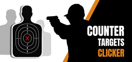
- Genre Clarity: 8/10 — Clear shooting game iconography. The silhouette of a figure holding a pistol in shooting stance, combined with the target graphic on the left, immediately communicates a shooting/action game. At tiny size, the target icon and gun pose remain recognizable and genre-appropriate. The casual clicker framing is less obvious at thumbnail scale, but the core shooting mechanics are unmistakable.
- Title Readability: 9/10 — Excellent legibility at all sizes. The title 'COUNTER TARGETS CLICKER' uses bold white sans-serif lettering with strong contrast against the black silhouette and orange diagonal accent. The layout stacks cleanly with 'CLICKER' in orange for emphasis. At tiny size, the text remains fully readable and the orange accent provides a secondary focal point without clutter.
- Contrast & Color: 9/10 — Strong value separation and pop. White text and black silhouettes create maximum contrast against the light background, with the orange diagonal stripe providing a warm accent that pops without overwhelming. The grayscale silhouettes maintain crisp edges and clear separation from the background. The design reads strongly even in quick scroll and stands out distinctly from the Steam dark background.
- Uniqueness & Polish: 6/10 — Competent but generic execution. The shooting range setup and silhouette approach is functional and clear, but the visual treatment feels somewhat template-like with standard target graphics and common action silhouettes. While clean and professional, there are no distinctive visual storytelling elements that suggest the incremental/progression hook or weapon customization features that make the game unique. It communicates 'shooting game' rather than 'clicker with shooting mechanics.'
- Brand Consistency: 5/10 — Minimal internal identity markers. The capsule uses a simple black, white, and orange palette with no distinctive character, weapon style, or recurring visual motif that would create lasting brand recognition. The target and gun silhouettes are generic enough that they could apply to many shooting games. Without reference to the 7 store screenshots, there are no internal cues that establish a unique identity or signature style for Counter Targets Clicker specifically.
- Composition: 7/10 — Clear hierarchy with smart layout. The composition uses effective left-right balance with the target graphic anchoring the left side and the figure with title on the right. The diagonal orange stripe creates dynamic movement and guides the eye toward the title. Text placement avoids edge collision and remains safe within margins; however, at tiny sizes the vertical stacking of 'COUNTER TARGETS' above 'CLICKER' could compress, though it maintains readability with the orange emphasis on the final word.
What works
- Bold, readable typography. White sans-serif text with strong contrast holds legibility at all viewing scales and stands out immediately against the dark Steam background.
- High value contrast design. Black silhouettes and white text create maximum visual separation that persists even at tiny thumbnail size and in grayscale.
- Functional genre communication. The shooting pose and target graphic clearly signal an action/shooting game without ambiguity.
- Clean compositional balance. Left-to-right layout with the diagonal orange stripe creates visual flow and prevents dead space or cluttered focal points.
What hurts the capsule
- Generic visual identity. The target, silhouette, and overall treatment lack distinctive visual elements that would make this capsule memorable or immediately recognizable as Counter Targets specifically rather than any shooting game.
- Missing game hook visualization. The design does not visually communicate the incremental/clicker progression mechanics, weapon customization, or the earned money upgrade loop that differentiate this game from standard shooting galleries.
- No brand consistency signals. There are no recurring motifs, signature palette choices, or iconic character elements that would create continuity with store screenshots or build brand recognition.
Priority fixes
- [uniqueness_polish] Introduce a distinctive visual element such as a specific weapon design, character style, or upgrade/progression visual (e.g., glowing ammo counter, level indicator, or signature target style) that communicates the clicker upgrade loop and differentiates from generic shooting ranges.
- [brand_consistency] Develop a signature color accent or recurring visual motif beyond the standard black-white-orange that becomes recognizable across store screenshots and marketing materials.
- [genre_clarity] Add a subtle visual hint of progression or monetization (e.g., a coin icon, upgrade glow, or level badge) to clarify that this is an incremental clicker rather than a standard shooting range simulator.
Store copy priority fixes
- [hook_strength] Replace 'In this game, everything is simple' with an action-forward hook like 'Become an unstoppable sharpshooter in this satisfying clicker—shoot, earn, upgrade, dominate' that leads with gameplay and reward.
- [feature_communication] Expand the detailed description to 150+ words with concrete examples: describe the upgrade tree depth, show weapon progression examples (e.g., pistol → rifle → sniper), explain helper mechanics, and clarify how locations increase in challenge or variety.
- [uniqueness] Add a specific differentiator: identify what is unique about this title's weapon system, upgrade tree structure, or progression speed compared to other clickers, or lead with a standout feature (e.g., 'Dual-wield mechanics,' 'Skill-based headshot multipliers,' 'Cosmetic weapon skins unlock gameplay perks').
- [audience_targeting] Include a sentence that directly addresses the relaxing/idle player: 'Perfect for casual play sessions or AFK grinding—progress happens whether you are actively clicking or not' or similar, to clarify session flexibility and appeal.
Related guides
Steam app ID: 4640230 · Tags: Incremental, Casual, Shooter, Idler, Gun Customization