Scoring genre clarity...

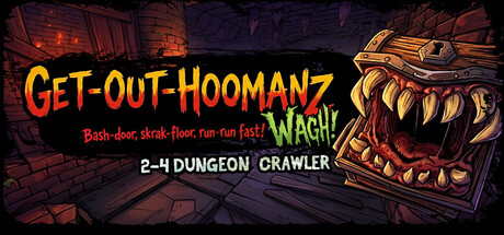
Get-Out-Hoomanz capsule

Get-Out-Hoomanz

A chaotic 2-4 player dungeon crawler! Sabotage your friends' dungeons with deadly traps, loot everything in sight, and escape the show alive. Can you survive your friends' hazards or just another human snack?

Dungeon CrawlerMultiplayerExploration
Patate Douce StudioQ4 2026

Get-Out-Hoomanz scores 75/100 — better than 72% of Dungeon Crawler capsules (n=984).

Released Q4 2026 · By Patate Douce Studio

Quick text summary

Get-Out-Hoomanz scored 75/100 on Steam Analyzer — Good for a Dungeon Crawler capsule. Top priority fix: [title_readability] Remove or enlarge the secondary tagline; keep only the core 'GET-OUT-HOOMANZ' title and 'WAGH!' for readable hierarchy at tiny size.

Capsule scores by dimension

  • Genre Clarity: 8/10 — Strong comedic chaos action signal. The goblin monster with exaggerated teeth and aggressive pose immediately signals a chaotic action-adventure theme, reinforced by the tagline 'Bash-door, skrak-floor, run-run fast!' which conveys frantic gameplay mechanics. At tiny size, the monster silhouette and orange/red color palette remain distinctive enough to suggest fast-paced indie action, though the exact 'multiplayer sabotage' angle is not visually obvious without reading text.
  • Title Readability: 7/10 — Bold title with minor tiny collapse. The main title 'GET-OUT-HOOMANZ' uses bright yellow-orange all-caps lettering with strong contrast against the dark background, reading clearly at full and small sizes. However, at tiny size the tagline text becomes unreadable due to small font size and the 'WAGH!' callout competes for attention, slightly fragmenting the hierarchy and reducing immediate legibility.
  • Contrast & Color: 8/10 — Excellent value separation, warm pop. The bright yellow-orange title and warm gold goblin highlights create strong value and saturation contrast against the cool purple-blue background, with the monster's teeth providing additional bright focal points. In grayscale, the silhouette remains clear and distinct; the design pops strongly on the Steam dark background even at small sizes.
  • Uniqueness & Polish: 7/10 — Distinctive goblin character, coherent comic style. The art direction shows a deliberate cartoonish, slightly grotesque goblin design with sharp teeth and intentional caricature that differentiates it from generic action games. The overall execution feels polished and purposeful with consistent illustrative quality, though it leans into a familiar 'chaotic multiplayer' visual trope rather than introducing a wholly novel visual hook.
  • Brand Consistency: 7/10 — Recognizable goblin mascot, solid identity. The goblin character appears to be a consistent brand mascot with a distinctive design (exaggerated teeth, gold accents, aggressive expression) that could be recognized across marketing materials. The warm yellow-orange and cool purple palette combination creates a memorable color signature, though without access to broader brand materials, internal consistency within this single capsule is well-maintained.
  • Composition: 8/10 — Clear focal point, well-balanced layout. The goblin monster dominates the right side as the primary focal point while the title anchors the left, creating diagonal balance and depth with a layered dungeon background. The composition reads effectively at small and tiny sizes with no critical elements lost to edge cropping, and the title placement on a relatively controlled area avoids major clarity loss from background texture.

What works

  • Strong visual contrast and color pop. Bright yellow-orange title and goblin highlights create excellent separation against the dark Steam background and maintain clarity at all viewing sizes including tiny.
  • Memorable character-driven branding. The distinctive goblin with exaggerated features serves as a recognizable mascot that differentiates the game and communicates chaotic personality.
  • Clear compositional hierarchy. Title on the left and monster focal point on the right create natural eye flow without competing elements or awkward empty spaces.

What hurts the capsule

  • Tagline text becomes illegible at tiny size. The secondary tagline 'Bash-door, skrak-floor, run-run fast!' and 'WAGH!' callout are too small to read at thumbnail size, reducing messaging clarity during quick scrolling.
  • Multiplayer sabotage angle not visually communicated. The capsule shows a single monster and does not visually suggest the 4-player competitive dungeon mechanics or friend sabotage core gameplay loop.
  • Slight visual busyness in background layer. The dungeon background texture is detailed and slightly noisy, which while atmospheric, can reduce title contrast on the left edge at smaller sizes.

Priority fixes

  1. [title_readability] Remove or enlarge the secondary tagline; keep only the core 'GET-OUT-HOOMANZ' title and 'WAGH!' for readable hierarchy at tiny size.
  2. [genre_clarity] Add subtle visual cues of multiplayer chaos (second character, trap indicators, or secondary player silhouettes) to clarify the 4-player competitive angle.
  3. [composition] Darken or blur the background layer slightly to ensure the title remains distinct even when placed over textured areas at all sizes.

Store copy priority fixes

  1. [feature_communication] Expand the 'Async Dungeon Crawling' description to clarify the real-time sabotage mechanic: 'While you navigate your dungeon, place traps in rivals' dungeons simultaneously—they see your sabotage attempts in real-time.'
  2. [feature_communication] Add a sentence clarifying what loot does and how it integrates with gameplay, e.g., 'Collected loot boosts your dungeon defenses to protect against enemy sabotage' or confirms it is cosmetic/progression.
  3. [audience_targeting] Include a note about whether strategy or quick reflexes matter more, to help players self-identify fit: 'Perfect for players who love chaotic couch multiplayer fun' or 'strategic trap placement rewards clever planning.'

Related guides

Steam app ID: 4641210 · Tags: Dungeon Crawler, Multiplayer, Exploration, Action, First-Person