Scoring genre clarity...
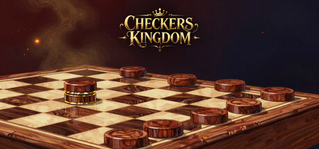
From your grandmother's kitchen table to the Phantom's throne. Learn the classical openings, master the canonical endgames, and face opponents who play like real humans across every official ruleset. A story campaign, one purchase, everything included.
$4.995 user reviews
SimulationBoard GameChess
Pinch GamesMay 9, 2026