Scoring genre clarity...
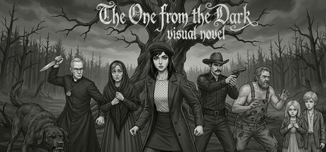
Visual novel set in a rural horror setting. Take on the role of a city real estate appraiser stranded in a remote village with no phone service, no cars, and no escape. Read dialogues, make choices, and try to maintain your sanity before the local Tree decides you're for dinner tonight.
$0.49Positive(16)
CasualAdventureAction
Reanim GamesMay 7, 2026