Scoring genre clarity...
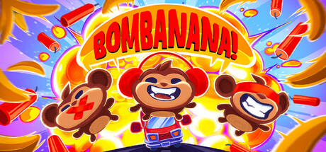
BOMBANANA! capsule

BOMBANANA!

You are a 3-player bomb defusal team made up of three monkeys: blind, deaf, and mute. Inside your minivan turned mobile bomb workshop, you must defuse bombs before they explode using limited time and limited communication!

Team-BasedMultiplayerPuzzle
Lefto StudioAugust 2026

BOMBANANA! scores 82/100 — better than 93% of Team-Based capsules (n=472).

Released August 2026 · By Lefto Studio

Quick text summary

BOMBANANA! scored 82/100 on Steam Analyzer — Good for a Team-Based capsule. Top priority fix: [composition] Slightly reduce or refine the scattered particle effects in corners to minimize visual competition and increase focus on the central character trio.

Capsule scores by dimension

  • Genre Clarity: 8/10 — Playful casual party game clear. The three cartoon monkeys with exaggerated expressions, bright primary colors, and chaotic explosive visual effects immediately signal a fun, lighthearted casual game rather than a serious title. The bomb imagery and team composition hint at cooperative mechanics. At tiny size, the character silhouettes and vibrant color burst still read as 'party game' despite losing fine detail.
  • Title Readability: 9/10 — Bold typography dominates clearly. The title 'BOMBANANA!' uses a thick, high-contrast red and yellow blocked typeface centered prominently with a yellow glow outline that separates it from the background noise. The letterforms remain legible at small and tiny sizes due to heavy stroke weight and warm color against the cooler background. The exclamation point adds playful punctuation that reinforces the casual tone.
  • Contrast & Color: 9/10 — Vivid saturation pops against dark. Bright warm yellows, reds, and oranges of the title and characters create strong value separation against the cooler blue background and assumed dark Steam interface. The monkey characters use brown mid-tones that still hold clear silhouettes against the bright yellow center glow. Even at tiny size, the color-blocked design maintains high contrast and legibility without muddy blending.
  • Uniqueness & Polish: 8/10 — Distinctive monkey trio memorable hook. The three monkeys with distinct personality expressions and the central character's unique red striped outfit create a memorable visual identity beyond generic casual game templates. The explosion/confetti particle effects and dynamic pose suggest action and energy. The execution feels polished with clean outlines and intentional color choices, though it falls short of truly exceptional craft that would warrant a 9.
  • Brand Consistency: 7/10 — Cohesive character-driven identity emerges. The three monkeys establish a recognizable mascot trio that likely appears consistently across marketing materials and in-game branding. The warm color palette (yellows, reds, oranges, browns) and cartoonish style create internal cohesion. The design would be recognizable as the same game across multiple touchpoints, though the capsule does not include a logo mark or additional brand signals beyond the character troupe.
  • Composition: 8/10 — Centered characters strong focal point. The three monkeys are clearly centered with the title above them, creating a strong hierarchical focus that works across all viewing sizes. The radiant burst effect behind the characters guides the eye inward rather than creating distraction. The composition avoids edge-hugging elements and maintains balanced negative space, though the busy particle effects in the corners add minor visual noise that could compete for attention.

What works

  • Title legibility at all sizes. Bold red-yellow blocked typeface with glow outline remains perfectly readable from full header to tiny thumbnail due to heavy stroke weight and high contrast.
  • Strong color pop and vibrancy. Saturated warm colors (yellow, red, orange) create excellent separation against the dark Steam background and maintain clarity even in grayscale squint tests.
  • Memorable character-driven concept. The three distinct monkeys with personality expressions serve as memorable mascots that communicate fun, lighthearted co-op gameplay instantly.
  • Clean centered composition. Clear focal hierarchy with characters centered below title avoids clutter and maintains visual balance across all viewing sizes.

What hurts the capsule

  • Busy background particle effects. The explosive confetti and burst elements scattered across the composition add visual noise that slightly competes with the main characters.
  • Limited brand identity signals. The capsule lacks a distinctive logo, icon, or visual motif beyond the character trio that could serve as a recognizable symbol outside this context.
  • Generic explosion trope. While the monkeys are unique, the explosion visual effect is a common casual game cliché that doesn't strongly differentiate from peer titles like Minami Lane or Sticky Business.

Priority fixes

  1. [composition] Slightly reduce or refine the scattered particle effects in corners to minimize visual competition and increase focus on the central character trio.
  2. [brand_consistency] Add a small distinctive logo mark or icon symbol in a corner that reinforces brand identity and improves recognition across marketing materials.
  3. [uniqueness_polish] Consider adding a unique visual motif (e.g., a minivan silhouette, bomb defusal UI element, or communication constraint visual) to strengthen the unique selling point beyond the character design.

Store copy priority fixes

  1. [feature_communication] Add one sentence under 'Puzzle Modules' explaining the types of challenges (e.g., 'wires to cut, sequences to input, colors to identify') so players understand the actual puzzle variety.
  2. [audience_targeting] Add a note clarifying whether three specific players are required for every session or if the game supports variable group sizes, to set expectations for availability.

Related guides

Steam app ID: 4656000 · Tags: Team-Based, Multiplayer, Puzzle, Online Co-Op, Casual