Scoring genre clarity...

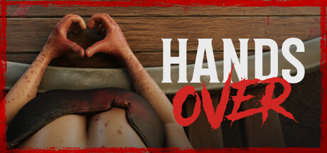
HANDS OVER capsule

HANDS OVER

HANDS OVER is a 5-player co-op horror game where harmless challenges become cruel tests of luck and nerve. Bluff, sabotage your friends, play dirty, and stay at the table longer than anyone else.

ActionCasualCard Game
ArtDockTo be announced

HANDS OVER scores 72/100 — better than 45% of Action capsules (n=8,838).

Released To be announced · By ArtDock

Quick text summary

HANDS OVER scored 72/100 on Steam Analyzer — Good for a Action capsule. Top priority fix: [uniqueness_polish] Add a visual element that hints at the bluff/luck mechanic—such as playing cards, poker chips, or dice prominently featured with the characters—to strengthen unique selling point storytelling.

Capsule scores by dimension

  • Genre Clarity: 7/10 — Party game with dark humor cues. The exaggerated character expressions and smug demeanor suggest social deception and high-stakes competition rather than traditional horror action. At tiny size, the grinning antagonistic faces read clearly as antagonists in a game about bluffing and sabotage. However, the genre description mentions horror, which is not strongly communicated visually—the tone reads more comedic party game than horror survival.
  • Title Readability: 8/10 — Strong contrast, clean hierarchy. The white 'HANDS' and red 'OVER' text are well-separated and maintain excellent contrast against the dark background. At small size, the two-line stacked layout with color differentiation remains readable, and at tiny size the bold sans-serif letterforms hold their shape well. The title placement on the character heads avoids competing with noisy backgrounds.
  • Contrast & Color: 8/10 — High value separation, clear silhouettes. The characters' warm reddish-brown clothing and sunglasses create strong separation from the dark teal-gray background. White title text pops decisively against both the character and background. In grayscale, the light faces and dark jacket values maintain clear silhouettes even at tiny size, with no muddiness or blending.
  • Uniqueness & Polish: 7/10 — Distinctive character design, polished render. The caricatured villain protagonists with exaggerated features and confident poses feel premium and specific to this game's tone. The lighting and shading on the character models show professional 3D rendering. However, the overall composition is relatively straightforward—two characters and a title—without deeper visual storytelling about the core bluff/sabotage mechanic that might elevate it to 8+.
  • Brand Consistency: 6/10 — Competent but limited visual identity. The malicious character archetypes establish a clear tone consistent with a social deception party game, but there are no memorable iconic symbols, motifs, or signature visual elements that would make this capsule instantly recognizable as HANDS OVER specifically. The palette and character style feel appropriate but generic within indie game space without stronger brand anchors.
  • Composition: 7/10 — Clear focal point, solid balance. The two characters occupy the center-right with title anchored to the left, creating a natural flow and single primary focal point. The composition balances character visual weight with text hierarchy effectively. At small and tiny sizes, the arrangement remains coherent, though the characters' edges approach the frame borders slightly—acceptable but with minor margin risk in Steam cropping.

What works

  • Excellent title contrast and readability. White and red text over dark background maintains clarity at all sizes from full to tiny, with strong value separation and clean sans-serif letterforms.
  • Professional character rendering and expression. The exaggerated, confident expressions on the villain characters immediately communicate deception and competitive mischief, reinforcing the bluff-and-sabotage core gameplay.
  • Strong value contrast for silhouette clarity. Characters and title separate cleanly from background in grayscale, ensuring recognition even under squint test and at minimal thumbnail size.

What hurts the capsule

  • Weak horror genre signaling. The visual tone reads party game dark comedy rather than horror, creating potential mismatch with genre expectations despite game description mentioning horror elements.
  • Generic brand identity without memorable motifs. No iconic symbols, props, or signature visual elements that would make this capsule distinctly recognizable as HANDS OVER in a crowded storefront.
  • Limited visual storytelling about core mechanic. The composition shows antagonistic characters but does not visually communicate the bluffing, luck, or sabotage mechanics that define the gameplay experience.

Priority fixes

  1. [uniqueness_polish] Add a visual element that hints at the bluff/luck mechanic—such as playing cards, poker chips, or dice prominently featured with the characters—to strengthen unique selling point storytelling.
  2. [genre_clarity] Clarify horror vs. party-game tone with environmental cues (dim lighting, eerie setting) or adjust expectations if the comedic dark tone is the primary hook.
  3. [brand_consistency] Introduce a memorable color motif, symbol, or recurring character silhouette that could become iconic and recognizable across future marketing materials.

Related guides

Steam app ID: 4661070 · Tags: Action, Casual, Card Game, 3D, First-Person