Scoring genre clarity...

SafeHaven capsule

SafeHaven

SafeHaven is a turn-based strategy game for two players. Deploy specialized units, outmaneuver your opponent, and capture their Standard before they capture yours.

$10.791 user reviews
StrategyBoard GameTabletop
JoCliMeMay 23, 2026

SafeHaven scores 73/100 — better than 57% of Strategy capsules (n=5,103).

1 user reviews · $10.79 · Released May 23, 2026 · By JoCliMe

Quick text summary

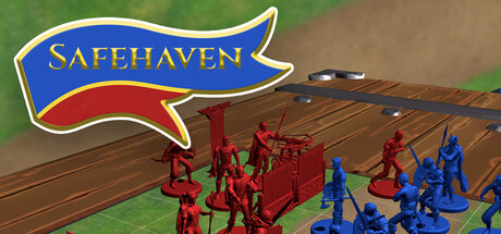
SafeHaven scored 73/100 on Steam Analyzer — Good for a Strategy capsule. Top priority fix: [composition] Add dynamic staging such as a mid-attack pose, elevated camera angle, or dramatic lighting to increase visual energy and stand-out appeal at small sizes.

Capsule scores by dimension

  • Genre Clarity: 8/10 — Clear turn-based strategy presentation. The miniature-style game pieces arranged on a wooden game board immediately signal turn-based tactical strategy. Red and blue unit formations, the Standard objective banner, and board-game aesthetic clearly communicate competitive strategy gameplay. At tiny size, the distinct unit colors and board layout remain recognizable as a strategy game, though specific mechanics require the context banner to confirm.
  • Title Readability: 7/10 — Bold banner logo, readable at small. The 'SAFEHAVEN' text sits in a prominent blue banner with yellow-gold lettering and a strong white outline at top-left. The letterforms remain legible at small and tiny sizes due to high contrast and bold weight. However, at tiny size the banner becomes quite compact and the white outline slightly thins, risking minor blur on the lowest resolution views.
  • Contrast & Color: 8/10 — Strong value separation, vibrant units. The red and blue unit miniatures create excellent contrast against the tan-brown wooden board and green grass background. The blue banner with yellow text pops clearly against the sky. The grayscale silhouette test shows strong light-dark separation between the units and board, with the blue pieces reading distinctly even at tiny size due to their saturated cool tone.
  • Uniqueness & Polish: 7/10 — Authentic board game aesthetic. The physical miniature game piece presentation and wooden board setting give SafeHaven a distinctive tabletop strategy identity that differentiates it from digital-only strategy games. The art style is clean and cohesive with intentional lighting and texture on the board. The execution feels polished but the concept, while appealing, is not visually unique enough to stand out as premium compared to top-tier strategy titles like Frostpunk 2.
  • Brand Consistency: 7/10 — Coherent tabletop identity, subtle branding. The capsule maintains consistent rendering of miniatures, board materials, and lighting throughout. The blue-red faction color pairing is a clear identity signal that would carry across store screenshots. The banner logo establishes visual continuity, though there are no iconic mascots or symbols beyond the Standard that would be instantly recognizable across viewing contexts.
  • Composition: 7/10 — Strong focal point, balanced deployment. The center-foreground composition places game units clearly in the focal area with the board creating natural depth layers (grass background, board midground, units foreground). The top-left banner placement respects safe margins and avoids edge-crop issues. At small and tiny sizes, the unit cluster reads as the primary subject and the banner guides secondary attention; however, the composition is somewhat static and could benefit from more dynamic angle or staging.

What works

  • Immediate genre recognition. The miniature units on a physical game board communicate turn-based strategy instantly without ambiguity.
  • Logo placement and contrast. The blue banner with yellow text and white outline sits in a clean region with strong readability down to small sizes.
  • Faction color clarity. Red vs. blue unit distinction creates memorable brand identity and supports quick visual faction recognition.

What hurts the capsule

  • Static composition lacks dynamism. The frontal deployment view feels staged and passive compared to action-oriented strategy game covers like Total War: PHARAOH.
  • No iconic symbol or mascot. The Standard objective is functional but not visually distinctive enough to become a recognizable brand emblem.
  • Board texture detail becomes noise at tiny. Wood grain and board details compete for attention at thumbnail size, slightly reducing the clarity of the unit silhouettes.

Priority fixes

  1. [composition] Add dynamic staging such as a mid-attack pose, elevated camera angle, or dramatic lighting to increase visual energy and stand-out appeal at small sizes.
  2. [uniqueness_polish] Introduce a signature visual element or iconic unit design that signals SafeHaven's identity and differentiates it from generic board game aesthetics.
  3. [contrast_color] Simplify or reduce board texture detail in post-processing to ensure unit miniatures read as the dominant focal element at tiny resolution.

Store copy priority fixes

  1. [uniqueness] Add a sentence or two describing what makes SafeHaven's strategic gameplay or board design distinct (e.g., 'dynamic board events,' 'asymmetrical factions,' or 'unique faction mechanics').
  2. [tone_match] Inject more personality into the unit descriptions with brief flavor text that evokes the fantasy setting (e.g., 'Warrior - Swift footsoldier, lightly armored but deadly in melee' instead of 'Agile, but lightly armored').
  3. [hook_strength] Strengthen the short description by adding an emotional or differentiating hook beyond the basic premise, such as 'Outwit your opponent in tactical duels where every unit placement matters' or a reference to the game's unique feature.

Related guides

  • Steam page optimisationCapsule, copy, screenshots, tags — the full Steam page conversion stack.
  • Steam tags guideTag selection, ordering, and how it shapes Steam's recommendation rails.

Steam app ID: 4687070 · Tags: Strategy, Board Game, Tabletop, Turn-Based Strategy, Turn-Based Tactics