Scoring genre clarity...

Hero Company capsule

Hero Company

Run a hero recruitment agency! Question suspicious applicants, catch the liars, and hire only the real deal — before your gold runs out.

Free to Play3 user reviews
Turn-Based TacticsStrategyRPG
Pana PororoMay 23, 2026

Hero Company scores 75/100 — better than 69% of Turn-Based Tactics capsules (n=1,210).

3 user reviews · Free to Play · Released May 23, 2026 · By Pana Pororo

Quick text summary

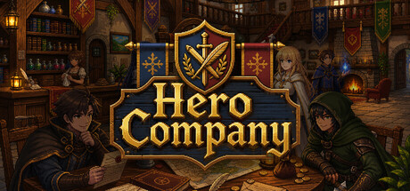
Hero Company scored 75/100 on Steam Analyzer — Good for a Turn-Based Tactics capsule. Top priority fix: [uniqueness_polish] Increase character silhouette detail or add distinctive visual markers (unique costume colors, equipment) to make recruited heroes feel more memorable and game-specific.

Capsule scores by dimension

  • Genre Clarity: 7/10 — Fantasy RPG management game clear. The ornate shield emblem with crossed sword and wand, gold heraldic styling, and tavern interior setting immediately signal a fantasy RPG management game. Multiple character silhouettes in adventurer clothing reinforce recruitment/hiring mechanics. At TINY size, the shield logo and warm fantasy aesthetic remain readable, though character details blur.
  • Title Readability: 8/10 — Bold gold serif legible across sizes. The title 'Hero Company' uses a strong gold serif font centered within a prominent heraldic shield, creating excellent contrast against the darker background. The decorative border contains the text securely. At SMALL and TINY sizes, the shield framing protects readability and the text remains clearly visible due to high value contrast.
  • Contrast & Color: 8/10 — Warm gold stands strong against dark. Rich gold and cream tones of the shield, title, and heraldic details create excellent separation from the #1b2838 dark background. Character silhouettes in darker clothing provide depth layering. The warm orange-brown tavern interior supports the gold without competing. Grayscale test confirms strong value separation of the shield and title against background.
  • Uniqueness & Polish: 7/10 — Polished heraldic aesthetic distinctive hook. The ornate shield with crossed magical symbols conveys the unique 'recruitment agency' concept more effectively than generic fantasy art. The tavern setting with multiple characters suggests social mechanics and NPC interaction. The consistent heraldic art style and composition feel intentional and premium, though the execution is competent rather than groundbreaking compared to top-tier indie capsules.
  • Brand Consistency: 7/10 — Cohesive medieval fantasy identity strong. The ornate gold heraldic shield, warm tavern lighting, medieval typography, and fantasy character costumes create a unified visual language. The color palette of golds, browns, and muted reds is internally consistent. The shield emblem could serve as a recognizable brand mark, though without seeing store screenshots, internal consistency appears solid within this capsule alone.
  • Composition: 8/10 — Balanced focal point clear hierarchy. The ornate shield with 'Hero Company' text dominates the center, creating a strong primary focal point. Character silhouettes are distributed left and right in supporting roles without competing. The tavern background layers depth without overwhelming. At TINY size, the shield remains the clear hero, and the composition resists collapse due to the framing device.

What works

  • Heraldic shield framing device. The ornate shield acts as both a title container and brand identifier, protecting readability at all sizes and adding premium polish.
  • Strong gold-to-dark contrast. The warm gold palette creates excellent value separation against Steam's dark background, ensuring the capsule pops during quick scroll.
  • Clear management RPG signaling. The combination of shield, tavern setting, character recruitment silhouettes, and fantasy aesthetic immediately communicates the game's core premise.

What hurts the capsule

  • Generic fantasy tavern interior. While competently rendered, the background lacks distinctive visual storytelling and could belong to many RPGs, diluting uniqueness at small sizes.
  • Character silhouettes lack personality. The supporting characters are darkened and indistinct, making them feel like background fill rather than memorable NPCs or recruitment subjects.

Priority fixes

  1. [uniqueness_polish] Increase character silhouette detail or add distinctive visual markers (unique costume colors, equipment) to make recruited heroes feel more memorable and game-specific.
  2. [composition] Consider adding a subtle visual element (coins, document, quill) that hints at the 'lying applicant detection' mechanic to strengthen the unique selling point.

Store copy priority fixes

  1. [feature_communication] Add 1–2 sentences explaining how the economy loop progresses: do players unlock new professions, expand the agency, or face escalating hiring challenges as gold scales?
  2. [uniqueness] Clarify what makes the lie-detection mechanic distinct: do hidden traits create replayability? Do profession matchups create emergent complexity that other deduction games lack?
  3. [audience_targeting] Insert a brief signal about difficulty or progression: 'For players who enjoy brain-teasing deduction' or 'A casual management sim with light puzzle depth' to anchor player expectations.

Related guides

Steam app ID: 4692360 · Tags: Turn-Based Tactics, Strategy, RPG, Economy, Incremental