Scoring genre clarity...
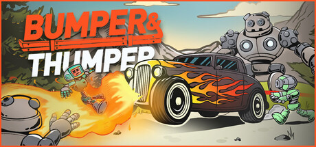
Bumper & Thumper capsule

Bumper & Thumper

A chaotic vehicular combat roguelite. Choose your ride, ram through hundreds of robots, collect scrap to level up and stack weapons. Combine crazy upgrades to create the perfect build, face bosses, and outrun the deadly robots. If you stop, you die.

Bullet HeavenRacingIndie
sadbucketComing soon

Bumper & Thumper scores 77/100 — better than 72% of Bullet Heaven capsules (n=137).

Released Coming soon · By sadbucket

Quick text summary

Bumper & Thumper scored 77/100 on Steam Analyzer — Good for a Bullet Heaven capsule. Top priority fix: [uniqueness_polish] Add a distinctive visual hook such as a more stylized character, unique weapon stack visual, or iconic motif that signals the build-crafting core mechanic.

Capsule scores by dimension

  • Genre Clarity: 8/10 — Clear vehicular combat action. The capsule immediately communicates racing/vehicular gameplay through the prominent hot-rod car with flame decals in the center, reinforced by collision effects and robot enemies scattered around. At TINY size, the flaming car and chaotic robot elements remain legible enough to signal action-combat gameplay, though the specific roguelite progression mechanics are not visually obvious.
  • Title Readability: 9/10 — Excellent bold title hierarchy. BUMPERS in bright orange and THUMPER in white create strong contrast against the light sky background, with clear letterforms and strategic placement in the upper portion. Both words remain fully readable and impactful at SMALL and TINY sizes due to the bold sans-serif font, thick weight, and color separation from the background.
  • Contrast & Color: 8/10 — Strong value separation throughout. The orange car with yellow flames pops against the blue sky and neutral background, while white and orange title text provides excellent contrast against darker elements. Robot silhouettes and the vehicle maintain clear edges in grayscale, creating strong visual separation that reads well even at reduced sizes during quick scrolls.
  • Uniqueness & Polish: 7/10 — Solid action style, somewhat familiar. The illustrated art style with dynamic flame effects and cartoon robot design shows intentional craft and a playful tone that fits the chaotic vehicular combat theme. However, the overall composition feels similar to generic action-racing indie titles, and the generic 'vehicle with weapons' hook lacks the distinctive visual storytelling or iconic character presence of top-tier capsules.
  • Brand Consistency: 6/10 — Coherent but generic identity. The warm color palette (orange, yellow, blue) and cartoon illustration style are applied consistently across the composition with a unified cartoon-action aesthetic. However, there are no distinctive brand motifs, iconic symbols, or memorable visual signatures that would make this recognizable as uniquely Bumpers & Thumper in a lineup; the style aligns with many casual action games.
  • Composition: 8/10 — Clear hierarchy, well-balanced layout. The flaming car sits as the dominant focal point in the center-right area, with robot enemies and explosion effects creating supporting visual interest without overwhelming the primary subject. Title placement at top left is safe from cropping, and the depth layering (sky background, robots at various depths, foreground car) guides the eye effectively even at SMALL size, though the right edge feels slightly crowded.

What works

  • Outstanding title readability. BUMPERS and THUMPER remain bold, legible, and impactful at all sizes due to thick weight, strong color contrast, and strategic safe-zone placement.
  • Strong visual hierarchy and focal point. The flaming car immediately draws attention as the primary subject, with supporting robot and explosion elements providing context without competing for dominance.
  • Good contrast against Steam background. Orange, yellow, and white elements create clear value separation that ensures the capsule stands out during quick scrolling.

What hurts the capsule

  • Generic visual identity. The cartoon action-racing aesthetic lacks distinctive brand motifs or iconic symbols that would make this recognizable beyond the title text.
  • Crowded right edge composition. Robot clusters and effects on the right side create visual clutter that slightly reduces clean read, especially at TINY size.
  • Unintuitive core mechanic communication. Roguelite progression, build stacking, and the 'if you stop you die' mechanic are not visually communicated; capsule shows action but not the unique gameplay loop.

Priority fixes

  1. [uniqueness_polish] Add a distinctive visual hook such as a more stylized character, unique weapon stack visual, or iconic motif that signals the build-crafting core mechanic.
  2. [composition] Redistribute robot elements to reduce right-edge clutter and create more breathing room around the central car subject.
  3. [brand_consistency] Establish a signature color accent or visual motif (e.g., scrap tokens, energy particles, or a unique UI frame) that becomes instantly recognizable across store assets.

Store copy priority fixes

  1. [uniqueness] Add 1–2 sentences explaining what sets this game apart from other vehicular roguelikes or bullet-heaven games—e.g., 'dynamic vehicle physics,' 'vehicle-specific boss mechanics,' or 'real-time upgrade crafting during runs.'
  2. [feature_communication] Provide 2–3 concrete examples of weapon or upgrade synergies (e.g., 'stack triple-shot cannons with speed boosts') to illustrate the depth of build customization.
  3. [audience_targeting] Explicitly mention accessibility in the detailed description (e.g., 'play at your own pace with optional timed input') to reflect the 'Playable without Timed Input' category.

Related guides

Steam app ID: 4696920 · Tags: Bullet Heaven, Racing, Indie, Action Roguelike, Bullet Hell