Scoring genre clarity...

Nova Strider capsule

Nova Strider

An indie top-down sci-fi score-attack game about blowing up aliens in the upper atmosphere! Compete against your friends locally and see who can get the highest score on the leaderboard.

Free to Play3 user reviews
ActionArcade2D
Orbit SoftwareMay 31, 2026

Nova Strider scores 68/100 — better than 17% of Action capsules (n=8,534).

3 user reviews · Free to Play · Released May 31, 2026 · By Orbit Software

Quick text summary

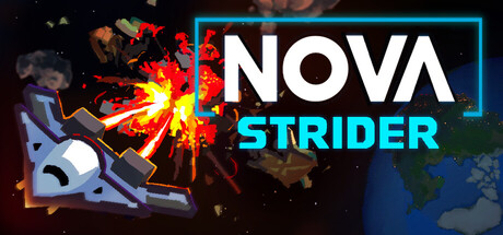
Nova Strider scored 68/100 on Steam Analyzer — Solid for a Action capsule. Top priority fix: [uniqueness_polish] Replace the generic explosion-spaceship with a distinctive visual element or character pose that communicates the score-attack core mechanic and top-down perspective more clearly.

Capsule scores by dimension

  • Genre Clarity: 7/10 — Action sci-fi gameplay clear. The explosive effect, spaceship silhouette, and alien antagonist clearly signal action gameplay with sci-fi setting. At TINY size, the explosion and spacecraft remain readable enough to convey fast-paced combat, though the exact top-down perspective is harder to infer at thumbnail scale.
  • Title Readability: 8/10 — Bold title with strong contrast. NOVA STRIDER uses large white letterforms with a cyan rectangle border that creates excellent separation from the dark background and busy explosion element. At TINY size, the title remains legible and the two-line stacking helps preserve readability, though the subtitle STRIDER loses some crispness.
  • Contrast & Color: 8/10 — Warm-cool separation works well. Orange-red explosion contrasts sharply against the dark blue-black background and cool cyan title border, creating strong value separation. The bright whites and warm fire tones pull forward effectively even at small sizes, and the grayscale silhouettes of ship and explosion remain distinct.
  • Uniqueness & Polish: 6/10 — Competent but generic action style. The explosion and spaceship are well-rendered but follow common indie action game iconography without a distinctive visual hook or memorable art direction. The cyan neon border treatment is a modest differentiator, but the overall composition feels like a competent template rather than a standout indie identity.
  • Brand Consistency: 5/10 — Limited identity signals present. The cyan neon aesthetic and explosion effects provide some visual language, but without access to in-game UI or other marketing materials, the capsule does not establish a strongly recognizable brand motif or signature palette. The spaceship and explosion are generic enough that they could represent many action games.
  • Composition: 7/10 — Clear hierarchy with good balance. The explosion occupies the left-center with the spaceship as secondary focus, while the title anchors the right side in a clean two-zone split. The composition reads well at small sizes with a clear focal point, though the right edge of the cyan border sits close to the frame edge and risks cropping on some Steam layouts.

What works

  • High-contrast title placement. White NOVA STRIDER text with cyan border sits on a relatively clean dark region, maintaining legibility down to TINY thumbnail size.
  • Explosion-spaceship focal point. The warm orange-red explosion and cool blue spaceship create visual interest and clearly signal action gameplay even at quick glance.
  • Value separation from background. The bright explosion and white title pop strongly against the dark #1b2838 Steam background without muddy mid-tones.

What hurts the capsule

  • Generic sci-fi action template. The explosion and spaceship combination is a common trope in indie action marketing, offering no unique visual hook or memorable identity.
  • Weak brand differentiation. Without iconic character, distinctive palette, or signature motif, the capsule does not establish a recognizable NOVA STRIDER brand identity separate from competitor action games.
  • Right border edge risk. The cyan title border edge sits dangerously close to the right frame margin and may be cropped or distorted in certain Steam layout contexts.

Priority fixes

  1. [uniqueness_polish] Replace the generic explosion-spaceship with a distinctive visual element or character pose that communicates the score-attack core mechanic and top-down perspective more clearly.
  2. [brand_consistency] Introduce a signature icon, color motif, or visual pattern from in-game UI (e.g., HUD elements, power-up glow, or alien design) to create a recognizable NOVA STRIDER identity.
  3. [composition] Reposition or inset the cyan title border to create a 10–15px safe margin from the right edge to prevent crop loss on Steam carousel layouts.

Store copy priority fixes

  1. [hook_strength] Replace the opening with a verb-forward hook like "Master the dash: the only move you need to survive an alien invasion in this fast-paced arcade shooter" to lead with gameplay excitement rather than genre classification.
  2. [uniqueness] Add a differentiation sentence such as "Linked enemy pairs force you to plan every dash—one wrong move resets your multiplier and ruins your run" to clarify what makes the strategic moment-to-moment play distinct.
  3. [feature_communication] Add one sentence explaining difficulty progression or how the game escalates (e.g., "As your score grows, enemies spawn faster and in increasingly dangerous formations") to set expectations for game length and skill ceiling.

Related guides

Steam app ID: 4701320 · Tags: Action, Arcade, 2D, Top-Down, Hand-drawn