Scoring genre clarity...
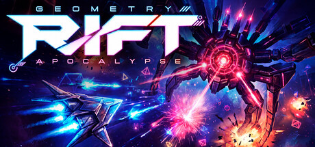
Geometry Rift: Apocalypse capsule

Geometry Rift: Apocalypse

Imagine the frenetic chaos of Geometry Wars colliding with the addictive progression of Vampire Survivors. That's Geometry Rift — a relentless auto-fire action experience where geometric enemies flood the screen and your only option is to shoot, dodge, and survive.

ActionAction RoguelikeTwin Stick Shooter
Víctor Vergara, Alex VergaraNov 2, 2026

Geometry Rift: Apocalypse scores 83/100 — better than 96% of Action capsules (n=9,074).

Released Nov 2, 2026 · By Víctor Vergara

Quick text summary

Geometry Rift: Apocalypse scored 83/100 on Steam Analyzer — Good for a Action capsule. Top priority fix: [composition] Shift the central energy burst slightly left of center to balance the visual weight more evenly across the full width and reduce right-side clustering.

Capsule scores by dimension

  • Genre Clarity: 9/10 — Neon arcade action immediately clear. The geometric shapes, bright neon lines, glowing energy bursts, and chaotic particle effects instantly signal fast-paced arcade action. At tiny size, the cyan and magenta geometric forms against the dark background read as action gameplay with strong visual identity. The aesthetic unmistakably communicates bullet-hell or arcade shooter mechanics.
  • Title Readability: 8/10 — Bold neon title legible at all sizes. GEOMETRY RIFT APOCALYPSE uses a bright cyan outline logo with magenta secondary text and orange accent, positioned on the left side over a dark background. The letterforms remain readable even at tiny size due to high contrast and clean sans-serif construction. The three-line stacking at full size works, though the tagline 'APOCALYPSE' compresses slightly at thumbnail but remains distinguishable.
  • Contrast & Color: 9/10 — Vibrant neon pops against dark field. Cyan, magenta, orange, and hot pink neon elements create exceptional value separation against the deep navy-black background (#1b2838 equivalent). The bright geometric trails and energy bursts have crisp silhouettes and luminous quality that reads powerfully even when squinted or at tiny zoom. Strong saturation and light separation make the design unmissable on a crowded storefront.
  • Uniqueness & Polish: 8/10 — Premium neon arcade aesthetic distinct. The clean vector geometric design with purpose-built neon trails and glowing particle effects feels intentional and polished, not template-based. The visual communicates the core mechanic (geometric combat, arcade speed) through stylized visuals rather than generic action tropes. The execution quality and cohesive neon-punk direction elevate it above standard arcade game capsules.
  • Brand Consistency: 8/10 — Iconic neon geometry signature style. The cyan and magenta neon geometric motifs, glowing particle system, and arcade vector aesthetic form a recognizable and consistent brand identity across the visual. These elements would be instantly recognizable on other marketing materials or sequel packaging. The signature neon palette and geometric silhouettes establish a clear, memorable brand voice.
  • Composition: 8/10 — Clear focal hierarchy dynamic balance. The bright central energy burst and geometric triangle form a strong focal point in the composition, with the title anchored safely on the left. Background particle effects and trailing lines create depth without cluttering the primary read. At small and tiny sizes, the composition remains balanced with no critical elements lost to edge cropping, and the eye naturally flows from title to central action.

What works

  • Neon aesthetic instantly recognizable. The cyan and magenta color palette with glowing effects is distinctive, memorable, and matches the arcade action genre perfectly.
  • Excellent contrast on dark background. Bright neon elements pop dramatically against the dark blue-black, ensuring visibility in dense store listings and small thumbnail sizes.
  • Title placement and readability. The multi-line neon logo sits on a controlled background region and remains legible at all viewing sizes without overlap issues.
  • Genre signaling through visual language. Geometric shapes, particle bursts, and glowing trails clearly communicate fast-paced arcade action gameplay at first glance.

What hurts the capsule

  • Composition slightly right-heavy. The large central burst and trailing effects cluster more toward the right side, leaving the right third feeling dense while the far left is open.
  • Fine particle details dissolve at tiny size. While the primary elements hold, the smaller geometric fragments and subtle glow layers lose definition at 120×45 thumbnail size, reducing perceived polish.

Priority fixes

  1. [composition] Shift the central energy burst slightly left of center to balance the visual weight more evenly across the full width and reduce right-side clustering.
  2. [contrast_color] Add a subtle dark halo or shadow behind fine geometric particles to preserve silhouette clarity at thumbnail sizes without increasing visual noise.

Store copy priority fixes

  1. [hook_strength] Remove the redundant opening from the detailed description; start instead with the WORLDS AND CHALLENGES section to avoid repetition and keep the short description as the sole hook.
  2. [uniqueness] Add 1–2 sentences about the demoscene composer's impact earlier in the copy (e.g., 'Featuring an original soundtrack by Awesome, a legendary demoscene composer, the music becomes a character in its own right') to position the audio as a genuine differentiator.
  3. [feature_communication] Expand the 'STORY AND MUSIC' section to clarify how narrative progression interleaves with roguelike runs—does story unlock gradually, or is it a meta-layer that enriches each run?
  4. [genre_clarity] Add a brief mention of what makes the special challenges 'original'—one concrete example (e.g., 'reverse gravity mode,' 'one-hit survival') would anchor the claim and excite players.

Related guides

Steam app ID: 4701970 · Tags: Action, Action Roguelike, Twin Stick Shooter, Arcade, Bullet Hell