Scoring genre clarity...

UNO capsule

UNO

UNO™ is the iconic card game reimagined with a large variety of gameplay and customization options. Play solo or with friends, personalize your experience from rules to cosmetics, and try the Happy Hour!

$9.99Mixed(140)
Card GameMultiplayerTabletop
Ubisoft EntertainmentJan 3, 2017

UNO scores 88/100 — better than 100% of Card Game capsules (n=1,230).

Mixed (140 reviews) · $9.99 · Released Jan 3, 2017 · By Ubisoft Entertainment

Quick text summary

UNO scored 88/100 on Steam Analyzer — Excellent for a Card Game capsule. Top priority fix: [uniqueness_polish] Consider adding a subtle visual element—such as a silhouette of a player or customization cosmetic hint—that communicates the game's expanded feature set beyond the classic card game.

Capsule scores by dimension

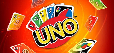
  • Genre Clarity: 9/10 — Instantly recognizable card game. The iconic UNO card deck is the dominant visual element, with colorful numbered and action cards fanned in a circular arrangement that immediately communicates a card game at any size. The familiar card design, bright primary colors, and game-specific iconography make the genre unmistakable even at tiny thumbnail size. This is textbook genre clarity through authentic asset representation.
  • Title Readability: 9/10 — Bold, centered, highly legible. The UNO logo is prominently centered with thick yellow lettering, black outline, and red backing that maintains perfect readability from full header down to tiny 120x45 thumbnail. The font is iconic and specifically designed for this brand, making it instantly recognizable at any scale. No taglines clutter the layout, allowing the logo to dominate without competition.
  • Contrast & Color: 9/10 — Vibrant, high-saturation, excellent separation. The warm red-to-orange gradient background creates strong value separation against the Steam dark background (#1b2838), while the yellow logo and colorful cards pop with vivid saturation that commands immediate attention. In grayscale, the light yellow and white card elements contrast sharply against darker reds and the deep background. The composition maintains silhouette clarity and edge definition even under squint test.
  • Uniqueness & Polish: 8/10 — Authentic brand execution, minor genericness. The capsule leverages the official UNO card assets and familiar visual language with professional polish, creating a premium feel that matches the established brand identity. However, the composition—fanned cards on a gradient—is relatively straightforward without a distinctive hook beyond brand recognition. The happy, celebratory energy reads well, but the layout relies on the brand's existing recognition rather than introducing a unique selling point or visual twist.
  • Brand Consistency: 9/10 — Perfect brand alignment, iconic elements. The capsule uses the exact UNO logo, official card designs with correct numbering and color coding, and the familiar red-orange color palette synonymous with the brand for decades. The composition feels authentic to how UNO has been marketed across digital and physical media, reinforcing instant recognition for anyone familiar with the franchise. No conflicting visual language or off-brand elements present.
  • Composition: 9/10 — Balanced, hierarchical, resilient. The UNO logo anchors the center as the primary focal point with cards arranged in a supporting circular fan that guides the eye without competing. The layout uses depth effectively with foreground cards, mid-tone gradients, and background glow, while maintaining safe margins and avoiding edge cropping issues. At small and tiny sizes, the composition collapses cleanly to the central logo and card silhouettes, preserving hierarchy without loss of meaning.

What works

  • Iconic brand recognition. The official UNO logo and card designs are instantly familiar and create immediate brand trust that resonates at any size.
  • Excellent contrast and saturation. Vibrant yellow, red, and orange palette creates strong visual pop against the dark Steam background with clear silhouette separation.
  • Clear visual hierarchy. The centered logo dominates with supporting card elements guiding attention without creating visual clutter or competing focal points.
  • Scalable composition. The centered circular arrangement collapses gracefully to a readable core at thumbnail sizes without losing the UNO identity.

What hurts the capsule

  • Minimal unique selling point. The capsule relies entirely on brand recognition rather than communicating the game's 'large variety of gameplay and customization' or 'Happy Hour' features.
  • Generic gradient treatment. The radial orange-red gradient, while functional, is a standard background choice that doesn't differentiate this capsule from typical casual game imagery.

Priority fixes

  1. [uniqueness_polish] Consider adding a subtle visual element—such as a silhouette of a player or customization cosmetic hint—that communicates the game's expanded feature set beyond the classic card game.
  2. [composition] Explore whether a secondary focal point like a stylized character or Happy Hour theme element could enhance storytelling while maintaining the UNO logo dominance.

Store copy priority fixes

  1. [feature_communication] Restructure the detailed description to lead with the base UNO experience first, then present DLC as optional expansions in a collapsed list or dedicated section—current order prioritizes DLC bundles over core gameplay.
  2. [uniqueness] Add 1–2 sentences explaining how MyDesign customization specifically differs from cosmetic systems in competitor digital card games (e.g., 'Build your own card deck design from scratch, not just pre-made themes').
  3. [hook_strength] Replace 'iconic card game reimagined' in the short description with a concrete differentiator or mode highlight (e.g., 'The classic UNO card game with 9 themed expansions, house rules, and live Twitch integration—play your way').
  4. [tone_match] Audit copy for consistency: either commit to playful, community-facing voice throughout, or formally separate business/DLC messaging into a distinct 'Editions' section to avoid tonal whiplash.

Related guides

Steam app ID: 470220 · Tags: Card Game, Multiplayer, Tabletop, Board Game, Casual