Scoring genre clarity...

BRICKFALL capsule

BRICKFALL

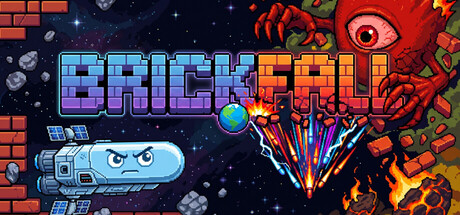
Bounce balls, collect XP, and craft unique builds. Use a variety of weapons—from lightning to homing missiles—to create chaotic synergies. Defeat bosses every 5 minutes and turn a single ball into a screen-filling barrage. How long can you survive the Infinite Mode?

$4.99
Action RoguelikeActionRoguelite
Rocket Industries Inc.May 24, 2026

BRICKFALL scores 82/100 — better than 94% of Action Roguelike capsules (n=1,675).

$4.99 · Released May 24, 2026 · By Rocket Industries Inc.

Quick text summary

BRICKFALL scored 82/100 on Steam Analyzer — Good for a Action Roguelike capsule. Top priority fix: [composition] Shift the red creature and eye slightly left toward center to create safe margin from right edge and avoid crop risk on narrow layouts.

Capsule scores by dimension

  • Genre Clarity: 8/10 — Clear action arcade shooter identity. The pixelated art style, bouncing ball mechanic, explosive effects, and weapon iconography immediately signal an arcade action game. At tiny size, the blue ball, red enemy creature, and colorful projectile burst are recognizable as chaotic action gameplay. The brick wall and destructible environment aesthetic reinforce the casual action-arcade genre clearly.
  • Title Readability: 9/10 — Excellent legibility across all sizes. The BRICKFALL title uses a bold, high-contrast gradient (blue to orange) on a dark background with strong outline definition. At tiny size, the letterforms remain distinct and the two-word layout reads cleanly without decoration obscuring meaning. The title placement in the upper-left quadrant avoids busy visual noise and maintains perfect clarity even when squinted.
  • Contrast & Color: 9/10 — Strong silhouettes with vibrant pop. The composition leverages high-saturation reds, oranges, and blues against the dark navy-purple background, creating excellent value separation. The ball, creature, and explosions all have clear luminous edges that stand out dramatically at small and tiny sizes. In grayscale, the light blues and yellows maintain strong separation from the dark space, and the red creature silhouette reads distinctly even at minimal resolution.
  • Uniqueness & Polish: 8/10 — Polished pixel art with distinct character. The capsule features cohesive retro-arcade pixel aesthetics with a personality-driven red creature boss that feels intentional rather than generic. The layered composition (foreground ball, midground effects, background creature) and the specific weapon effects (homing projectiles, explosions) communicate the unique synergy-building core mechanic. The craftsmanship is evident in the clean pixel rendering and deliberate color choices that avoid the template-heavy look common in casual games.
  • Brand Consistency: 7/10 — Consistent pixel style, memorable creature. The capsule establishes a recognizable pixel-art identity with consistent retro arcade rendering across all elements. The red creature with the prominent eye is a distinctive character motif that could serve as brand recognition. However, without reference to the six store screenshots, the internal palette and style feel cohesive but not yet demonstrably iconic across the full game presentation.
  • Composition: 8/10 — Clear focal hierarchy with depth layering. The composition uses effective foreground-midground-background separation: the blue ball and projectiles burst in the center, the red creature anchors the right side, and brick walls frame the scene. The title occupies the upper-left safe zone without crowding edges, and the eye naturally travels from the ball collision to the creature threat. At tiny size, the explosion and creature remain the primary focal points while the title stays readable and non-intrusive.

What works

  • Title visibility at all scales. Bold gradient lettering with outline definition ensures BRICKFALL remains legible at tiny thumbnail size without any readability collapse.
  • High contrast color palette. Vibrant reds, blues, and oranges pop sharply against the dark background, maintaining strong silhouette clarity even when squinted or viewed at minimal resolution.
  • Personality-driven character design. The red creature with the prominent eye creates a memorable antagonist that signals the game's tone and core conflict immediately.
  • Clear action-arcade genre signals. Pixel art, destructible environments, projectile effects, and bouncing ball mechanics communicate the gameplay type instantly at any size.

What hurts the capsule

  • Crowded right-side composition. The creature and eye occupy the far right edge, risking crop loss on some Steam display formats or when the capsule is placed in tight layouts.
  • Limited visual uniqueness within genre context. While well-executed, the pixel-art arcade aesthetic is common in indie action games; the capsule does not yet feel distinctly different from similar casual roguelike shooters in visual terms.
  • Secondary UI elements lack emphasis. The brick walls and background objects, while thematically appropriate, do not clearly communicate the crafting or synergy-building core mechanic that sets this game apart.

Priority fixes

  1. [composition] Shift the red creature and eye slightly left toward center to create safe margin from right edge and avoid crop risk on narrow layouts.
  2. [uniqueness_polish] Add a subtle visual cue (e.g., glowing aura, status icon, or unique weapon silhouette) that hints at the synergy-building or XP mechanic to increase mechanical clarity.
  3. [brand_consistency] Ensure the creature design and color palette are reinforced consistently across store screenshots to build stronger brand recognition over time.

Store copy priority fixes

  1. [uniqueness] Rewrite the closing of the short description to lead with the brick-breaking + roguelike fusion as the unique angle instead of the generic survival question—e.g., 'Experience the only brick-breaker where each bounce unleashes roguelike synergies that turn one ball into a screen-filling arsenal.'
  2. [tone_match] Replace 'devastating upgrades' and 'unstoppable synergies' in the detailed description with language that echoes the playful tone of the opening lore (e.g., 'ridiculous synergies,' 'absurd combos') to maintain consistent voice.
  3. [audience_targeting] Add one sentence early in the detailed description that explicitly signals the intended player—e.g., 'Perfect for score-chasers who love quick arcade runs and satisfying progression' or 'Ideal for casual players seeking colorful action without pressure.'

Related guides

Steam app ID: 4702740 · Tags: Action Roguelike, Action, Roguelite, 2D, Cute