Night Parking scores 72/100 — better than 42% of Racing capsules (n=762).

Quick text summary

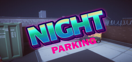
Night Parking scored 72/100 on Steam Analyzer — Good for a Racing capsule. Top priority fix: [composition] Add a car silhouette or dynamic parking scenario in the foreground to visually communicate the core challenge and gameplay mechanic at all viewing sizes.

Capsule scores by dimension

  • Genre Clarity: 7/10 — Clear casual arcade parking game. The neon sign aesthetic and urban nighttime setting immediately suggest a casual arcade game, reinforced by the 3D parking lot environment visible in the background. At tiny size, the neon styling and parking lot context still communicate the core mechanic, though genre specificity (parking vs racing) becomes slightly ambiguous at smallest viewing sizes.
  • Title Readability: 8/10 — Bold neon text reads well across sizes. The large gradient neon 'NIGHT' text with magenta outline and cyan-to-yellow fill is highly legible at all viewing scales, including tiny thumbnails. The bright cyan and magenta color separation against the dark background ensures strong contrast, though the secondary 'PARKING' text in magenta is smaller and slightly less prominent at reduced sizes.
  • Contrast & Color: 8/10 — Vibrant neon pops against dark background. The cyan-to-yellow neon gradient on the primary title creates excellent value separation and saturation against the dark #1b2838 Steam background, with magenta accents providing additional visual punch. In grayscale, the neon elements maintain strong edge definition and silhouette clarity even at tiny size due to the bold outline work.
  • Uniqueness & Polish: 7/10 — Polished neon aesthetic, generic scene. The neon sign treatment is well-executed with clean gradients, proper depth layering, and professional lighting effects on the 3D parking lot environment. However, the underlying composition—nighttime city parking lot—is visually generic and doesn't communicate a unique selling point or distinctive mechanic beyond the neon styling wrapper.
  • Brand Consistency: 6/10 — Coherent neon style, limited identity cues. The capsule establishes a consistent neon-arcade aesthetic with coordinated color palette (cyan, magenta, yellow) and unified rendering approach across text and environment. However, there are no iconic character, mascot, or signature visual motifs visible that would create lasting brand recognition separate from the neon treatment itself.
  • Composition: 7/10 — Clear focal point with balanced hierarchy. The large neon sign dominates the upper-center area with clear visual hierarchy, while the parking lot environment provides supporting context without competing for attention. The composition maintains good depth layering (background structure, midground lot, foreground signage), though the parking lot background is somewhat generic and the composition would benefit from stronger visual storytelling elements centered on the parking challenge itself.

What works

  • Legible neon typography. The gradient cyan-to-yellow 'NIGHT' text with magenta outline maintains excellent readability and visual impact at all viewing scales, including tiny thumbnails.
  • Strong color-to-background contrast. Vibrant neon colors create clear separation against the dark Steam background in both color and grayscale, ensuring quick visual recognition during fast scrolling.
  • Polished rendering quality. Clean 3D environment modeling, proper lighting, and professional neon glow effects demonstrate solid craft execution throughout the capsule.

What hurts the capsule

  • Generic parking lot setting. The nighttime urban environment lacks distinctive visual storytelling or memorable character elements that would differentiate it from generic casual game templates.
  • No unique gameplay hook visible. The capsule does not clearly communicate the 'difficult parking spots' or 'dexterity and precision' challenge through visual composition—it shows location but not gameplay tension.
  • Limited brand identity signals. The neon styling is the only recognizable visual signature; there are no character, mascot, or iconic motif elements that could create lasting brand recall.

Priority fixes

  1. [composition] Add a car silhouette or dynamic parking scenario in the foreground to visually communicate the core challenge and gameplay mechanic at all viewing sizes.
  2. [genre_clarity] Introduce a visual element (tight parking space lines, car tilted at difficult angle, or precision UI hint) that clarifies the parking challenge over generic arcade racing.
  3. [uniqueness_polish] Develop a recognizable character, mascot, or signature visual motif that extends the neon aesthetic into a cohesive brand identity beyond the sign treatment.

Store copy priority fixes

  1. [feature_communication] Expand the features list to include specific mechanics: describe 1–2 unique parking challenges (e.g., 'tight alley parking,' 'parallel parking under traffic'), explain how difficulty escalates, and detail what 'multiple levels' means in terms of scope and variety.
  2. [uniqueness] Add a clear differentiator: specify what the night setting adds (neon aesthetics, reduced visibility, unique ambiance) or explain what makes this parking puzzle stand out from existing parking games—e.g., 'the only parking game that combines time pressure with obstacle avoidance and music-driven rhythm.'
  3. [hook_strength] Replace 'Get ready for an exciting adventure' with a verb-forward opening that leads with the core tension: e.g., 'Test your precision: squeeze your car into impossible parking spots before time runs out.'
  4. [audience_targeting] Add a sentence that signals the intended audience: e.g., 'Perfect for quick arcade sessions and casual players seeking satisfying, skill-based challenges without story or violence.'

Related guides

Steam app ID: 4704330 · Tags: Racing, Casual, Arcade, 3D, Stylized