Scoring genre clarity...
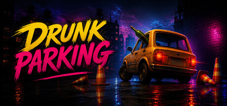
You had one job: park the car. The problem? You’re doing it drunk. Drunk Parking is a chaotic physics-based driving game where simple parking turns into a complete mess. Fight unpredictable controls, overcorrect every turn, and try to land your car perfectly in a city full of obstacles.
$1.99
SimulationDrivingAutomobile Sim
Vladyslav KurhanMay 26, 2026